Third-party risk programs are built to assess vendors one at a time: tier this one, assess that one, chase a SOC 2 from the other. That’s necessary — and it completely misses the risk that actually takes companies down. You can vet every vendor flawlessly and still be one event away from a cascade, because the danger isn’t in any single vendor — it’s in the shape of the whole portfolio.
Half your vendors run on the same cloud. Three “independent” SaaS tools all sit on top of the same sub-processor. One critical capability has a single sole supplier with no alternative. None of those show up in a per-vendor review, because each individual vendor looks fine. They only show up when you look at the portfolio as a population — and that’s concentration risk.
Regulators have caught up to this. The EU’s DORA regime makes ICT concentration risk an explicit requirement; the OCC and FFIEC press on it in third-party guidance; ISO 27001:2022 A.5.21–5.22 expect you to manage risk across the ICT supply chain, not just the first hop. The question they’re all asking is the same: if one thing goes wrong, how much of your portfolio goes with it? Talarity answers it with a concentration analysis across seven dimensions.
Who’s involved
- CISO / CRO — reads the concentration gauge and the alerts to understand portfolio-level exposure, not just per-vendor scores.
- Procurement — uses the category and sole-supplier signals to deliberately diversify where the portfolio is dangerously narrow.
- Risk manager — acts on the specific alerts (the shared sub-processor, the critical-tier density) and tracks whether concentration is improving over time.
Step 1 — One score, seven dimensions
Open Third-Party Risk → Vendor Dashboard and the Concentration Risk Intelligence panel gives you a single headline — an overall concentration score and level — over a heat map of seven distinct dimensions.
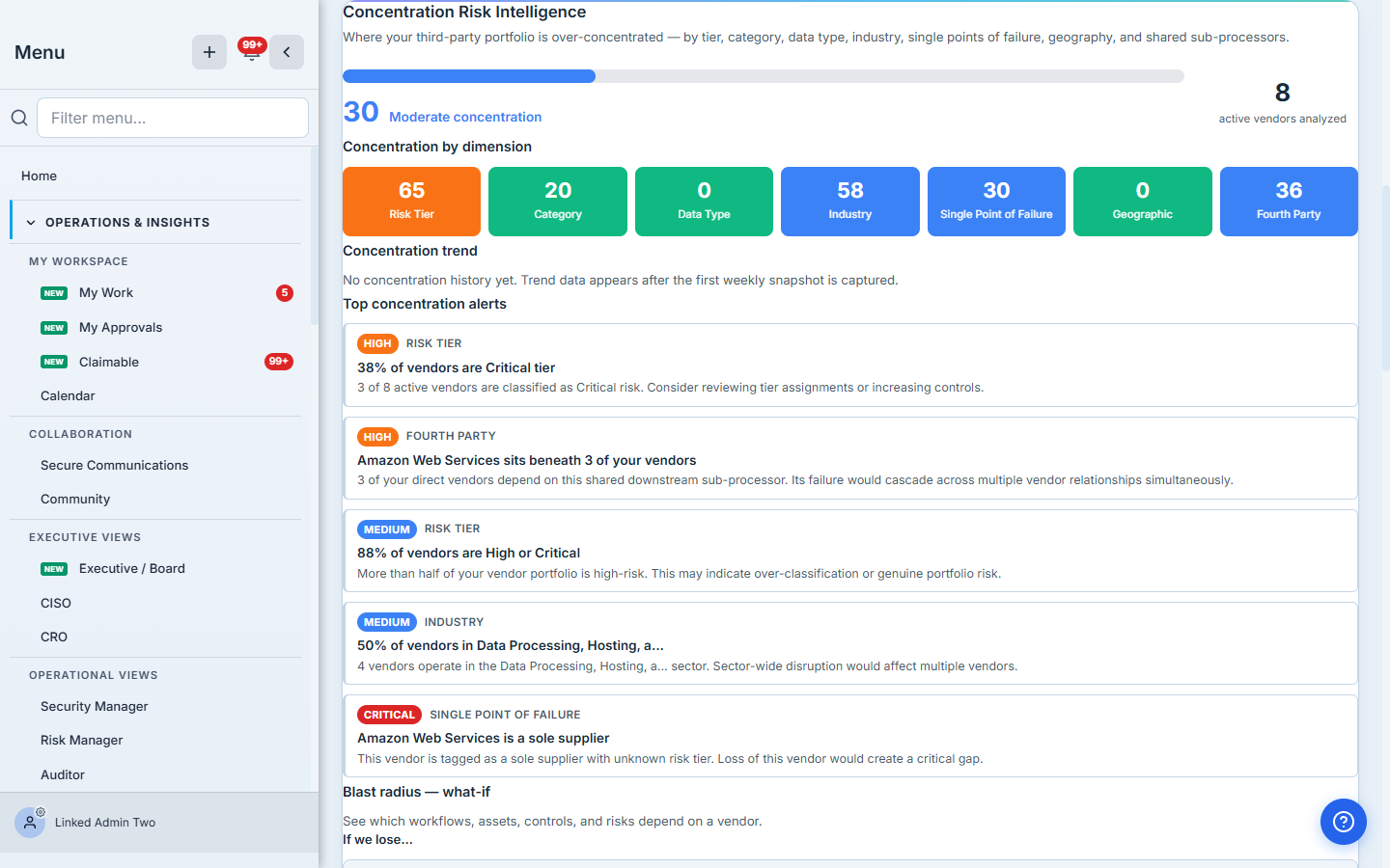
The overall number is a weighted blend, but the dimensions are where the insight lives — a portfolio can be “moderate” overall while being acutely concentrated on one axis. Each dimension is scored 0–100 and colour-coded, so a glance tells you where the portfolio is dangerously narrow and where it’s healthily spread.

What each dimension measures:
- Risk Tier — are too many of your vendors critical? A portfolio where 40% are critical-tier is carrying a lot of high-stakes relationships at once. (Computed as a Herfindahl–Hirschman index over the tier distribution.)
- Category — are you over-relying on one kind of vendor (cloud, payments, identity)? Five cloud-infrastructure vendors is five vendors exposed to the same class of failure.
- Data Type — how many vendors touch the same sensitive data (PII, PHI, PCI, financial)? Each additional holder of the same data multiplies your breach surface.
- Industry — are your vendors clustered in one sector? A sector-wide event (a sweep of one industry’s software) would hit several at once.
- Single Point of Failure — do you have sole suppliers for critical capabilities, with no alternative source?
- Geographic — is your data processed predominantly in one region, exposing you to a single geopolitical or regulatory event?
- Fourth Party — do multiple direct vendors secretly depend on the same downstream sub-processor? That shared dependency is invisible per-vendor and catastrophic in aggregate.
Step 2 — The alerts are the action list
The heat map tells you where; the alerts tell you what to do about it. Talarity surfaces the specific concentrations that breach a threshold, ranked by severity.
Read the alerts top to bottom and the portfolio’s real shape emerges:
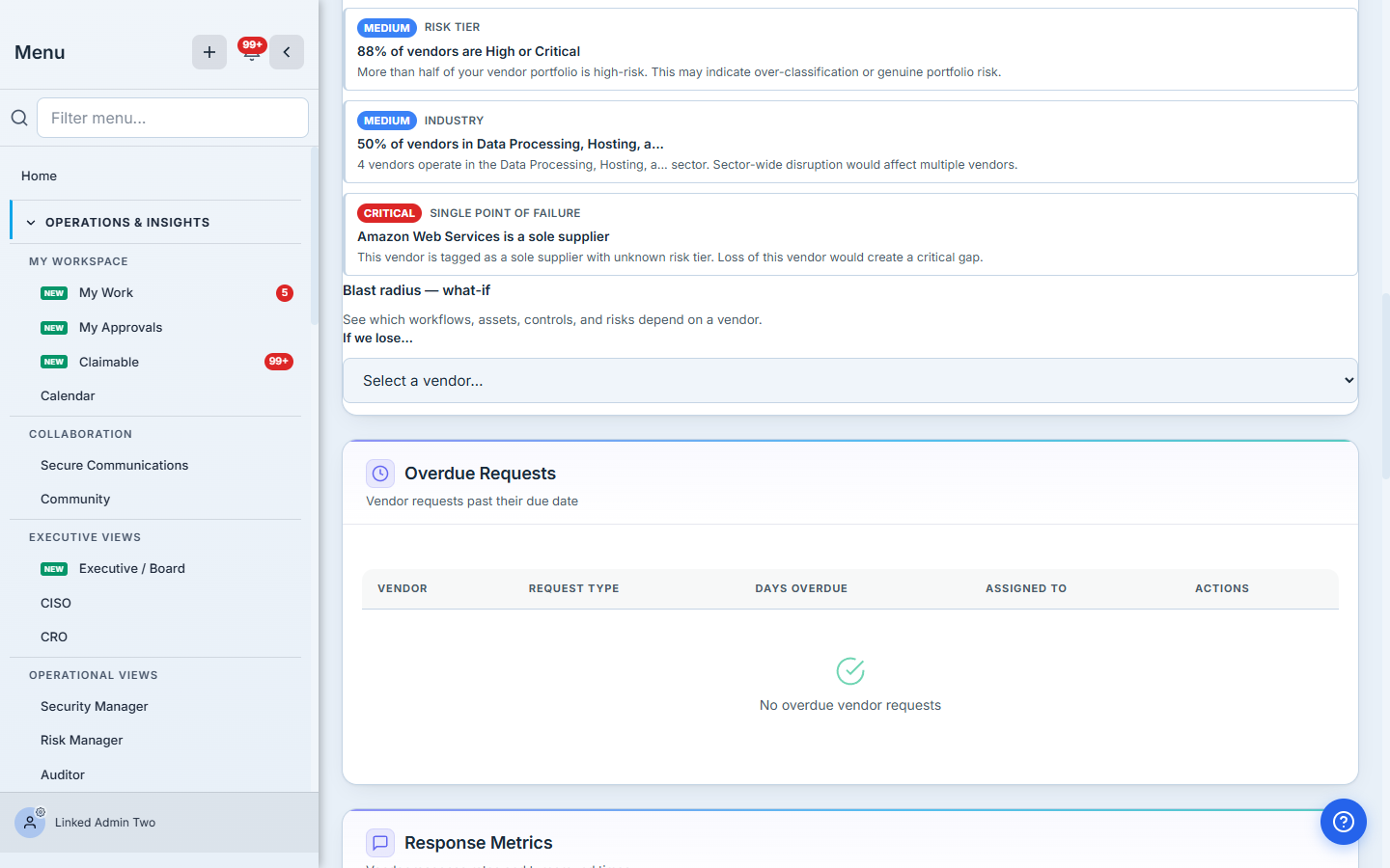
- [CRITICAL] Single Point of Failure — “Amazon Web Services is a sole supplier.” You’ve tagged a vendor as having no alternative, and losing it would create a critical gap. This is the single highest-leverage thing to know about a portfolio.
- [HIGH] Fourth Party — “Amazon Web Services sits beneath 3 of your vendors.” Three of your direct vendors quietly depend on the same downstream sub-processor. Its failure would cascade across multiple “independent” relationships simultaneously — the exact failure mode that per-vendor reviews never catch.
- [HIGH] Risk Tier — “38% of vendors are Critical tier.” More than a third of the portfolio is high-stakes. (And a companion alert: 88% are High-or-Critical.)
- [MEDIUM] Industry — “50% of vendors in Data Processing, Hosting.” Half the portfolio operates in one sector; a sector-wide disruption would hit them together.
Each alert names the dimension, the magnitude, the affected count, and a recommended direction (diversify, add a fallback, review the tiering). It’s a portfolio-level work list that simply doesn’t exist if you only ever look at vendors individually.
The fourth-party alert is the one that earns the feature. “We use Datadog, Snowflake, and Cloudflare — three different vendors, nicely diversified” feels safe right up until you realise all three run on AWS, and an AWS event takes out all three at once. That dependency is invisible in every individual vendor file and only appears when the platform walks the supply-chain graph and counts how many of your direct vendors converge on the same downstream node.
Step 3 — Ask “what if we lose this one?”
Below the alerts, the Blast radius — what-if picker turns concentration from a static score into a scenario. Pick a vendor and Talarity walks the entity graph to show which workflows, assets, controls, and risks depend on it — the real downstream cost of losing it. It’s the natural next question after the analysis flags a sole supplier: if it went away tomorrow, what exactly breaks, and how much? The more of your asset, control, and risk relationships you’ve linked to vendors, the sharper that answer gets.
Step 4 — Watch the trend, not just the snapshot
Concentration isn’t static — every vendor you add or retire reshapes it. Talarity captures a weekly snapshot of each dimension, so the panel can show whether your portfolio is diversifying or concentrating over time. A concentration score that’s been climbing for two quarters is a strategic signal long before it’s an incident. (The trend line populates after the first weekly snapshots accumulate — it’s a few weeks of history, not a day-one chart.)
Where the analysis needs your data
Concentration math is honest about its inputs, and a couple of dimensions are opt-in:
- It needs a real portfolio. Below five active vendors the analysis is suppressed rather than faked — Herfindahl ratios are meaningless on a handful of vendors, and a green “0% — all clear” on a tiny portfolio would be a lie.
- Geographic concentration activates once you record where each vendor processes data; Data Type concentration sharpens as the portfolio grows (a shared data type across many vendors is what raises it).
- Fourth-party concentration depends on the supply-chain graph — it’s as good as the sub-processor relationships you’ve mapped or collected via disclosure. The shared-dependency insight is only as deep as the links you’ve recorded.
- Single Point of Failure keys off the Sole Supplier tag — tag the vendors that genuinely have no alternative, and the SPOF dimension lights up with the criticality it deserves.
What you walk away with
- A portfolio-level view of risk that per-vendor assessments structurally cannot give you — your exposure measured as a population, not a list.
- A seven-dimension concentration heat map that shows, at a glance, where the portfolio is dangerously narrow (too many critical vendors, one category, a shared sub-processor, a sole supplier) and where it’s healthily spread.
- An alert list that turns those concentrations into ranked, specific actions — including the fourth-party cascades and sole-supplier gaps that are invisible vendor-by-vendor.
- A blast-radius what-if and a concentration trend so you can model the impact of losing any one vendor and watch whether the portfolio is getting safer or riskier over time.
Open the Vendor Dashboard and read your concentration alerts. If one of them says a single sub-processor sits beneath three of your vendors — or that you’ve got a sole supplier with no fallback — you’ve just learned something about your risk that no amount of per-vendor diligence would ever have surfaced.