A risk analyst, a CISO, and a board member do not want to see the same dashboard. The obvious answer is to ship one dashboard per role, and that is what Talarity used to do — eight of them, sitting in the sidebar as eight separate destinations.
It was the wrong shape. A fixed lens per role only works if everybody has exactly one role and never wants a page from somebody else’s. The eight are now one row — Area Insights — with a Configure tab beside it holding the entire library they were built from. They have not been deleted: they are starting points you copy, rather than rows you scroll past. The sidebar’s Dashboards section keeps its single-topic screens — Insights Home, SLA Tracking, Security Posture and the rest — and gains a row for every dashboard you build yourself. What it no longer carries is eight competing versions of everything.
Who’s involved
- Anyone who opens Talarity more than twice a week. There is no role to be assigned; every dashboard and every page template is available to every user, subject only to your organization’s group and licence gating.
- The person who ends up building the team’s screen. Usually one person assembles the Monday-morning view and shares it with the org. That is a deliberate act with a name and a visibility, not a global default somebody changed.
What’s on the page
- Area Insights — one dashboard, made of tabs. Sidebar: Operations & Insights → Dashboards → Area Insights (
/app/views/executive). - Configure — not a sidebar row of its own; it is the tab sitting beside Area Insights in the strip above the page, and the ⚙ Actions menu offers Open Configure as a second way in. It holds the dashboard and page library, and the dashboards you have already built.
- The tab bar’s utility controls — + Add Tab, 🔗 Copy Link, 📤 Share, 📅 Schedule, and ⚙ Actions.
Step 1 — Area Insights, and what a tab actually is
Open Area Insights. The heading reads Area Insights, and under it: The organization’s security and risk posture at a glance — what changed, what it costs, what needs a decision.
Everything below that heading is one tab, and the tab bar is the dashboard. Out of the box Area Insights carries ten of them — Executive Posture, Risk Economics, Trends & Targets, Security Rollup, KRI Monitoring, Remediation & Treatment, Heatmaps & Distributions, Audit & Evidence, CIS Controls Analysis, CSF Analysis — in that order, with a More ▾ dropdown holding whichever of them stop fitting the width. If your organization has linked accounts, an eleventh tab, Group Overview, is appended at the end.
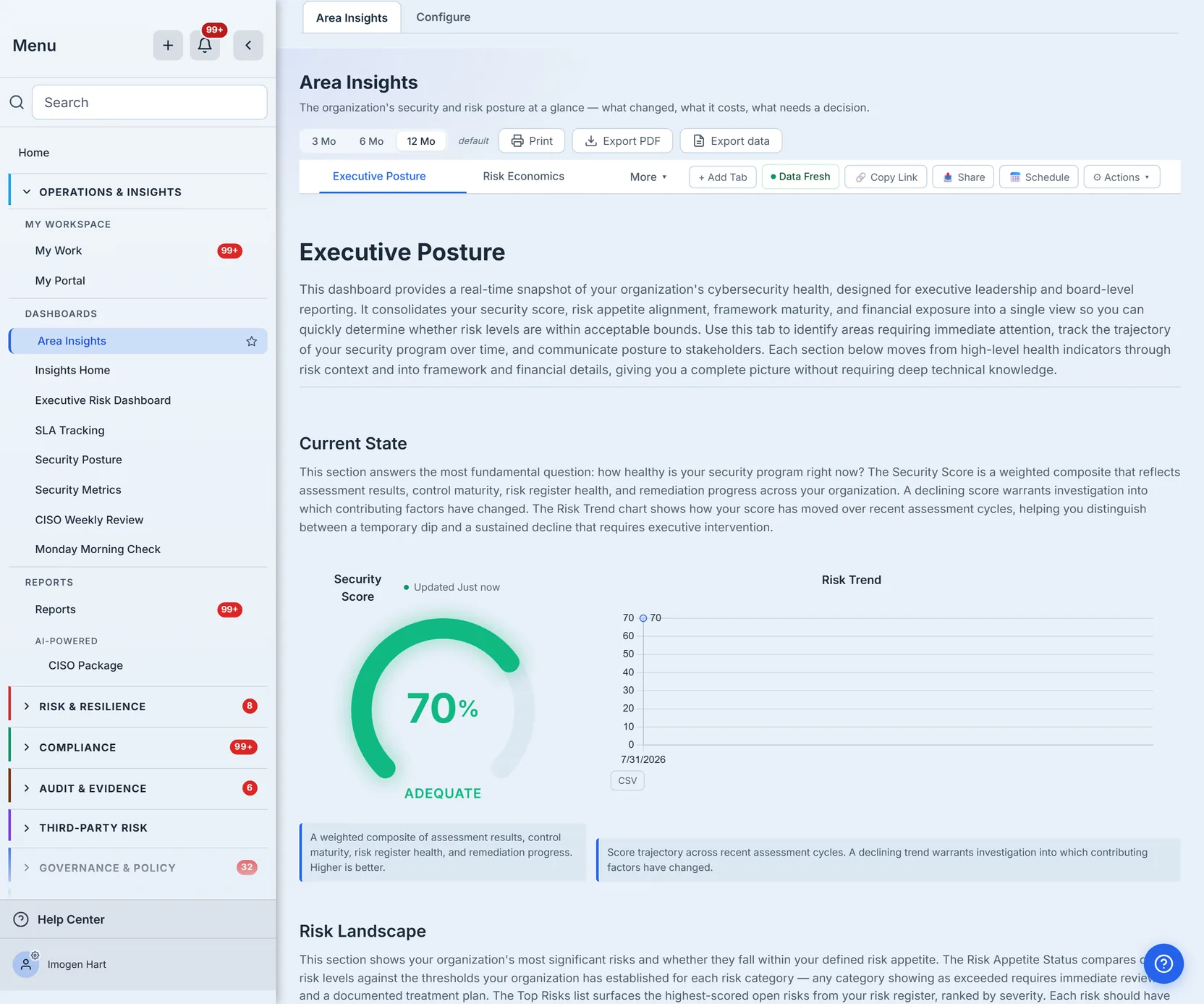
Some tabs depend on what you have licensed: Risk Economics and KRI Monitoring need the Risk module on a Professional tier, Security Rollup and Heatmaps & Distributions need the Risk module. A tab you cannot open is not rendered greyed out — it is not built into your tab bar at all.
Step 2 — Add a tab from the Page Library
Click + Add Tab. The Page Library opens: every page template your organization can use, grouped by category, each row showing the page’s description, a scope tag (All Scopes, Enterprise, or Linked Account) and its widget count. There is a search box, and — if your organization has enterprise access and more than one account — All / Enterprise / Linked Account filter buttons.
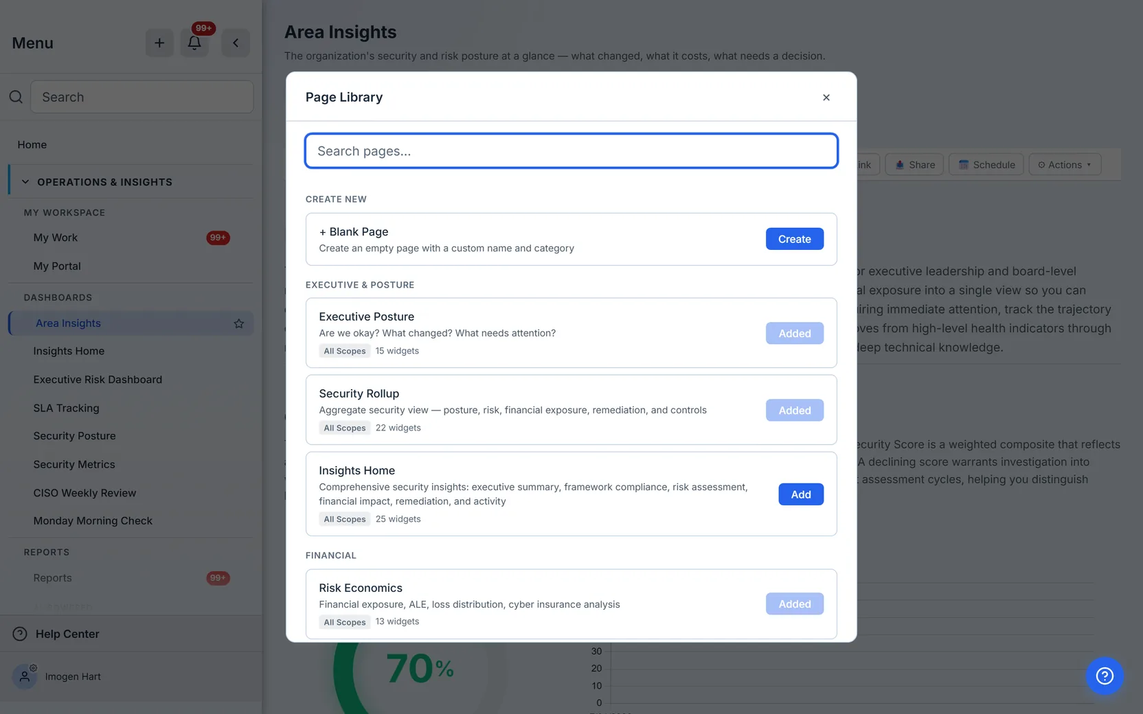
Add puts the page on your tab bar; a page already there reads Added and is disabled, and one you previously hid reads Restore. At the top, Create New → + Blank Page starts an empty page with a name and category of your choosing, which you then fill with individual widgets.
That is the important distinction. You compose a dashboard out of pages; the widgets inside a stock page arrive as a set the template author chose. Adding and removing individual widgets is possible — see the next step — but the unit you work in is the tab.
Step 3 — Tune the page: the Actions menu
⚙ Actions ▾ is where the page you are looking at gets adjusted. The display settings in it are stored against your user, not the organization’s:
- ✎ Customize Page — fork the stock page into your own copy of it.
- Widget Style — a Highlight empty widgets checkbox, and a With card frames / Without card frames pair.
- ⚙ Customize page… — the modal that reads the rendered grid, so what it lists is exactly what is on screen: remove a widget, reorder the rest. Adding one needs your own copy of the page first, which is what Customize Page above is for.
- Explanations — a Show all explanations checkbox, which opens every widget’s “what am I looking at” note at once.
- Page Width — Page width or Full screen.
- 🔄 Reset View to Defaults — disabled until you have actually changed something, and it warns you first: it removes custom pages, tab reordering, pinning and hidden tabs.
- 🔗 Copy Link, 📋 Make a Copy, ⚙ Open Configure.
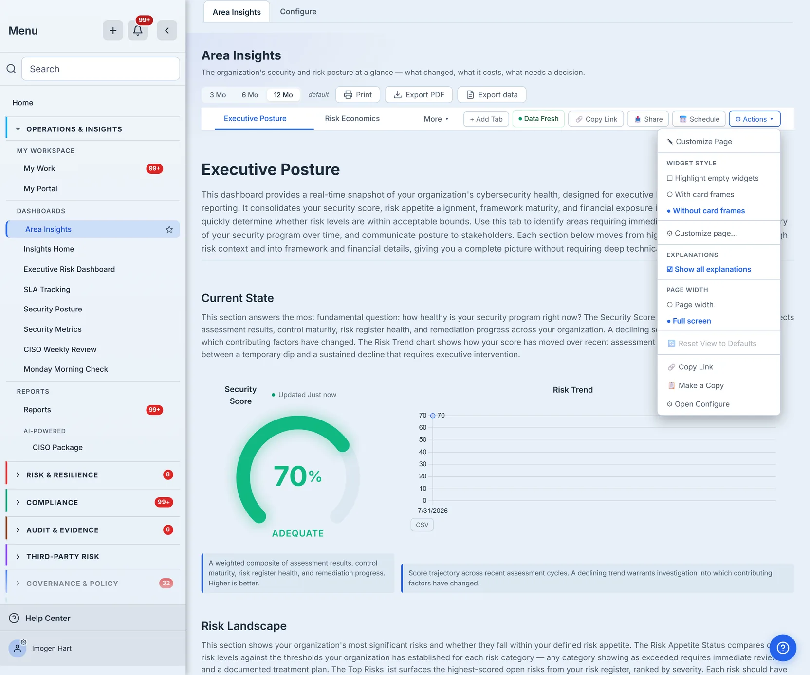
Make a Copy is the one worth knowing about. It names a new dashboard of your own, fills it with the tabs the dashboard you are standing on ships with — the stock ten, not the arrangement you have since tuned — and opens it. That is the way to get “Area Insights, but with two more tabs and one fewer”: copy it and edit the copy, rather than quietly editing the version everyone else opens.
Step 4 — Configure: the library, and the eight originals
The Configure tab is the builder. It opens on Configure Dashboards, and it is in three parts.
At the top, three panels of controls that act on whichever dashboard is currently active — Page setup (Add tab, Add widget, Customize page, Restore widget defaults, Reset tab), Appearance (the same empty-highlight, card-frame, explanation and page-width switches the Actions menu carries) and Share and maintain (Copy link, Share, Schedule, Setup checklist, Make a copy, Reset dashboard). Each button returns you to the dashboard you came from with that action already running — they call the same code the Actions menu calls, so nothing here is a second implementation of it. The overlap is deliberate but it is not total: Add widget, Restore widget defaults, Reset tab, Setup checklist and Reset dashboard live only here.
Then My dashboards: every dashboard you have built or that somebody shared with the org, each labelled Shared or Private, with its tab count. Open is always there; if you are allowed to edit it you also get Edit tabs, Rename, Duplicate, Delete, and Share with org — which reads Make private on one that is already shared. Build nothing and the section says so: No custom dashboards yet. Create one from the library below.
Then Dashboard and page library. Starting points leads: the eight original role dashboards — Area Insights, CISO, CRO, Security Manager, Risk Manager, Auditor, Relationship Manager, Assessment Analyst — each with an Open button. Under that, every page template grouped by category, each card carrying its widget count and an Add as tab toggle. A search box and a category filter sit above them, with a count showing how much of the library the filter is leaving visible.
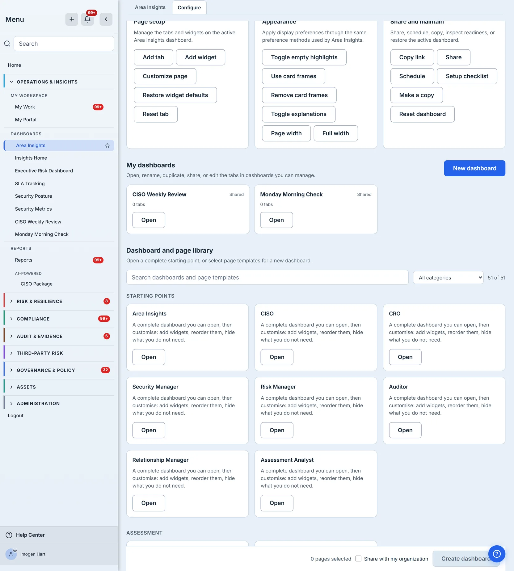
This is where the CISO view went. It was not deleted — it is a starting point you open, and /app/views/ciso still resolves, so an old bookmark or a link in a report export keeps working. Open it and its default tab list runs to twenty-four, licence-gated exactly the way Area Insights’ is. It leads with the same Executive Posture and Risk Economics pages Area Insights leads with, and then goes where Area Insights does not — FAIR Quantification, Threat & Scenario Lab, Controls & Gaps, Root Cause Analysis and eighteen more, over the same risks, controls and assessments Area Insights is reading.
Step 5 — Create a dashboard
Select page templates with Add as tab and the tray at the bottom counts them, alongside a Share with my organization checkbox. Create dashboard — or New dashboard at the top of My dashboards, which starts from nothing — opens the Create Custom View dialog with whatever you picked already ticked and that checkbox already carried across.
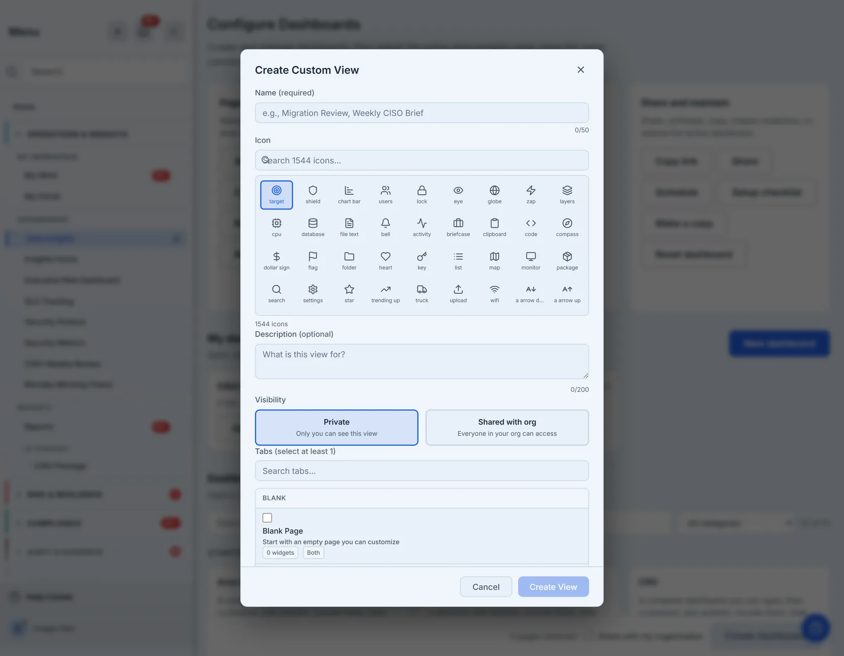
Name it, pick an icon, decide who sees it — Private or Shared with org — tick its tabs, Create View. A shared dashboard becomes a row in the Dashboards section of everybody’s sidebar, which is how one “CISO Weekly Review” becomes the whole security team’s Monday-morning screen.
How it works
- Nothing opens to a dashboard. Talarity lands every user on Home. Area Insights is somewhere you go, and there is no per-user role deciding which dashboard that is — every one of them is available to every user, gated only by your organization’s group settings and what you have licensed.
- Your tuning is yours. Tab order, which tabs are pinned, which you hid, and any pages you customized are stored as your preferences against the stock template. Reset throws them away and the stock template comes back. Nothing you do to a built-in dashboard changes what a colleague sees.
- The widget counts are derived, not written down. Each count is computed from the same branch the renderer takes, so a page whose layout changes cannot leave a stale number on its library card. The authored figures used to drift — one page claimed 11 and rendered 15.
- A dashboard you build has an owner and a visibility. Private dashboards are yours alone. A shared one is editable by its creator and by org admins, and openable by everyone. Both are listed under My dashboards with which one they are stated on the card.
- The retired dashboards still resolve. Every one of the eight has its own URL and still answers on it. Retiring them from the sidebar removed a destination, not a page.
Where it ends
🔗 Copy Link hands a colleague the exact state you are looking at — the dashboard, the tab, the scope and the time range all travel in the URL. It is an internal link: whoever opens it still has to log in and still sees only what their own permissions allow.
📤 Share is the different act. It emails named people a read-only link, and it makes you choose what that link carries: Summary only — the charts and figures, with figures that do not open — or Summary and the records behind it, which lets the recipient click through to the individual rows, names and dates. That choice is enforced on the server, not just in the link, so a recipient given the summary cannot open a record by editing the URL. Access expires, and you pick the window.
One limit worth knowing before you send: a shared dashboard opens for people who hold a full account on your organization. Recipients outside it arrive as guest accounts, and a guest-account view of a dashboard does not exist yet — Talarity says so plainly rather than showing them an empty page. To put a dashboard in front of someone external today, export it or bring them onto the org properly.
📅 Schedule sends the dashboard on a recurring basis, starting from the dashboard rather than from the schedules screen, because this is the only place that knows which dashboard you mean.
What is not here is packaging a dashboard into a board-ready disclosure. That is its own workflow. This is about the living screen your team works from every day.
What you walk away with
- One dashboard you actually shape — ten tabs to start with, a library to add from, and no wall of role dashboards to scroll past.
- Tuning that cannot damage anyone else’s screen — every layout preference is yours, and Reset always exists.
- A dashboard worth sharing — build it once under a name, share it with the org, and hand the whole team a purpose-built screen.
Open Area Insights, hit Configure, and build the one screen you actually want to start your day on.