A product-security lead is asked one question in a dozen forms: how exposed is what we ship? The honest answer spans the whole software development lifecycle — the findings from every scanner, whether they’re being fixed inside their deadlines, which repositories carry the risk, whether the pipelines that build the code are hardened, what’s hiding in the dependency tree, and which APIs face the internet. The AppSec Dashboard (/app/appsec/dashboard) is the one screen that reads all of it at once, section by section, from the scanner output and repository metadata the program already ingests. This article walks each section: what the number means, which query feeds it, and — the part that separates a scoreboard from a lie — where the page is careful to say “unassessed” or “unknown” instead of inventing a passing grade.
Who’s involved
- Product-security / AppSec lead — owns the whole board: finding SLAs, repo posture, pipeline and supply-chain risk, API exposure.
- Engineering managers — read the repository matrix and SDLC coverage to see which teams carry unremediated risk and missing controls.
- Developers — work the findings that land in their repositories, inside the severity-based deadlines the SLA section tracks.
- Auditors — read the same posture as evidence that a secure-SDLC program actually runs, with documented, audit-logged exceptions.
What’s on the page

Eleven sections, read top to bottom: a KPI strip, findings by severity and class, remediation SLA health, the repository risk matrix, SDLC control coverage, the source-control connectors, pipeline posture, the software supply chain, API security, the findings trend, and a work list. Every one of them is a read — nothing on this page changes your data. The page says so at its foot, along with how fresh the figures are: it reads live behind a short cache and refetches when you come back to the tab, so there is no Refresh button to remember.
The header carries the one thing that leaves the page: Export auditor package generates a PDF of this same posture. It is deliberately the same handler the Repositories register uses rather than a second export written for the dashboard, which is why the PDF and the screen cannot disagree about a number — both are assembled from the handler modules this page already calls. It carries two things a plain CSV of the rollup would have had to re-derive: the linked-account scope statement, printed before any figure it qualifies, and the scan-coverage caveat that tells a never-scanned repository apart from a clean one. The export is audit-logged. It needs permission to manage source control, so a read-only reader gets a refusal rather than a file — the same gating the register applies.
First, check whose software you are looking at
Before reading a single number, read the band directly under the page header. If your organisation has linked accounts — subsidiaries, acquired companies, separately governed business units — your access may be narrowed to some of them, and this page will say so there rather than leaving you to infer it.
This matters more here than anywhere else in the module. Every other AppSec page is a list, and a list that is short gives you something to notice. A rollup does not: a KPI strip and five posture grades read as “the organisation’s application security” whether they cover nine repositories or ninety. A reader who does not know their view is partial will carry a confident, wrong number into a board meeting.
So the band is not decoration, and its absence is information too — nothing is painted when your view is unrestricted. If it is there, every figure below it means “of the accounts you can see”, and the honest sentence to put in front of an executive is the one that names them. Repository, pipeline, finding, SBOM and API data all narrow this way; product advisories deliberately do not, because an advisory is about something you ship rather than about one subsidiary’s code.
The KPI hero

Four cards, each a question an executive asks. Active Findings counts everything open and in-progress across every scanner class. When the register is empty and no scanner output has ever been ingested, it does not print a reassuring zero: it reads Not scanned, with a subtitle saying findings are unknown rather than absent. Both halves of that condition matter — an organisation with hand-entered findings and no scans has a real count to show, and gets one. The distinction is the single most important thing this dashboard does: an empty register and a clean one look identical on every tool that reports a count, and only one of them means you are safe. When findings do exist, the card also names how many the scanner left unrated, because those carry no deadline until someone rates them.
Critical & High pulls the highest-severity open findings forward and turns red when there are any. It is the one card on the strip that does not open a list, and it says so on its own face: “each opens from the severity legend below.” The reason is worth internalising, because it is the rule the whole page is built on — a figure opens the set it counted, never a superset. This card counts two severities; the findings register filters severity one value at a time, so there is no single link that lands on exactly these. Sending you to the unfiltered active register instead would mean clicking a 5 and arriving at a list of 8. The page declines, and points at the two severity rows that each do open correctly.
SLA Breached counts findings already past their remediation deadline, with a subtitle for how many more are approaching one. Active Repositories counts the repos under management; its subtitle leads with how many have no scanner results — what a scan would find there is unknown, not zero — and falls back to how many are still unclassified, because you can’t hold a repo to a production standard until you’ve said it’s production. Note the care in that wording: it does not say “never scanned”, because a repository can hold a hand-recorded finding and still have no scanner output, and the matrix two sections down would have contradicted the stronger claim on the same screen.
Findings by severity and class
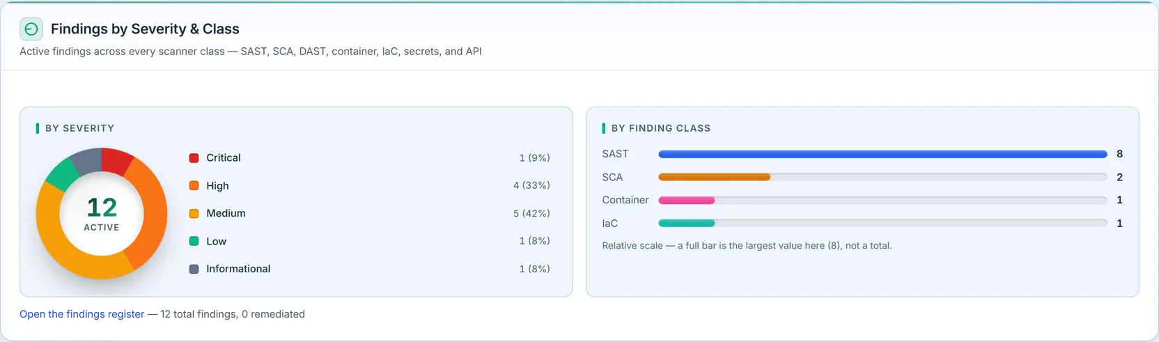
Two cuts of the same finding set. The severity donut shows the open distribution from Critical down to Informational — plus a sixth band, Unrated, for findings whose scanner reported no severity and supplied no CVSS score to derive one. It is painted a colour no severity uses, because an unrated finding is not a low-severity one: it is one nobody has rated yet, and it carries no remediation deadline until someone does.
The percentages are apportioned rather than rounded one at a time, so that two findings with the same count always print the same share — which is the readable property, and it is not free. Here three severities hold one finding each and all three print 12%, and the column therefore adds to 99 rather than 100: with eight findings, a share of one is 12.5%, and the leftover point cannot be given to one of three identical rows without printing 13% beside 12% for the same count. The page takes the honest tie over the tidy total.
The by-class bars break the same findings down by how they were discovered. The closed set is eight classes — SAST, SCA, DAST, container, IaC, secrets, API and AI red-team — and the section names all eight in its own subtitle rather than leaving the list to a caption that can drift; only the classes actually present get a bar. The bars are scaled to the largest value present, not to a total, and the section says so — a full bar means “the biggest category here,” not “100% of findings.” The footer names the honest total, and it is a different total from the donut’s: 11 findings on record, 0 remediated, against 8 active in the centre of the chart. The gap is the three findings dismissed as false positives, which the next section counts by name.
Remediation SLA health
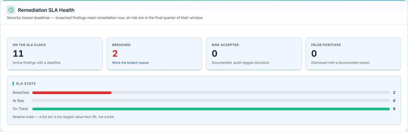
This is where a finding count becomes a remediation program. Deadlines are severity-based: the more severe the finding, the shorter the clock. On the SLA clock is the count of active findings with a deadline; Breached are past it and need work now; At Risk are in the final quarter of their window — computed from the actual due date and first-seen date, not a guess.
The deadline and the state are stored differently, and the difference is the section’s whole claim to being live. The deadline is stamped from the finding’s rating, and re-derived only when that rating moves up: a finding re-rated from medium to critical inherits the shorter clock, and the re-derivation can only tighten a deadline, never push one further away. The state is re-derived on every query from that deadline against the clock, so it is not a column anybody has to remember to update. What does not move a deadline already running is a change to your own targets — tightening the critical SLA changes what future findings get and leaves the ones already on the clock where they are.
The two right-hand tiles are the honesty of the section: Risk Accepted counts findings a human formally decided to accept, described as “documented, audit-logged decisions,” and False Positives counts findings dismissed with a recorded reason. Neither is swept into “remediated” — an accepted risk is a decision on the record, not a fixed bug, and the dashboard keeps them distinct.
The four-state bar accounts for every active finding, and the fourth state is the one worth reading twice. No deadline holds the findings no severity target applies to — the informational ones and the ones the scanner never rated. They are not on track and they are not failing; they are outside the programme until somebody rates them. A three-state bar would have had to hide them or file them under a state they are not in. The footnote under the bar also tells you which bars lead anywhere: the findings register has a breach queue, so the breached bar has a page, while at-risk and on-track have none. Review the SLA targets at the foot of the section opens the per-severity deadlines that decide what counts as breached.
Repository risk matrix
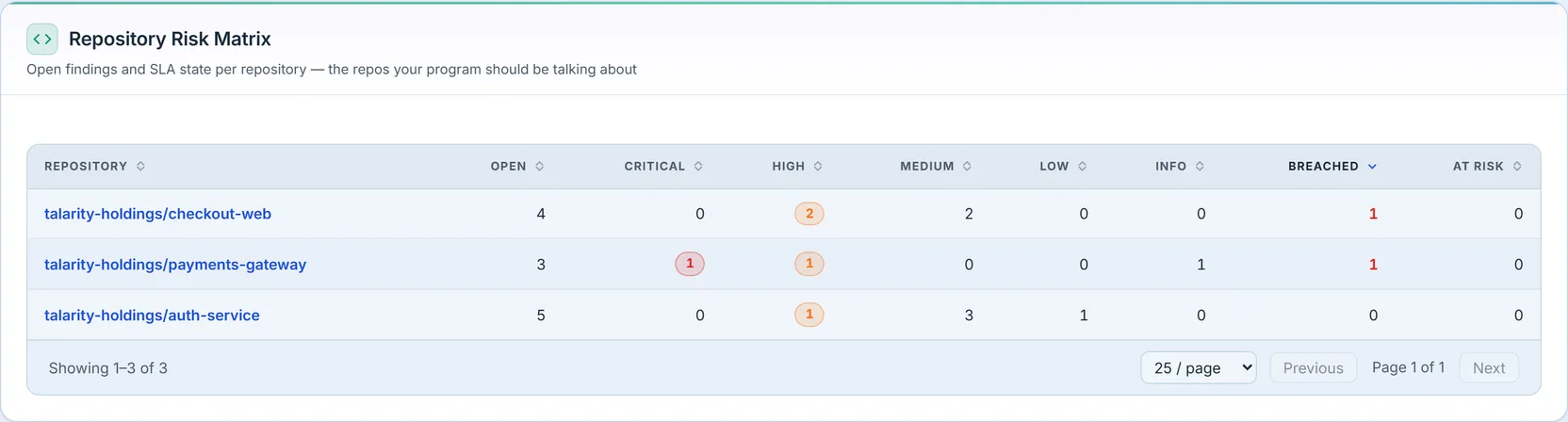
The matrix answers “which repos should we be talking about?” — and it answers it about the repositories that have something to talk about. It lists only repositories carrying at least one open finding, which is why a three-row table can sit below a KPI reading eight active repositories without either being wrong. The section says so in its own description rather than leaving you to reconcile the two numbers; the repositories with nothing open are in the register, not here. A separate row groups the findings tied to no repository at all, and it is ordered with everything else rather than pinned to the bottom — which is why it leads the table in the figure above, holding five of the eight open findings.
Rows are sorted by breached findings then total open, so the repos that most need attention sit at the top, and the active sort is declared in the header rather than implied. Every severity cell carries a badge when it is non-zero, and every non-zero cell is a link to exactly those findings — the same rule as the severity legend, one cell at a time. The severity columns include Unrated, and that column is what makes the row add up: an unrated finding counts toward the row’s total like any other, so without a column of its own the per-severity numbers would silently fail to reconcile with the Open count beside them. A repository with no name resolves to an honest “Unknown repository” rather than a raw identifier — the matrix never leaks a database id into a column a person reads.
SDLC control coverage
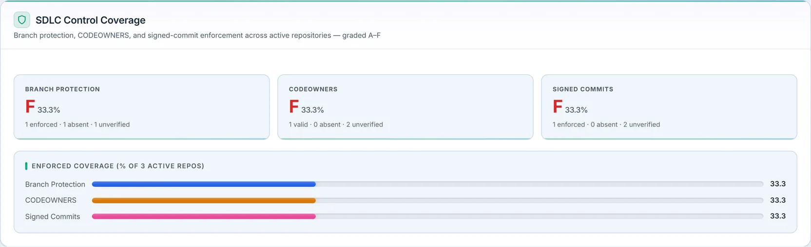
Three controls, graded across the active repositories: branch protection, CODEOWNERS, and signed commits. Each card shows the percentage of active repos where the control is enforced, the letter grade that maps to it, and the breakdown underneath — and the breakdown has more states than the grade does. Each control carries its own vocabulary, which is why the three cards do not read alike. Branch protection is enforced, partial, absent or unverified. CODEOWNERS is valid, invalid, absent or unverified — and invalid, a CODEOWNERS file that exists and does not parse, is the state most worth seeing, because it looks like coverage from every angle except the one that matters. Signed commits has no partial state at all. In every case only the first state counts toward the percentage: partial protection is not credited, an unparseable CODEOWNERS file is not coverage, and an unverified repository counts against you rather than being dropped from the denominator.
Read unverified precisely, because it is narrower than it looks: it counts repositories whose controls have never been attested, not ones whose attestation has aged out. These grades read the state on record and do not expire it, so a repository attested long ago still counts at full weight. What your attestation cadence governs is the chasing — the reminders and work items that go out asking for a re-attestation — and Review the attestation cadence opens that interval.
Here’s the design detail worth internalizing: when there are no active repositories to measure, these grades show a dash — not an “F”, not “0%”. A fabricated failing grade on an empty program is a lie the dashboard refuses to tell; the honest state is “nothing to measure yet,” shown as an empty prompt. When repos do exist and a control genuinely isn’t enforced on any of them, that’s a real zero and a real F — the dash is reserved strictly for “there is nothing here to grade.”
Source control connectors
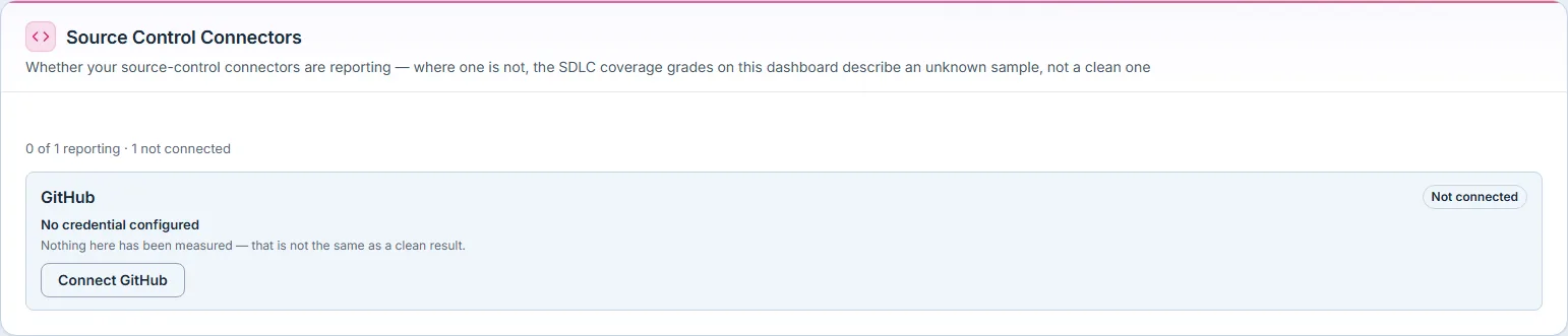
This section sits directly under the grades, and it is the one that tells you how much the grades are worth. Branch protection, CODEOWNERS and signed-commit state arrive either from a connected source-control provider or from your team’s own attestations. If the connector is not reporting, the coverage percentages above describe what has been attested, which is a sample of unknown completeness — not a clean measurement of every repository.
So the section states its own status in a sentence rather than a green tick: “Nothing here has been measured — that is not the same as a clean result.” It is the same refusal the KPI strip makes about never-scanned repositories, applied one layer up: silence about a control is not evidence the control is in place. A dashboard that dropped this section would show the same grades and mean something weaker, and nothing on screen would say so.
Pipeline posture
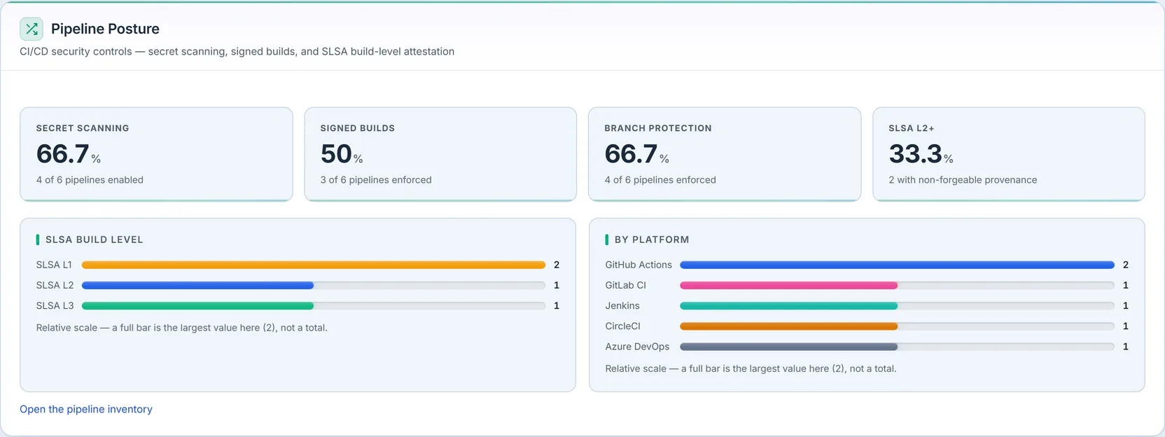
The pipelines that build and ship the code are their own attack surface. This section grades them on secret-scanning coverage, signed builds, branch protection, and the share reaching SLSA Level 2+ — the level at which the SLSA specification calls build provenance non-forgeable. Read that as the level a pipeline has been attested at rather than as a property this page has checked: as the section’s closing line says, these states are recorded by your team, and the supply-chain section below is equally plain that no signature is cryptographically verified.
Note the third card is called Pipeline Branch Protection. The SDLC section above grades branch protection across repositories; this one counts pipelines, over a different denominator. Two cards with one name would have looked like a contradiction on a single screen, and the longer label is the fix.
The SLSA build-level bars are a fixed ordinal scale, so they show every rung from L0 to L3 including the empty ones — “nothing left at L0, nothing yet at L3” are the two readings a maturity scale exists to give, and dropping a zero rung would delete half of them. A fifth, hatched row counts pipelines with no level attested at all, which is what makes the bars account for every pipeline the cards divide by. The by-platform bars work the other way on purpose: a platform is an open-ended vocabulary rather than a scale, so only the platforms actually in use get a bar — nobody needs “CircleCI 0” on a screen. Selecting a platform bar opens the pipelines page filtered to that platform.
And the closing line is the section’s own disclosure: these control states are recorded by your team or imported from your inventory — Talarity does not read them live from your CI provider. Each percentage therefore reflects what has been attested, and a control nobody has attested counts against you rather than being left out of the sum.
Which numbers open, and why the others don’t
Every chart on this page carries a footnote saying whether its bars lead anywhere — and when they don’t, why not. The SLSA build-level bars don’t open a list because the pipelines page filters by platform, branch protection and repository, but not by SLSA level. The VEX coverage segments don’t, because the SBOM inventory lists documents and components rather than vulnerabilities. The OWASP posture bars don’t, because those ten fixed risks are a matrix rather than a register. The weekly trend points don’t, because the findings page filters by severity, class, status and repository, but not by the week a finding arrived or closed.
The ones that do open say so in the same breath. The severity donut, the by-class bars and the by-platform bars each land you on a register already narrowed to the slice you clicked. The SLA-state bars are the interesting middle case: the findings page has a breach queue, so the breached bar has a page of its own, while at-risk and on-track do not — and the footnote tells you that rather than leaving you to discover it by clicking.
Software supply chain
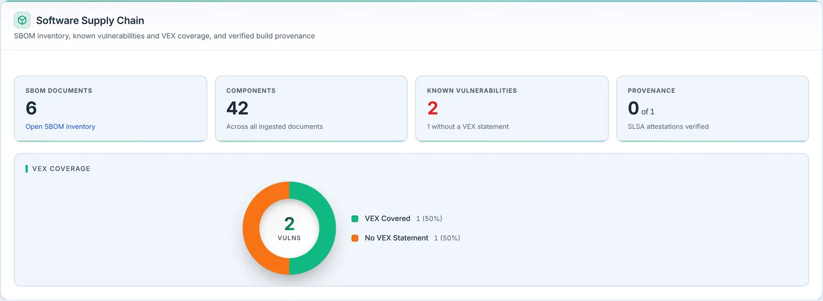
Every ingested SBOM (software bill of materials) rolls up here: how many documents, how many components across them, how many carry vulnerabilities, and how much of the build has SLSA provenance recorded.
Two of those labels were chosen to refuse a stronger claim than the product can make, and both are worth reading slowly.
Correlated Vulnerabilities, not “known vulnerabilities.” The figure counts component-and-CVE pairs matched from your own findings register against your ingested SBOMs. It is not a lookup against a public vulnerability database, so it cannot tell you about a CVE nobody has recorded — and the card says that on its face rather than letting a low number read as good news. The second subtitle is the other half of the same honesty: it names how many ingested documents have not been correlated yet, so any count here is partial by an amount the card states.
Provenance recorded, not “verified.” Recording provenance stores the attestation, and when you supply the artifact digest alongside it, checks that the subject digest matches — a mismatch fails loudly. Full DSSE signature verification needs your builders’ public keys and is not enabled. The two unverified states are not the same state: an attestation carrying no DSSE signature at all is unsigned, while one whose signature is present but has not been cryptographically checked is structural only — and the card prints both counts separately rather than netting them into one reassuring number. Neither is quietly counted as verified.
The VEX-coverage donut is the section’s sharp edge. VEX — a Vulnerability Exploitability eXchange statement — is how a team records “yes this component has CVE-X, and here’s whether it actually affects us.” The donut splits the correlated vulnerabilities into those with a VEX statement and those without. A vulnerable dependency with no VEX statement isn’t necessarily exploitable — but nobody has said so on the record, and that’s exactly the queue a supply-chain program has to work down.
API security
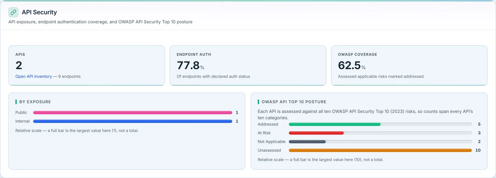
The API inventory — populated by importing OpenAPI specifications — gets the same treatment as the code. The metrics count APIs and their endpoints; the endpoint-auth card shows what share of endpoints declare authentication, and it excludes endpoints whose spec declares no security at all from the denominator rather than guessing they’re unprotected — “unknown” is not counted as “insecure.”
Two cards and the OWASP API Top 10 posture bars read from a manual attestation, in which each of the ten 2023 categories is marked Addressed, At Risk, Not Applicable, or Unassessed. The split between those two cards is the point. OWASP Risks Assessed measures how many applicable categories you have looked at at all, so an unassessed category counts against you there — silence is not a pass. Assessed → Addressed then measures how many of the ones you did assess came out addressed, and its subtitle points straight back at the first card: not overall coverage. An earlier single “coverage” percentage computed addressed over addressed-plus-at-risk, which quietly dropped unassessed categories from the denominator and could show a confident 100% to a team that had assessed one category out of ten. Each card also prints its own divisor in plain words, so the arithmetic is checkable from the screen rather than taken on trust.
The by-exposure bars separate public, partner, internal and unknown APIs — four levels, each with its own count in the figure — because a Broken Object Level Authorization finding on a public API is a different fire than the same finding on an internal tool.
Findings trend
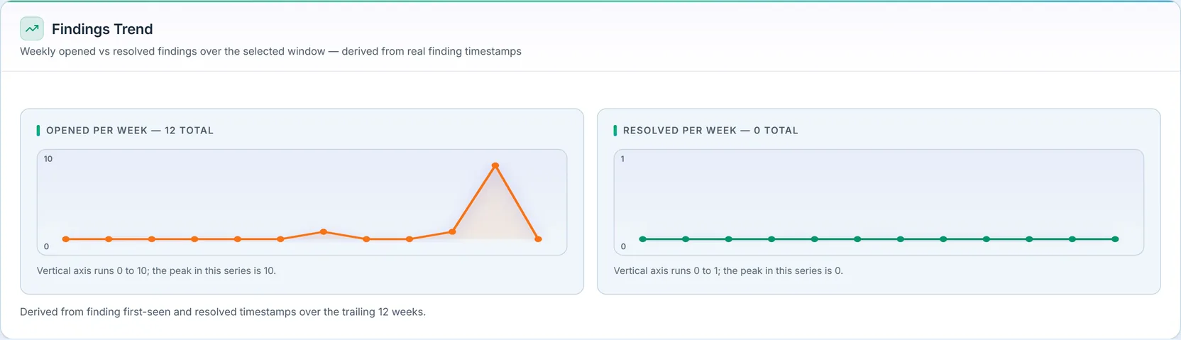
Opened versus closed findings, week by week, over a window you choose (4, 8, 12, or 26 weeks). This is the “are we winning?” view: when the opened line runs above closed for a stretch, the backlog is growing regardless of how good any single week looked.
Three details make the comparison honest, and each of them is a decision you can see on the screen.
Both charts share one vertical scale. Two independently-scaled sparklines side by side are the classic way to make a bad week look like a good one: a flat line at the top of its own axis and a flat line at the bottom of another look identical. One axis across both panels means the heights are comparable, and each panel restates the shared range and its own peak underneath so you never have to guess.
The right-hand series is “closed”, not “resolved”. A finding leaves the active register three ways — remediated, accepted as a risk, or dismissed as a false positive — and this series counts all three, because that is what the underlying timestamp records. The panel’s own footnote lists the three. It is deliberately a weaker word than the SLA section’s “remediated”, and the two sections are consistent precisely because of it: an accepted risk is still not a fixed bug, so it never appears as remediated anywhere, but it does stop being open, so it belongs in a chart about what left the queue.
The series are derived, not stored. Both are computed from the findings’ own first-seen and closed timestamps over a fixed week spine, not read from a stored weekly snapshot, and the section names the exact weeks it covers. That means a quiet week is a true zero, and the trend can’t drift out of sync with the findings it’s counting, because it is those findings, bucketed by date.
Needs attention
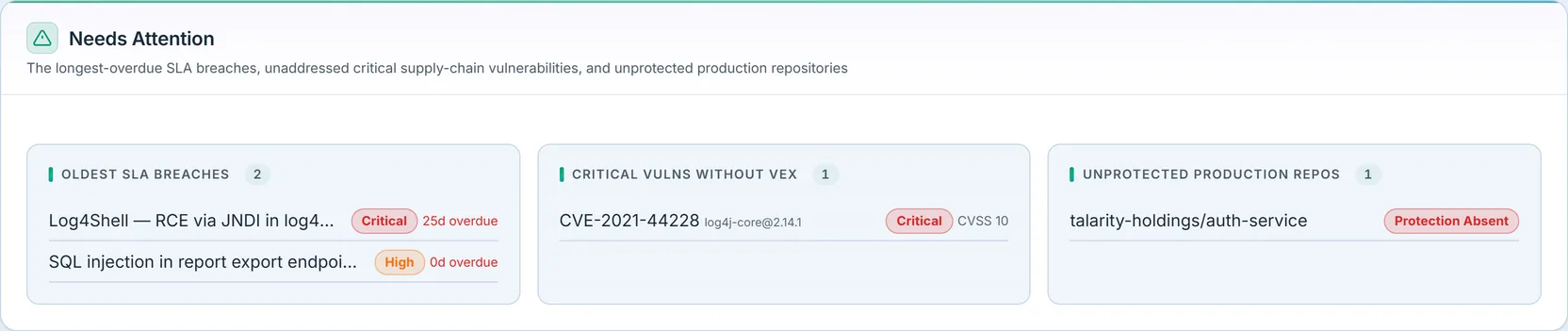
The last section is the work list, and it’s three queues at once. Oldest SLA breaches surfaces the findings that have been overdue longest, each with its repository and how many days past due, and each row opens that specific finding rather than the register it lives in. Critical vulnerabilities without a VEX statement pulls the un-VEXed critical component vulns forward by CVE — the supply-chain items nobody has yet ruled in or out. Unprotected production repositories names the repos classified production whose branch protection is absent or unverified — note that predicate, because “unverified” is in it: a repository nobody has attested is in the queue, and one with partial protection is not.
Each queue shows how many records back it when the full list is longer than the preview, so a short list is honestly short and a truncated one says so. When all three queues are empty, the section says so plainly rather than rendering three blank boxes — and it spells out all three conditions in the sentence, so an all-clear is a statement about something rather than an absence of rows. There is a fourth state underneath this one: an organisation that has never ingested a scan gets “Nothing to triage yet — and nothing has been scanned”, because an empty queue on an unscanned program is not a clean result.
Nothing here waits for you to visit
Every figure above is a read, which makes it easy to finish a section-by-section walkthrough believing the feature is this screen. It is not. The programme behind the board runs whether or not anybody opens it, and the parts that reach out are the ones that turn a dashboard into a security programme.
- Breaches escalate nightly. A scheduled job walks the findings whose deadline has passed and escalates them, with nobody on the page.
- An accepted risk can lapse. Acceptance takes an expiry date, and when it passes the finding is flipped back to open and returns to the queue. That is the deeper reason the SLA section keeps accepted risk out of “remediated”: it is a decision with a clock on it, not a closed bug.
- Attestations are chased. Your attestation cadence drives reminders for repository controls and for API posture, and raises work items against the people who own them — which is what the unverified counts above turn into.
- Three of these counts reach the sidebar badge — breached findings, unclassified repositories, and API attestations that are due — so the numbers find you before you go looking for them.
- Attestations bridge into evidence collections, so an auditor opens the attestation itself from an evidence package rather than asking you for a screenshot of this page; repositories link to related records the same way.
- The underlying records leave this page in two more directions. Global search finds a finding by its CVE id, not just by repository — so someone who arrives holding a CVE from a news story can type it and land on the record. And the findings, pipelines, API inventory, endpoints and OWASP posture are each a report-builder dataset, so the same numbers can be composed into a scheduled report instead of being read off this screen.
So when the summary below calls this an SLA programme rather than a finding count, that is what it rests on — not the tiles, but the nightly pass, the lapse, and the reminder.
What you walk away with
- A single read of SDLC exposure — findings, SLAs, repo posture, pipelines, supply chain, and APIs, from the scanner output you already ingest.
- An SLA program, not just a finding count — severity-based deadlines with breached and at-risk split out, deadlines stamped once and states re-derived live, and accepted-risk and false-positive kept honestly separate from “fixed.”
- Coverage grades that say what they are — a dash instead of a fake F when there are no repos to measure, a real F only when a control genuinely isn’t enforced, and a connector panel that says out loud when the grades describe an unknown sample. Read them as a rollup of what has been attested rather than a live reading of every repository.
- A supply chain and API surface scored on what’s assessed — correlated rather than “known” vulnerabilities, provenance recorded rather than verified, and unassessed OWASP categories visible as work instead of hidden inside a coverage percentage.
- A trend you can trust — two series on one axis, derived from the findings’ own timestamps, so a quiet week is a real zero and the chart can’t drift from the data.
- One work list of the oldest breaches, the un-ruled-out critical vulns, and the unprotected production repos — each a click from the record.
- One artifact to hand over — the auditor package PDF, built from the same handlers as the screen, carrying the scope statement and the scan-coverage caveat, and audit-logged when you generate it.
The registers behind these numbers each have their own walkthroughs in the AppSec cluster: managing AppSec findings, pipeline security posture, and the software supply chain and SBOM surface. This dashboard is where all of it becomes a program you can report on in one read.