Most GRC problems do not announce themselves. A risk owner leaves the company and their twenty-two risks quietly stop being reviewed. An asset is imported without a custodian. A control was tested eleven months ago, which felt recent at the time. Nothing errors, nothing turns red, and every dashboard keeps rendering — because a dashboard cannot tell the difference between no risks are overdue and nobody has looked.
That difference is what an auditor finds. It is also, awkwardly, what your board reporting is built on: a residual-risk number computed from a register nobody has reviewed since February is not wrong so much as unfounded.
Data Quality is Talarity’s answer. It scores your own records — not a feed, not a third-party signal — across roughly fifteen dimensions covering ownership coverage, review currency, completeness, control-testing recency, attestation completeness and evidence freshness. Each dimension is a plain question with a denominator, each shortfall becomes a finding you can work, and the whole thing is tracked over time so you can see whether the programme is getting better or just getting older.
Who’s involved
- GRC lead — owns the score, sets what “good” means for this organisation, and reports the trend.
- Data owner — the person who actually assigns the missing custodian or reviews the stale risk.
- Auditor — asks how you know your register is current. This page is the answer, with a date on it.
What’s on the page
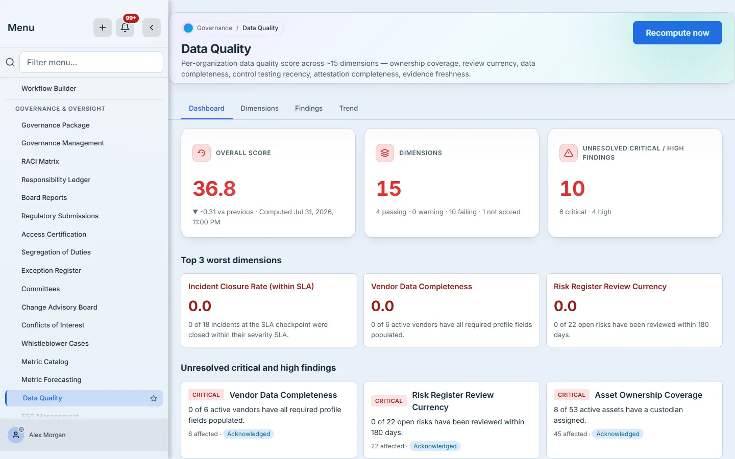
Open Data Quality (under Governance & Policy → Metrics & Programs, at /app/grc/data-quality). One surface, four tabs, all cuts of the same computation:
- Dashboard — the headline score, the dimension breakdown, the three worst dimensions, the unresolved critical and high findings, and a per-dimension table.
- Dimensions — the fifteen dimensions themselves: what each weighs, what counts as excellent or concerning, and the per-organisation overrides you can set.
- Findings — every dimension that fell below its alert threshold, as a workable item with a status.
- Trend — the score over time, because one reading is not a direction.
Step 1 — Read the score
Three cards carry the headline. The first is the score itself — a weighted roll-up of every dimension that could be scored, with the change since the previous snapshot and the timestamp it was computed.
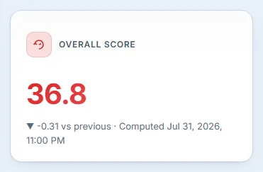
The delta matters more than the absolute number. A 36.8 in an organisation that is three weeks into onboarding means something entirely different from a 36.8 that was 74 last quarter. The timestamp matters for the same reason: this is a snapshot, and you should know how old it is before you quote it.
The second card is the one worth reading carefully.
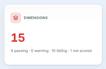
Fifteen dimensions, and the breakdown accounts for all fifteen: four passing, none in warning, ten failing — and one not scored. That last category is the one people miss. A not-scored dimension is not a zero and not a pass; it is a dimension Talarity could not compute at all, because the underlying records do not exist yet or no measurement is registered for it. It is excluded from the weighted score entirely, which is the honest treatment — averaging in a zero for something you have not measured would understate your posture, and averaging in a 100 would flatter it. But it does mean part of the picture is blank, and the card says so rather than letting four plus zero plus ten quietly fail to equal fifteen.
Step 2 — Find the worst of it

Each card gives the score and, more usefully, the sentence behind it: 0 of 6 active vendors have all required profile fields populated. That is a denominator, not an adjective. You can act on “0 of 6” in a way you cannot act on “poor”.
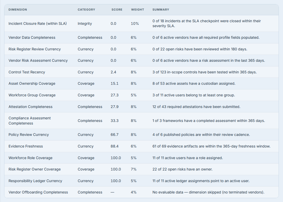
Below the worst three, the per-dimension table lists all fifteen dimensions worst-first with score, weight and summary — including the ones that are fine, which is how you tell a broad problem from a narrow one. The not-scored dimension sits at the bottom and says why it could not be measured.
Step 3 — Decide what “good” means here
The platform ships defaults, but a data-quality target is a policy decision, not a constant. A managed-services firm with three hundred client assets has a different reasonable expectation for custodian coverage than a twelve-person startup. The Dimensions tab is where you say so.
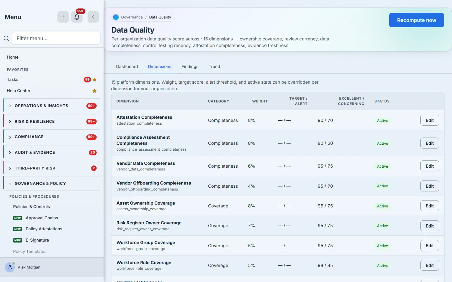
Each row shows the dimension’s weight (how much it contributes to the overall score), your target / alert thresholds, and the platform’s excellent / concerning bounds. Edit opens the per-dimension editor.
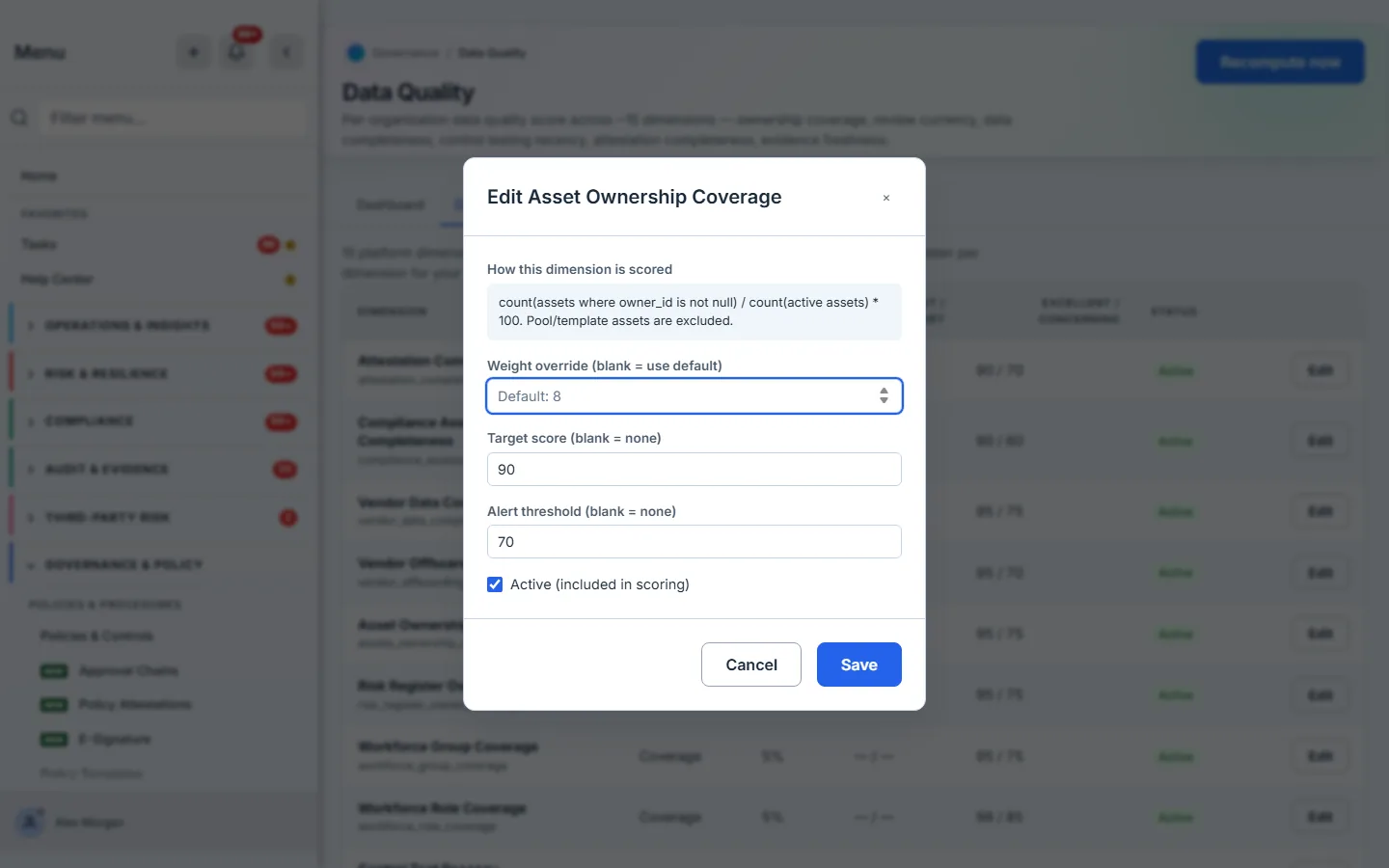
The first thing in the editor is the formula in plain terms — count(assets where owner_id is not null) / count(active assets) * 100. Pool/template assets are excluded. You cannot pick a sensible target without knowing what is being counted, and the exclusions are usually where the surprise lives.
Four things are yours to set:
- Weight override — leave it blank to follow the platform default. Blank genuinely means “follow the default”, so this dimension keeps tracking the platform’s judgement as it changes.
- Target score — what you are aiming at.
- Alert threshold — the line that generates a finding. This is the one that does work.
- Active — whether the dimension counts toward your score at all. Switch off a dimension that does not apply to your organisation rather than carrying it as a permanent failure.
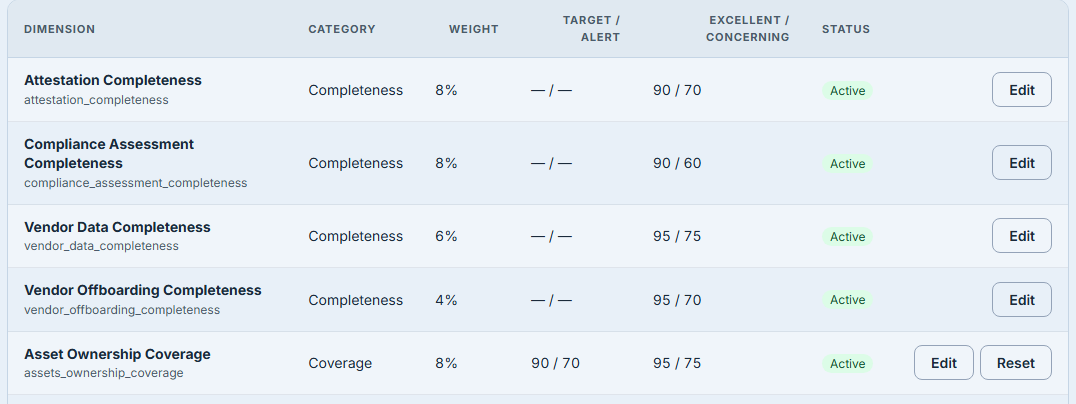
Once anything is overridden, the row gains a Reset, which returns that dimension to platform defaults. The weight column still reads its plain value here, because only the thresholds were changed — the badge tracks the weight specifically, not “something was configured”.
Step 4 — Work the findings
A dimension that falls to or below its alert threshold becomes a finding. This is the step that turns a score into work.
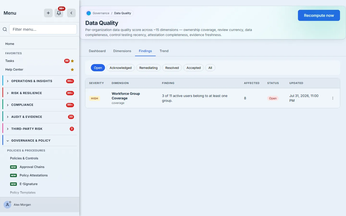
Every finding carries the same denominator the dimension did — 8 of 53 active assets have a custodian assigned, with 45 affected — plus that affected count, which is the number of records you would have to touch to close it. That number is your estimate of the work.
Note that this filter is narrower than the dashboard card. Open here means exactly that: nobody has picked the finding up yet. The dashboard’s unresolved count also includes the ones already acknowledged or being remediated, because those are still outstanding work even though somebody has them. Expect the two numbers to differ once your team starts working the list — that divergence is the team making progress.

Findings move through a small lifecycle, reached from the actions menu on each row.
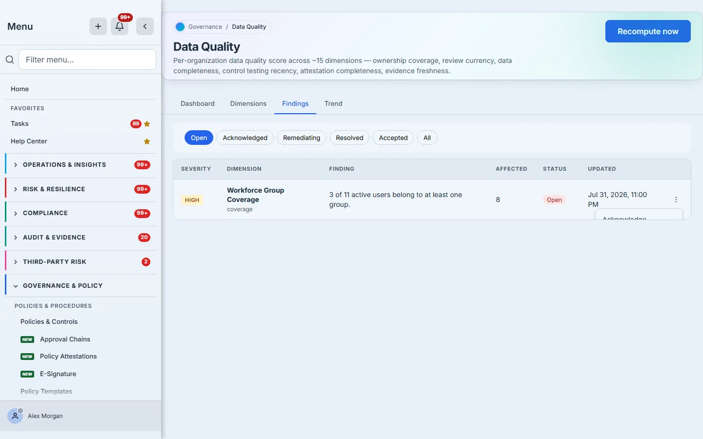
- Acknowledge — someone has seen it. It stops being unread without pretending it is fixed.
- Mark remediating — work is underway.
- Mark resolved — the underlying records were fixed.
- Accept the risk — you are choosing to live with it, and Talarity asks for a reason before it will record that. The reason is the point: an accepted gap with no rationale is indistinguishable from a gap nobody noticed, and the two look very different in an audit.
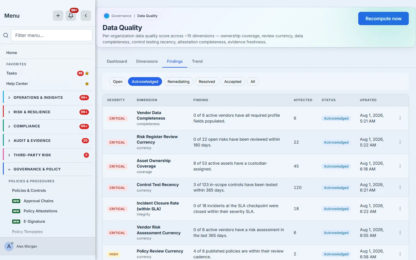
Note that Mark resolved does not fix your data — it records that you believe it is fixed. The next recompute is what confirms it, because the dimension is measured again from the records themselves. If the score does not move, it was not fixed.
Step 5 — Watch the line, not the reading
One score is a reading. The programme is the direction.
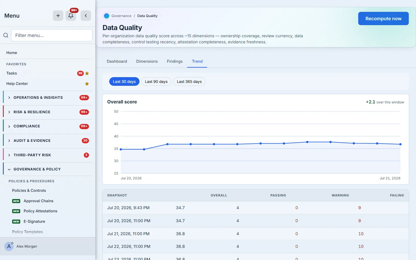
The chart plots every snapshot inside the selected window — thirty, ninety or three hundred and sixty-five days — with the net change across those readings called out. The window is a filter, not a promise: if the organisation has only been scored for a fortnight, that fortnight is what the thirty-day view shows.
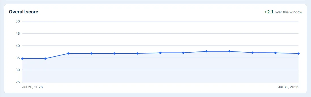
The axis is worth a note. It is scaled to the data with a floor on how narrow it will go, so a two-point move renders as a two-point move rather than filling the plot and looking like a collapse. If you want the exact numbers, the table beneath the chart carries every snapshot with its passing, warning and failing counts.
Recompute now, in the page header, takes a fresh snapshot on demand. Use it after a remediation push — but bear in mind each recompute is a point on this line, so the line is a record of your programme, not a scratchpad.
The cadence that works
- Weekly — glance at the score and the delta. You are looking for movement, not a number.
- When a finding opens — acknowledge it within a few days. An open finding nobody has acknowledged is the same failure mode the page exists to catch, one level up.
- Quarterly — revisit the Dimensions tab. Targets set during onboarding are usually wrong six months later, and a dimension that is permanently failing because it does not apply to you should be switched off, not endured.
- Before any board or audit cycle — recompute, then read the trend. “Our register is current” is a claim; “here is the score, here is the date it was computed, and here is the line for the last ninety days” is evidence.
What you walk away with
A number you can defend, and — more importantly — the sentence underneath it. Fifteen dimensions each measured against your own records, every shortfall carrying its denominator and its affected count, a lifecycle for working them, and a line showing whether the programme is improving. The failure this page prevents is not a control failing. It is nobody noticing that the records the controls are reported from went quietly out of date.