Every metrics program eventually gets the question: “where is this number heading?” Most tools answer it with a trend line drawn through whatever points exist — three data points, a confident curve, no caveats. That is exactly the kind of chart that falls apart the moment a board member or an auditor asks “how do you know?”
Talarity’s Metric Forecasting page (/app/grc/forecasting) takes the opposite position. Every projection is computed by a named statistical method with a published minimum of real history; a metric that hasn’t earned a forecast gets an honest “insufficient data” answer with the exact shortage spelled out; and every forecast — including the failed and insufficient ones — is a permanent record you can backtest against what actually happened. No framework clause requires you to forecast your metrics. What the page supports is the part frameworks do care about: a measurement program whose numbers can be interrogated.
Who’s involved
- Metric owner — owns the number in the Metric Catalog and the snapshot cadence that feeds it. More history means better forecasts; the page tells them exactly how much more.
- Governance lead / program analyst — generates projections, compares methods, and reads the confidence tiers before putting a forecast in front of leadership.
- Forecast administrator — runs backtests that score each method against held-out history, so method choice is evidence, not taste.
- Auditor — pulls the trail: every generate and backtest writes an audit event, and every forecast row records its method, its inputs, and its accuracy.
What’s on the page
Five tabs, each with one job:
- Dashboard — KPI roll-up of the last 30 days, method accuracy from recent backtests, and a status breakdown where every count opens the exact rows it counted.
- Forecasts — generate a projection for any catalog metric, then read the curve (and its confidence band, when the history has earned one).
- Method Comparison — run every method on the same metric side by side before committing to one.
- Recurring Work — completed work items that genuinely recur, with an honest one-step projection of the next occurrence.
- Backtests — hold back recent history, forecast from the earlier slice, and score the prediction against what really happened.
The tabs are deep-linkable — /app/grc/forecasting?tab=backtests lands your colleague exactly where you meant.
Step 1 — Feed it history, not hope
Forecasts are computed from metric snapshots — the timestamped values your metrics record in the Metric Catalog, whether by scheduled compute jobs or ad-hoc entry. This page never invents a point: if the catalog holds 19 snapshots, the model sees 19 snapshots.
Each method publishes its price of admission, right in the picker:
- Linear regression — needs 30 points; best for steady trends; horizons up to 90 days.
- Exponential smoothing (Holt) — needs 14 points; adapts to recent level and trend shifts; horizons up to 60 days.
- Seasonal naive (weekly) — needs 14 points; repeats the observed weekly pattern; horizons up to 35 days.
Behind the scenes, only numeric snapshot values feed the models, and the horizon you request is capped per method at the range it can defensibly serve — asking linear regression for a 200-day projection is refused, not humoured.
Step 2 — Generate a forecast
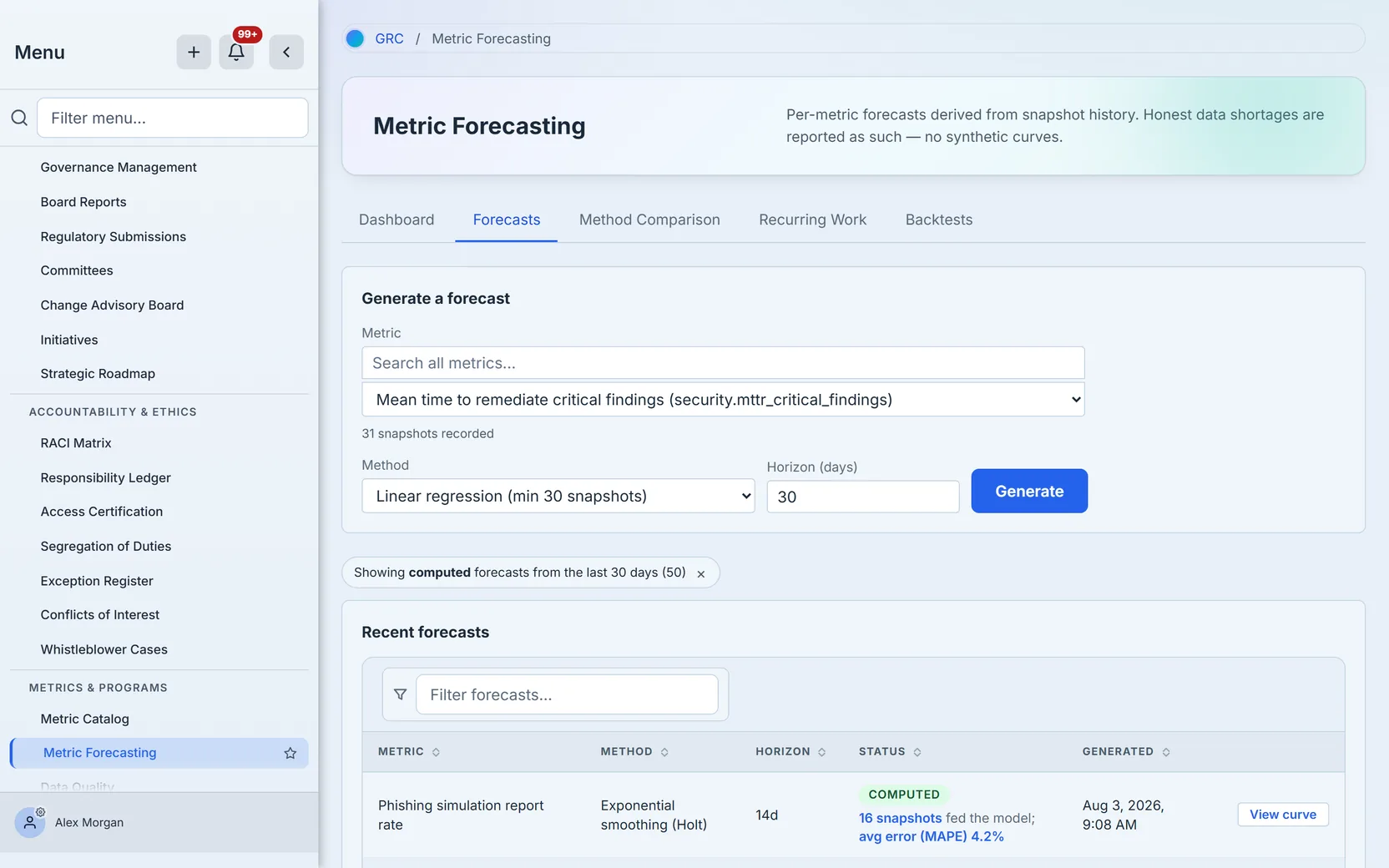
On the Forecasts tab, pick a metric from the catalog picker (grouped by category, searchable server-side once your catalog grows past a screenful), choose a method, set the horizon in days, and click Generate.
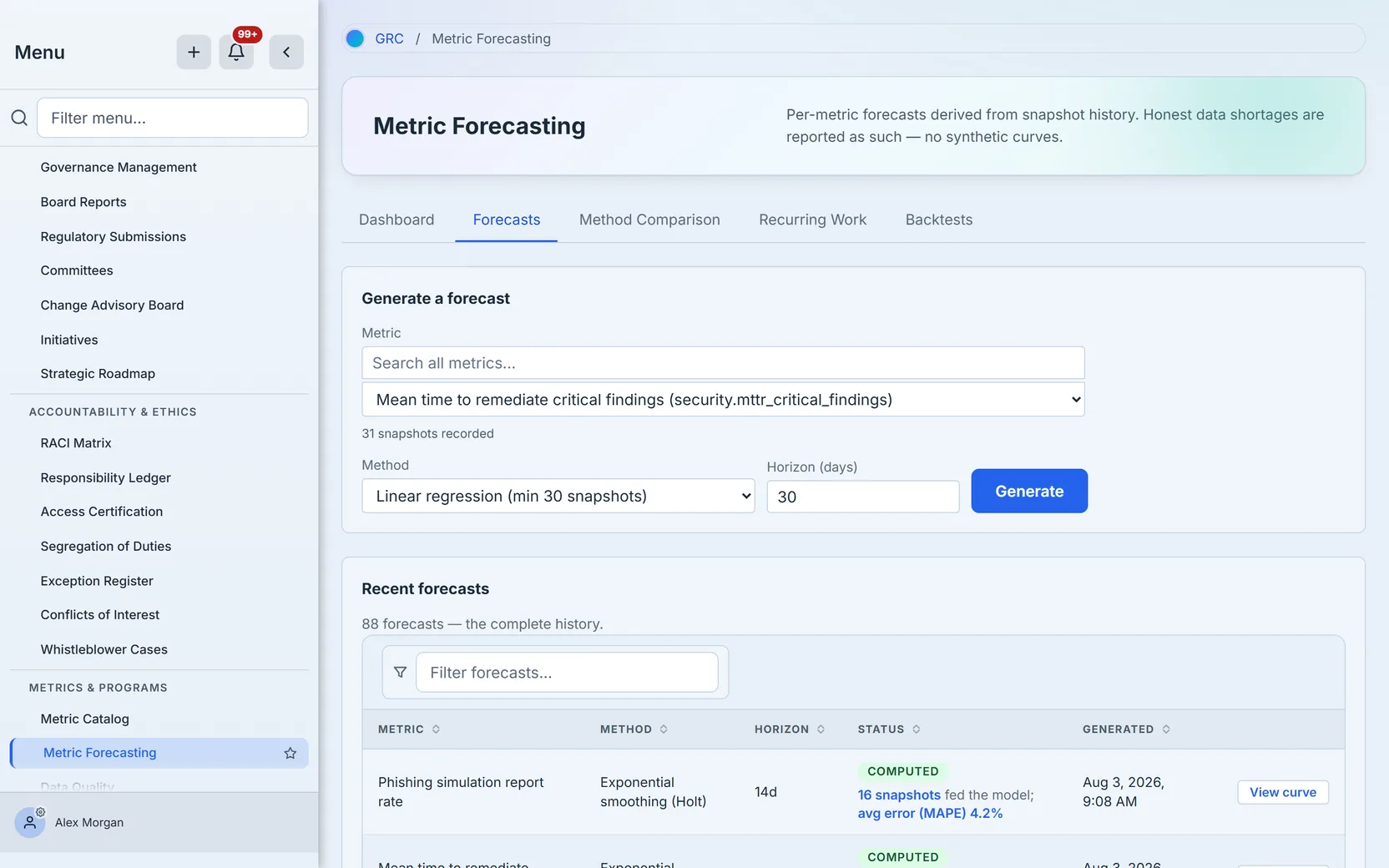
Every generation persists a forecast row — computed, insufficient, or failed — and writes an audit event. That is deliberate: the record of asking is part of the program’s history, and the insufficient answers are first-class records with their own explanation, not silent no-ops.
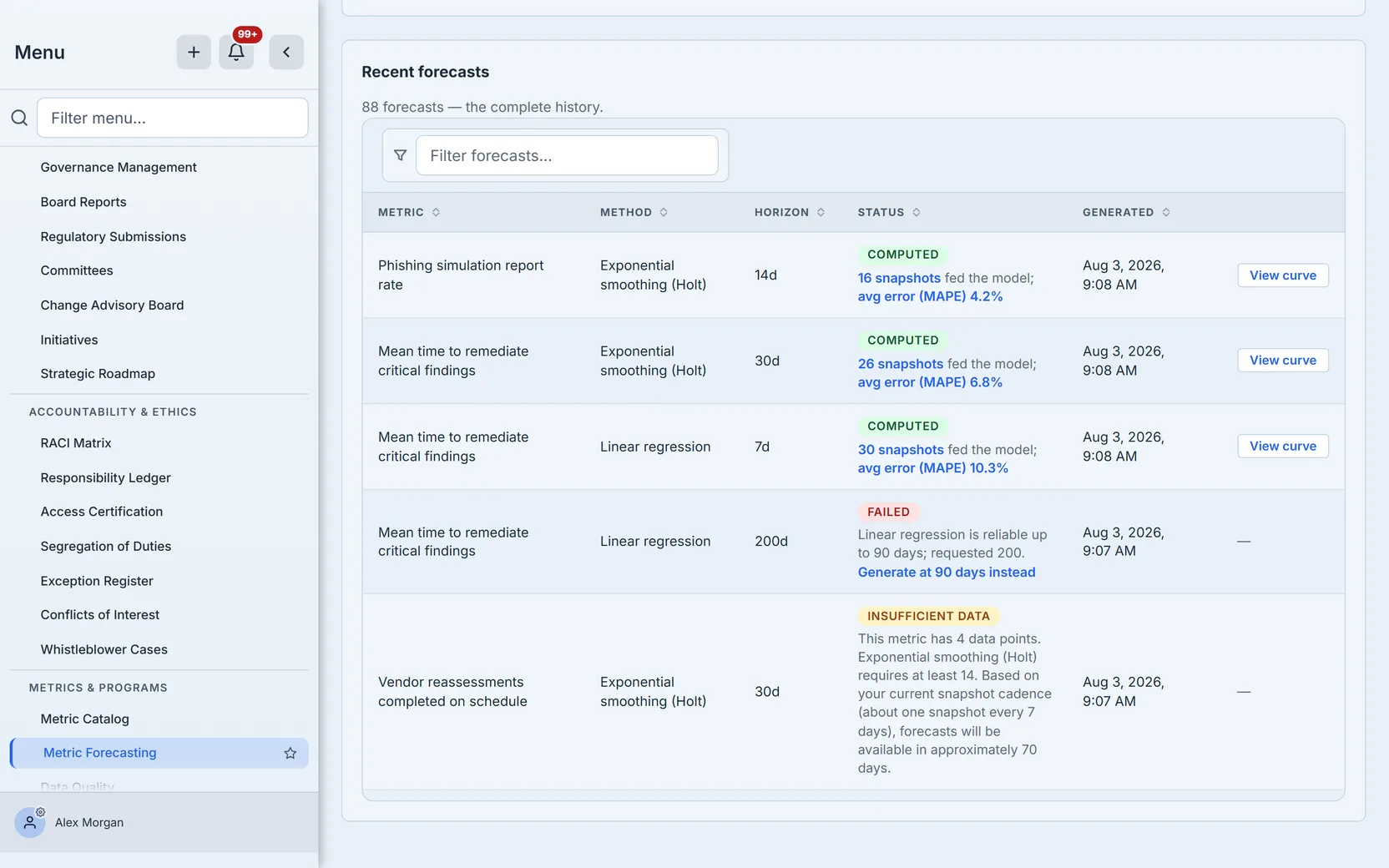
Each computed row states how many snapshots fed the model and its historical accuracy (MAPE — mean absolute percentage error — from the most recent backtest of that metric-method pair, when one exists). A forecast whose whole horizon has already elapsed reads Expired: it no longer predicts anything, and the page says so rather than letting a stale projection pass as current.
Step 3 — Read the curve like an auditor would
Click View curve on any computed forecast. The solid line is your actual snapshot history — every plotted point a real recorded value. The dashed line is the projection. The shaded band, when present, is the p25–p75 confidence interval.
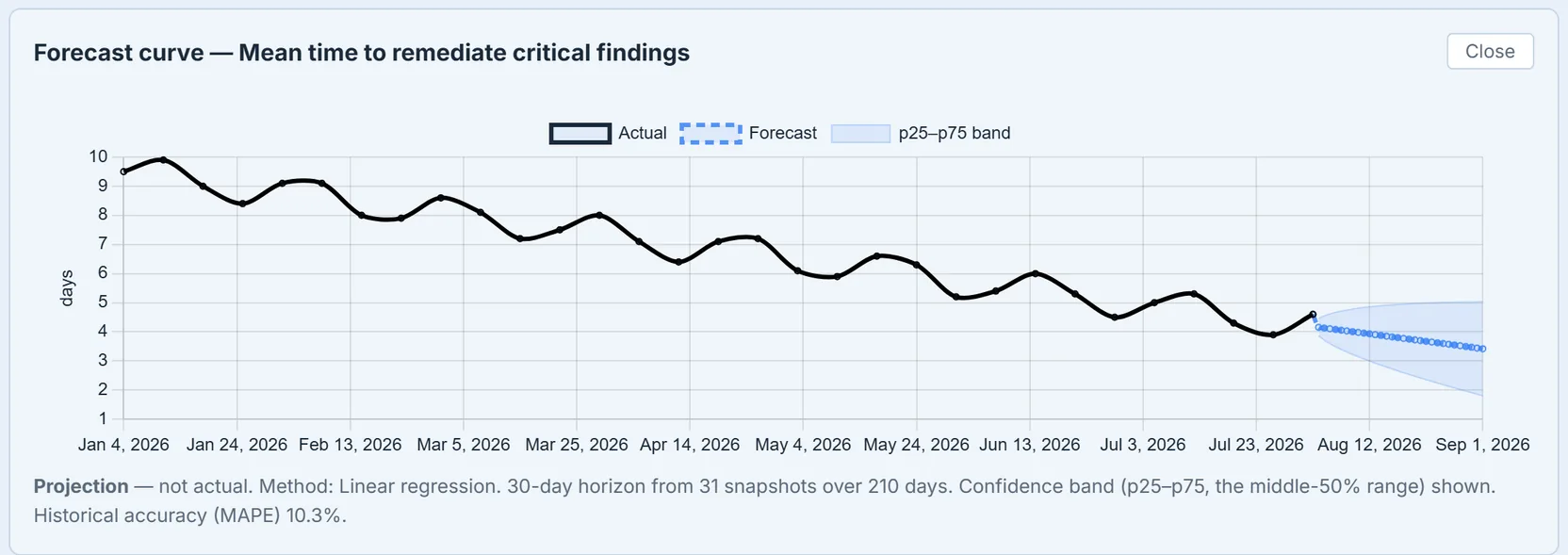
The curve itself is gated, in two tiers:
- No curve at all below 12 points spanning 90 days — the chart panel shows the engine’s shortage message instead of a thin, misleading line.
- Curve without a band until the history reaches 26 points over 180 days — and the caption says exactly that, so nobody mistakes a preliminary projection for a quantified one.
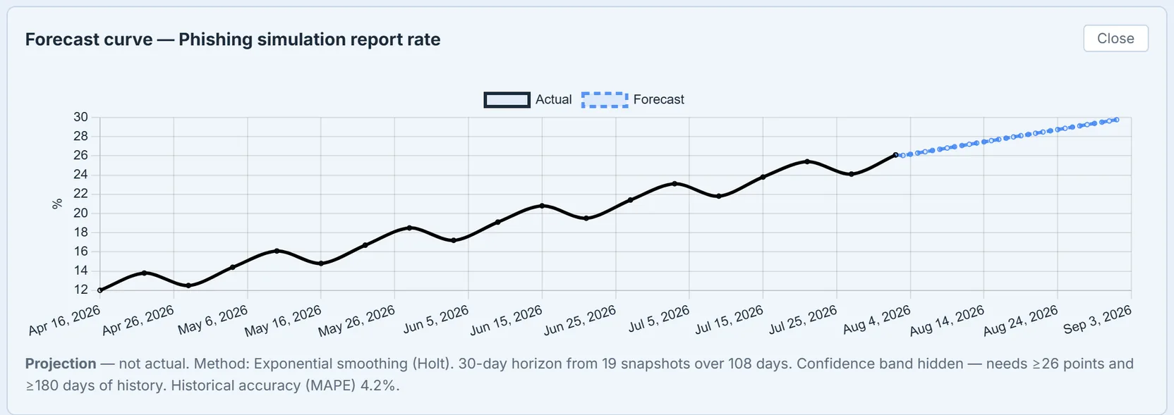
When a method’s historical accuracy is poor (MAPE above 25%), the caption adds a plain-language warning to interpret with caution. The band, the gates, and the warning are all computed server-side from the stored forecast — the page displays the verdict; it never re-derives a friendlier one.
The band is honest about what it measures. For linear regression it is derived from the residual spread of the fit, widened with the horizon. Exponential smoothing and seasonal-naive don’t produce a defensible interval, so they render no band at all — a missing band is the truthful representation, not a styling gap.
Step 4 — When there isn’t enough data, that IS the answer
Generate a forecast for a young metric and you get the page’s signature move: a persisted row whose status is Insufficient data, carrying a message like “This metric has 4 data points. Exponential smoothing (Holt) requires at least 14. Based on your current snapshot cadence (about one snapshot every 7 days), forecasts will be available in approximately 70 days.”
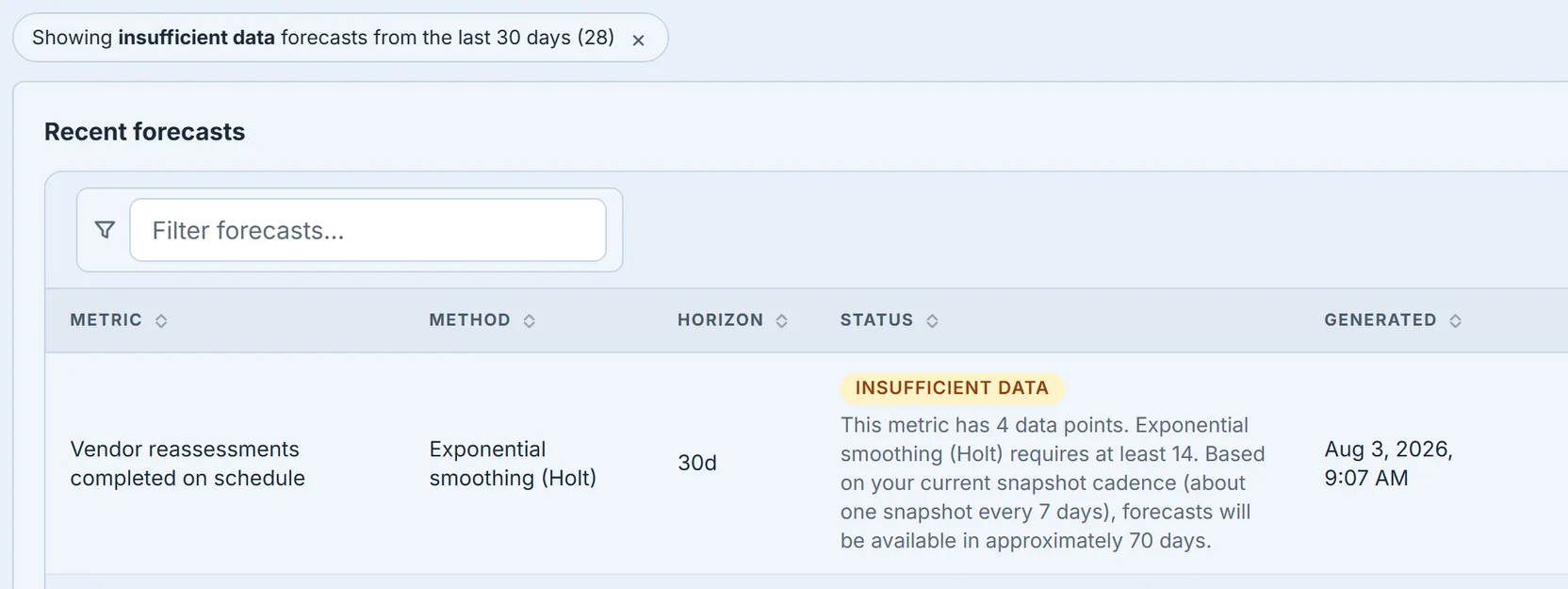
The “approximately N days” figure is computed from the metric’s real snapshot cadence — the median gap between its recorded values — not a canned string. Treat these rows as a to-do list for your measurement program: they tell you which metrics need more history and how long the wait is at the current cadence.
Step 5 — Compare methods before you commit
On Method Comparison, pick a metric and a horizon and run every method at once. Each row shows the method’s status, its minimum versus your available points, and the outcome — projected mean, first and last values — for the methods that could run.
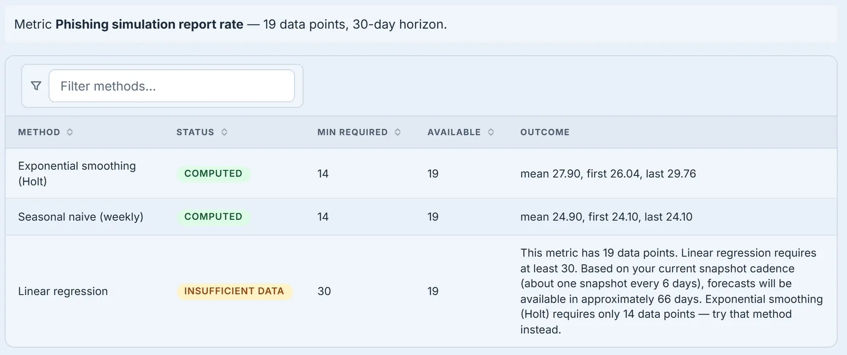
Two details worth knowing. A method that can’t run tells you which one can — the hint names the best available alternative for your current history. And the comparison is computed in memory, not persisted: exploring methods doesn’t spray speculative rows into your forecast history. Only Generate writes a record.
Step 6 — Prove the method with a backtest
A forecast’s credibility is an empirical question, and the Backtests tab is where it gets answered. Pick a metric, a method, and a holdout window, and click Run backtest: Talarity holds back the most recent days of real history as a test set, forecasts from the earlier slice alone, and scores those predictions against what actually happened.
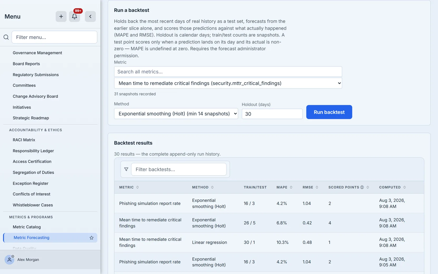
The scores are MAPE (mean absolute percentage error) and RMSE (root mean square error), computed by joining predicted and actual values day by day across the holdout window. Days where the actual value is zero are skipped rather than scored — MAPE is undefined at zero, and the page shows an em dash rather than a fabricated number.
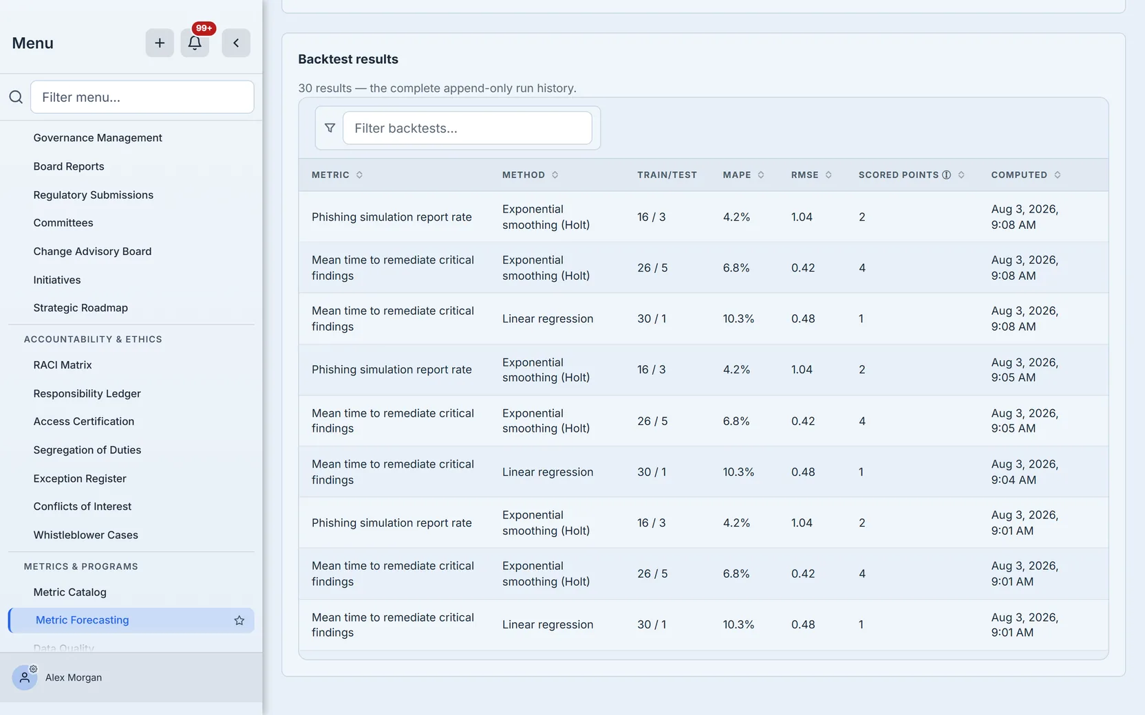
Like everything else here, a backtest that can’t produce a meaningful split says so: it needs the method’s full minimum before the holdout cutoff plus at least one real point inside it, and refuses to score a degenerate split. Running backtests requires the forecast administrator permission — scores feed leadership decisions, so writing them is a privileged act.
Step 7 — The dashboard, where every number opens its own receipts
The Dashboard tab rolls up the last 30 days: metrics with active forecasts, total forecasts generated, the insufficient-data rate, and the computation-failure rate — the last two toned as warnings only when they’re nonzero.
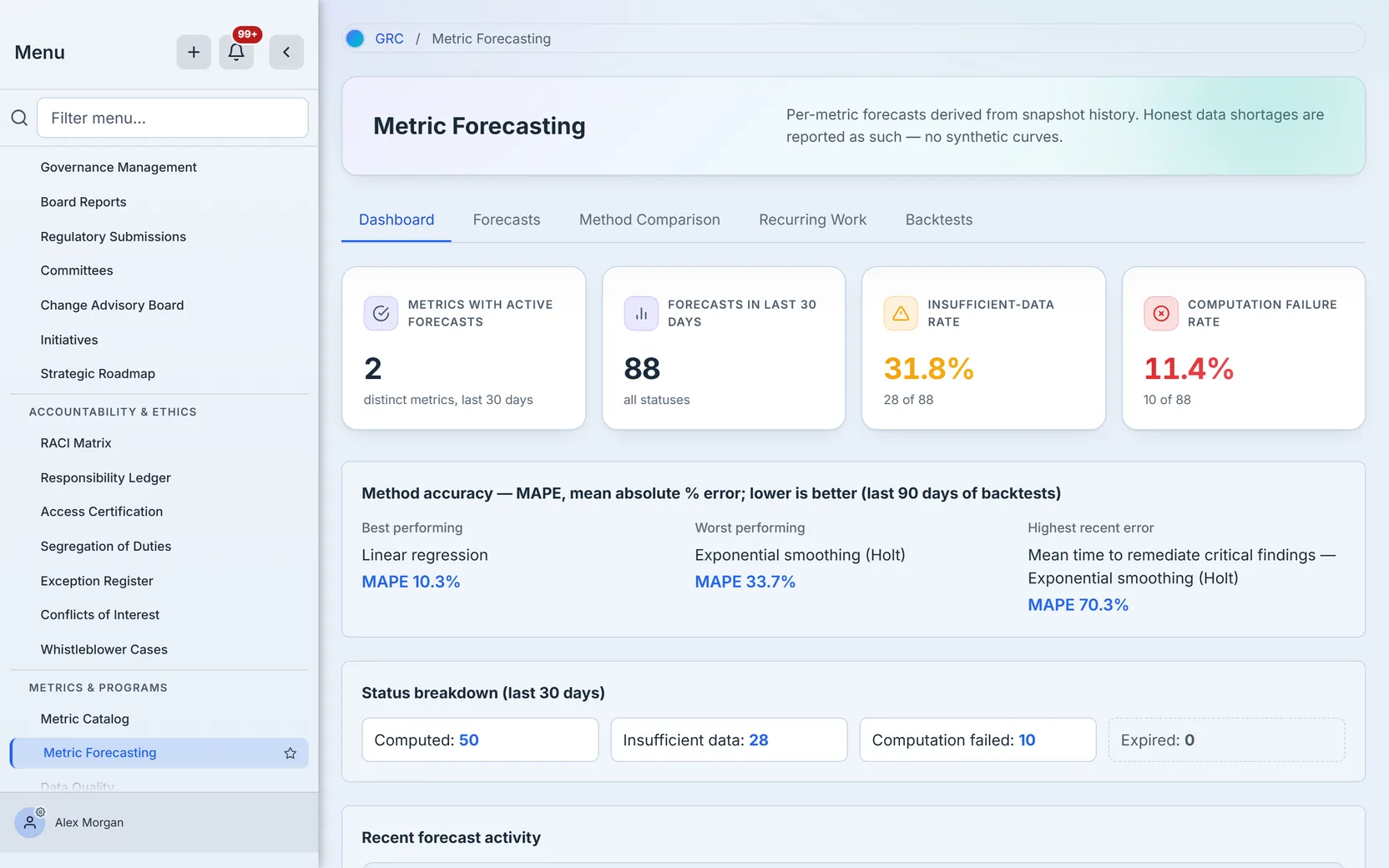
The Method accuracy panel names the best and worst performing methods over the last 90 days of backtests, plus the highest recent error — the metric-method pair whose recent backtests scored worst.

And the numbers are not decorative. Every KPI card and every cell of the status breakdown opens the Forecasts tab filtered — server-side — to exactly the rows and the 30-day window it counted, with a filter chip naming what you’re looking at. A zero-count cell disables itself rather than dead-ending you.

The Recurring Work tab — cadence detection for your operations
The fifth tab applies the same honesty discipline to a different question: which completed work keeps coming back? It groups the last 12 months of completed work items by normalized title and surfaces the ones that recur on a real cadence — occurrences, average interval, a regularity verdict, and a projected next date that is exactly one cadence step past the most recent occurrence, never an invented series.
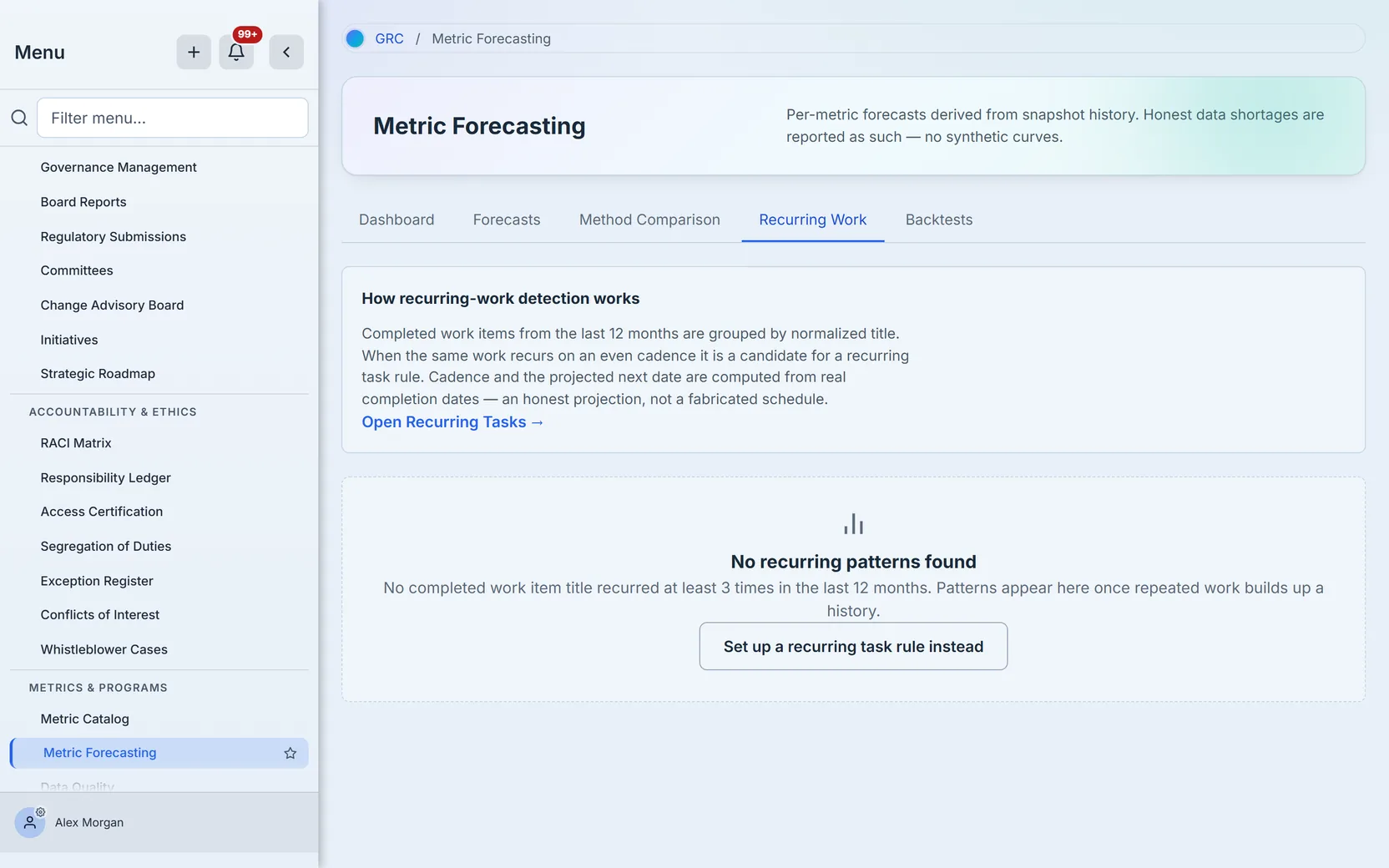
A batch of identical items created the same day — a bulk import, a campaign fan-out — is not a recurrence, and the detector refuses to project a schedule off one. Patterns that qualify are candidates for a recurring task rule, one click away via Manage recurring tasks.
What this page does not do
- ARIMA and Prophet exist in the method registry but ship disabled — they require external libraries the platform doesn’t bundle. The picker doesn’t offer them, and nothing here claims them.
- It doesn’t create metrics or record snapshots. That’s the Metric Catalog’s job (
/app/grc/metric-catalog) — the upstream page where definitions, lineage, and snapshot history live. - It doesn’t schedule work. The Recurring Work tab detects cadences; creating the recurring rule happens in Tasks.
- Programmatic consumers get a bit more than the page shows: per-metric forecast history and per-metric method accuracy are available through the same governance API surface the page uses.
Access reality
The page ships with the Governance Hub feature — org groups that can see Governance Management can see Forecasting. Viewing needs forecast read access; Generate needs forecast write; Run backtest needs the forecast administrator permission. A user with page access but without write can read every projection and drill every number — the mutating buttons are the boundary.
What you walk away with
- A projection per metric with a named statistical method, a stated horizon, and the snapshot count that fed it — never an unattributed trend line.
- A two-tier confidence gate that withholds the curve below 12 points/90 days and the band below 26 points/180 days, with captions that say which tier you’re reading.
- Insufficient-data rows as first-class records — the exact shortage, the method minimum, and a cadence-based estimate of when the forecast becomes possible.
- Backtest evidence — MAPE and RMSE against held-out actuals for every metric-method pair you’ve scored, feeding a dashboard that names your best and worst methods.
- A full audit trail — every generate, every regenerate, every backtest, logged with who and when.
Run yours this afternoon. Open /app/grc/forecasting, pick your longest-lived metric, and click Generate. If it has thirty snapshots, you’ll get a curve you can defend; if it doesn’t, you’ll get the number of days until you can — and both answers are worth having.