Every management system standard asks the same two things of leadership: measure the programme, and look at the measurements on a schedule. ISO/IEC 27001:2022 puts it in clause 9.1 (monitoring, measurement, analysis and evaluation) and clause 9.3 (management review). SOC 2 asks for it in CC4.1 (ongoing and separate evaluations) and CC2.2 (communicating what those evaluations find to the board). NIST CSF 2.0 made it a function of its own, GOVERN, with GV.OV asking that outcomes are reviewed and used to adjust the strategy. CIS Controls v8 frames the same question as progress through its implementation groups.
Most teams answer it with a slide deck. The deck is assembled from exports the week before the meeting, is out of date by the time it is presented, and cannot be filed: nobody can say afterwards which figures were on which slide on which day. Talarity treats a dashboard as a document instead — one definition that reads your data when you open it, and produces a dated record when you need one.
Who’s involved
- CISO or executive sponsor — reads Executive Posture and Program Health before a committee, and exports the one the committee will minute.
- Risk manager — works in the Risk Manager View day to day, opening figures to the risks behind them.
- Relationship manager (MSP or parent company) — starts at Group Overview or an enterprise command centre and narrows to one account.
- Advisory lead — opens one engagement as a live document during delivery.
- Auditor — receives the exported report, or a time-boxed link that opens in a guest account scoped to that one dashboard.
What’s on the page
Talarity delivers sixteen dashboards with the product. This article walks through ten of them, in four groups:
- Executive — Executive Posture (
/app/views/dashboard-executive-posture), Program Health (/app/views/dashboard-governance-program-health), Group Overview (/app/views/dashboard-group-overview). - Risk — Risk Manager View (
/app/views/risk-mgr, fourteen sections), Relationship Manager View (/app/views/rm, five). - Framework — CIS Enterprise and CIS Linked Account command centres at
/app/cis-command/enterpriseand/app/cis-command/linked-account, CSF Enterprise and CSF Linked Account command centres at/app/csf-command/enterpriseand/app/csf-command/linked-account. - Advisory — Engagement insights (
/app/views/dashboard-advisory-engagement).
The other six work the same way: Area Insights (/app/views/executive), CISO View (/app/views/ciso), CRO View (/app/views/cro), Security Manager View (/app/views/security-mgr), Auditor View (/app/views/auditor) and Assessment Analyst View (/app/views/analyst).
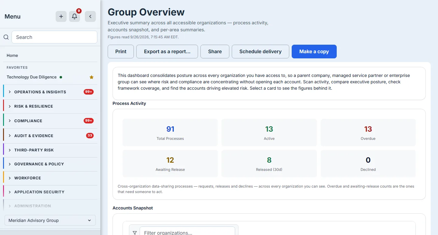
Each one carries the same header: its title, a line saying what it is for, the time the figures on screen were read, and five actions — Print, Export as a report…, Share, Schedule delivery and Make a copy. An action your access does not include is shown unavailable, with the reason beside it; the command centres open for anyone with access to assessments, and Export, Share, Schedule delivery and Make a copy also need edit access to reports.
Step 1 — Open one from the report library
A delivered dashboard is a template in your Report library, not a separate kind of page. Open the library at /app/reports/templates, set the type filter to Dashboards only, and every dashboard card offers Open dashboard beside Generate report, Customize and Save a copy.
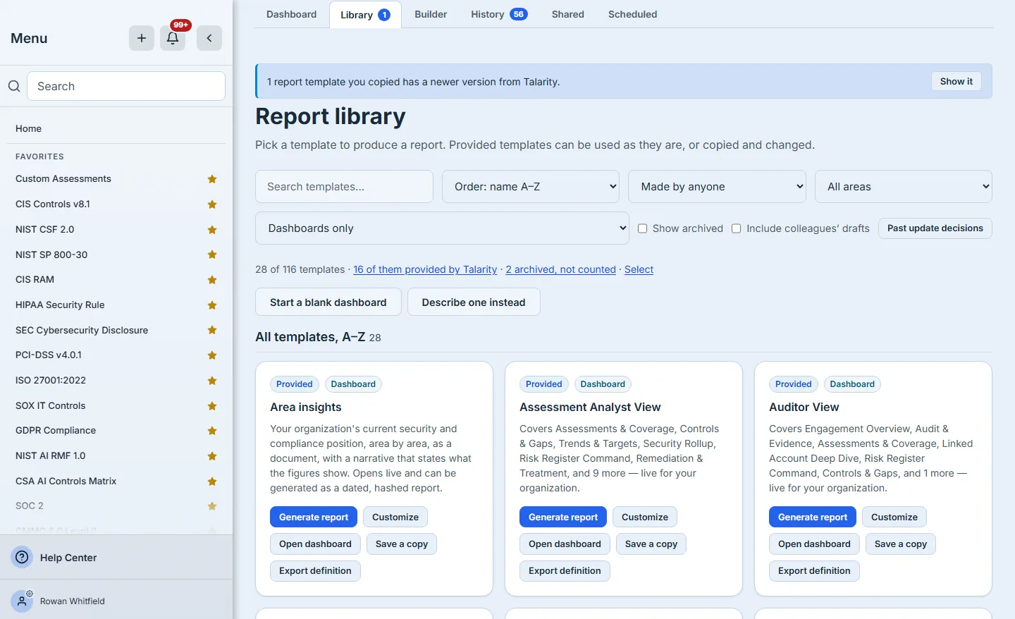
That single definition is what makes the rest of this article work. The live page and the exported report are two renderings of one template, so the figures on the screen and the figures in the filed report come from the same template and the same parameters rather than from two implementations that drift apart.
Step 2 — Read it: the stamp, and the three executive pages
Open Executive Posture. Under the title is what the page is for, and under that, Figures read with a date and time.
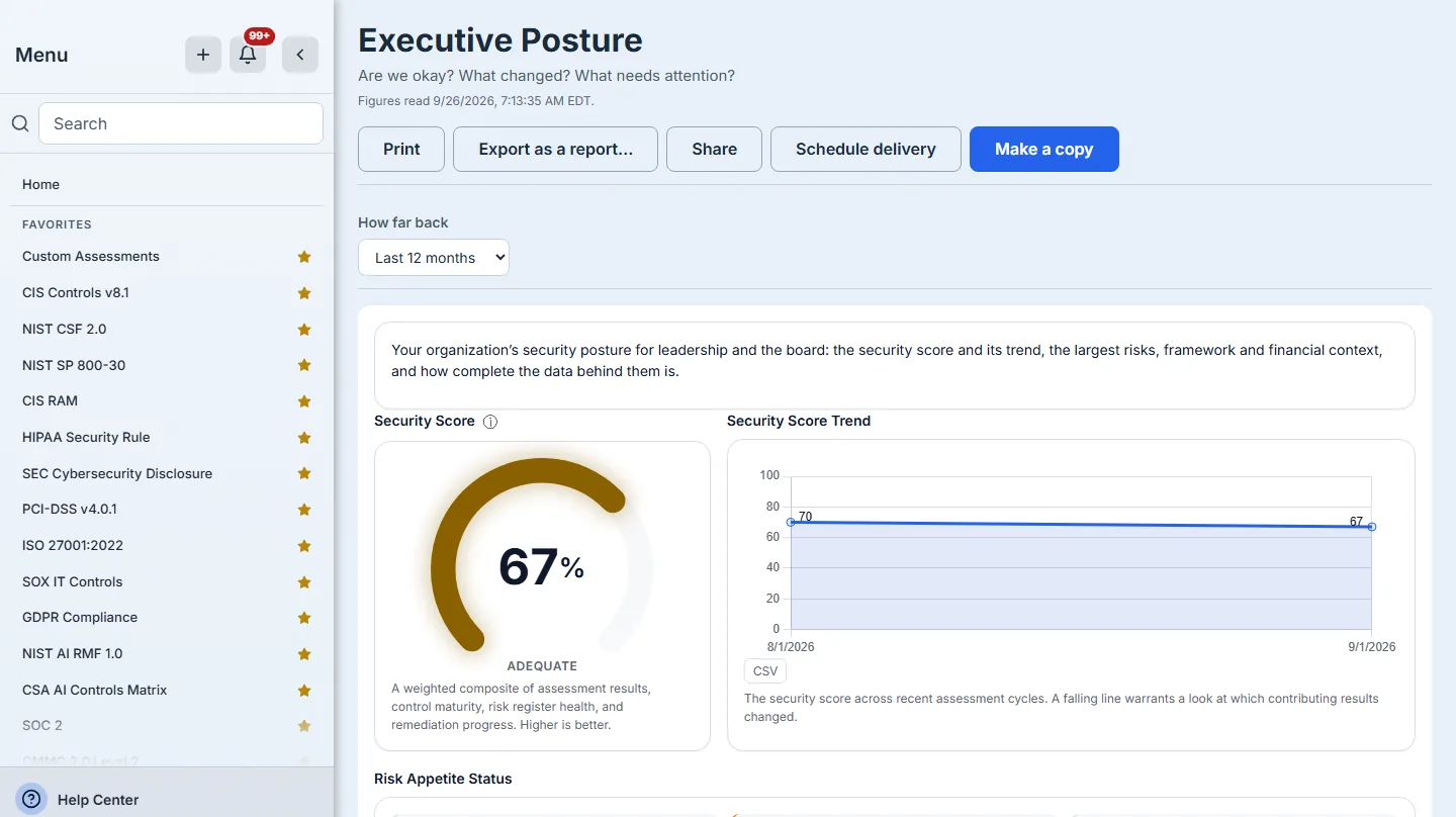
That stamp is the claim that the page is live, so it is taken from the figures actually drawn, not from when the page frame was built. A figure read a few minutes earlier in the same session is reused rather than recomputed; when the figures on screen were read at different times, the stamp says “between” the oldest and the newest. When fresher figures arrive in the background, the page redraws them and restates the time. When every data set fails, no time is printed at all, because a time stamped over a failure would say the figures were fresh when there are none. A failure is shown as a failure, with a retry; it is never drawn as an empty page that looks like “nothing to report”.
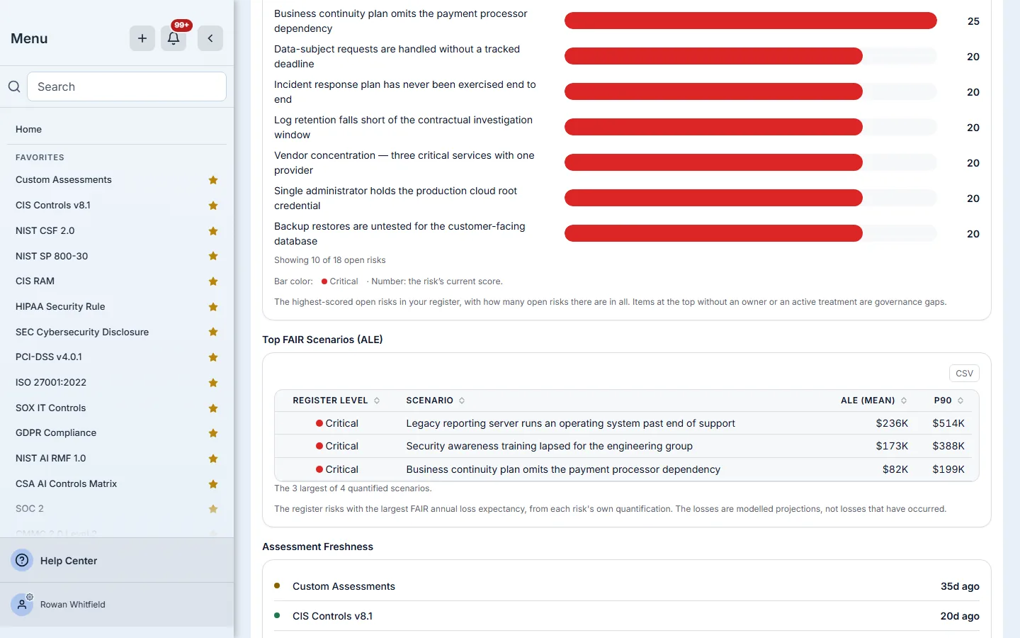
Further down, the financial band lists the register risks with the largest modelled annual loss, from each risk’s own FAIR quantification: the loss expectancy is stated as the mean beside the P90, and a note says how many quantified risks the rows were drawn from.
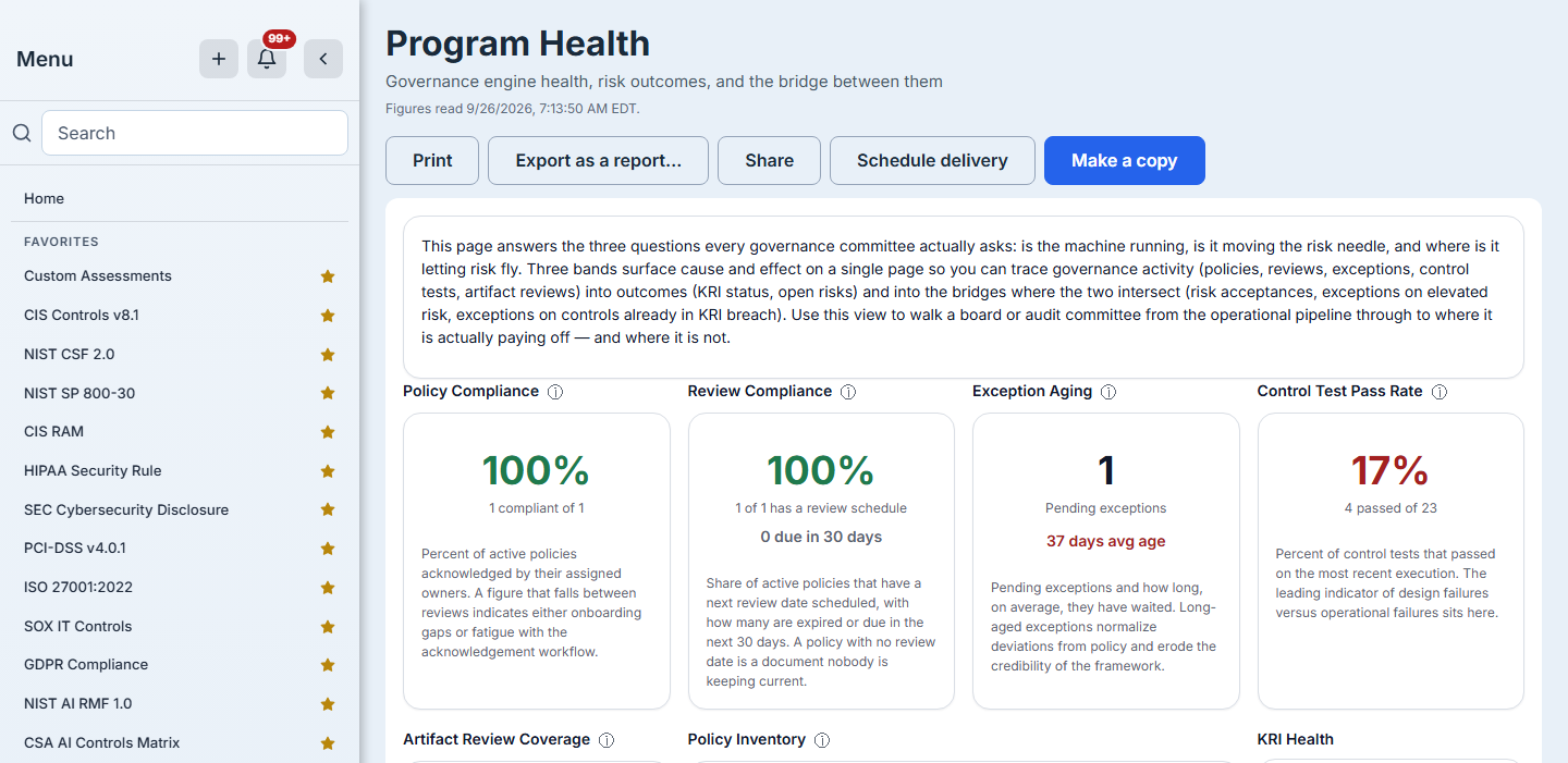
Program Health answers the governance committee’s three questions on one page: is the machine running (policy, review and exception figures), is it moving the risk needle (KRI health and open risks), and where the two meet.
Group Overview is the page for a parent company or managed service provider: one summary across every organisation that shares data with yours.
Step 3 — Move through a long one, and open a figure
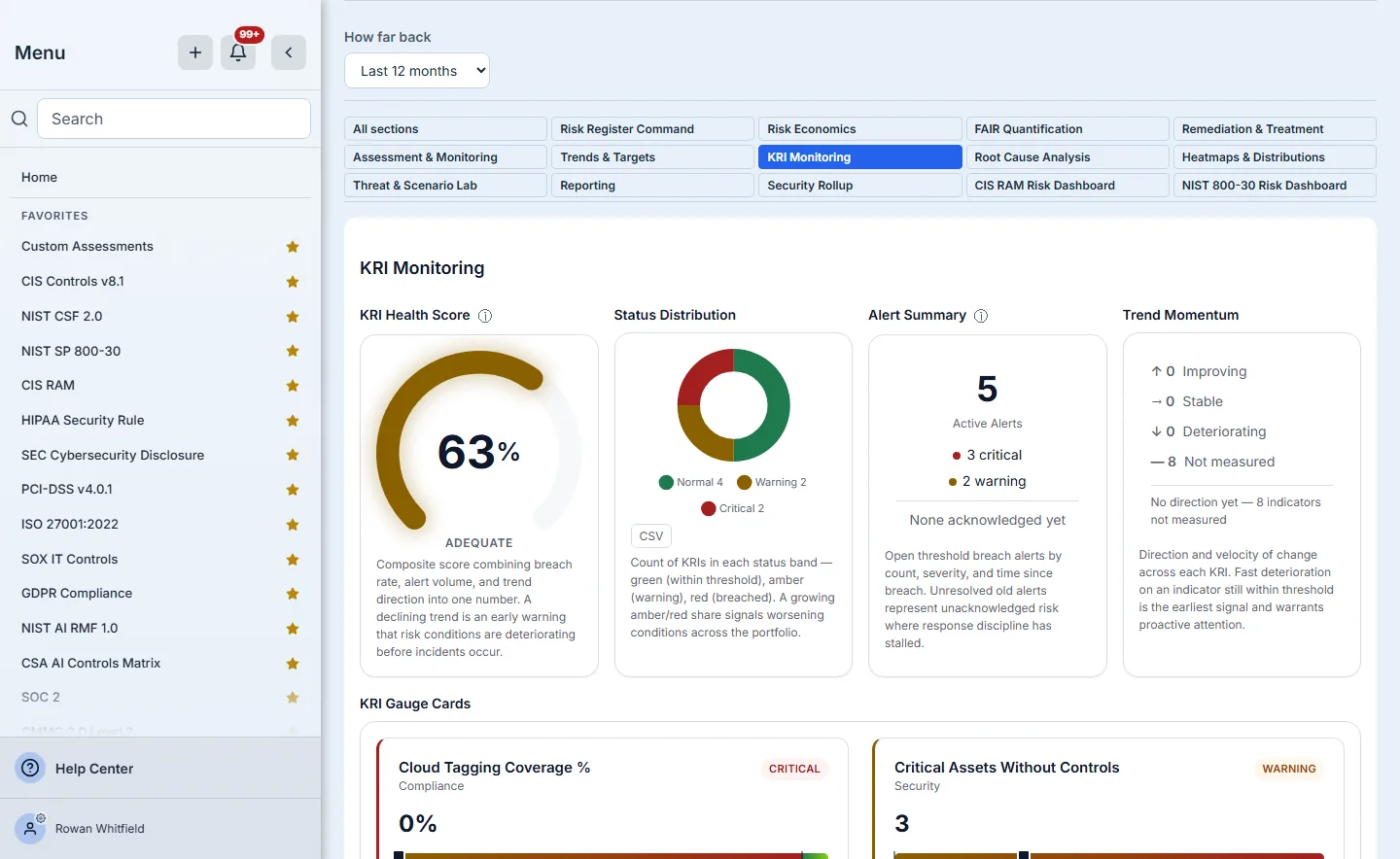
The Risk Manager View covers the risk function in fourteen sections. A dashboard with five or more sections gets a section switcher; choose KRI Monitoring and the page shows that section alone, and the address carries ?section= so a bookmarked or shared link reopens on the same section.
If a link asks for a parameter the dashboard does not use — a mistyped key, or one from a different dashboard — a sentence in the parameter bar says so rather than silently ignoring it. If you lack access to the data behind a figure, the figure stays in its place and says it is withheld — not that there is nothing to show — and a note above the document counts how many are withheld, so a withheld figure is never mistaken for an empty one.
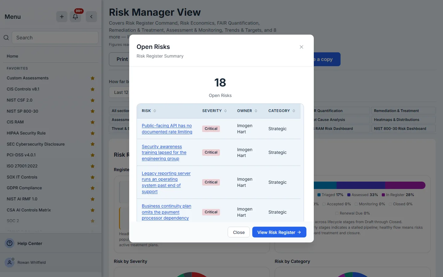
Figures open the data behind them. Select the open-risk count in the register section and the risks behind the number appear; each row opens that risk’s own record, and the list ends with a way through to the full register. A row that cannot be opened says why — a row held by another organization in a group roll-up, for example — rather than looking like a link that is missing.
Step 4 — Narrow it to one account
The Relationship Manager View is organised by account. Its account parameter is optional: left empty, it covers every linked account; choose one and every section narrows to it. A ranking says what it could not rank — an account with no completed assessment in the period is counted, not silently left off.
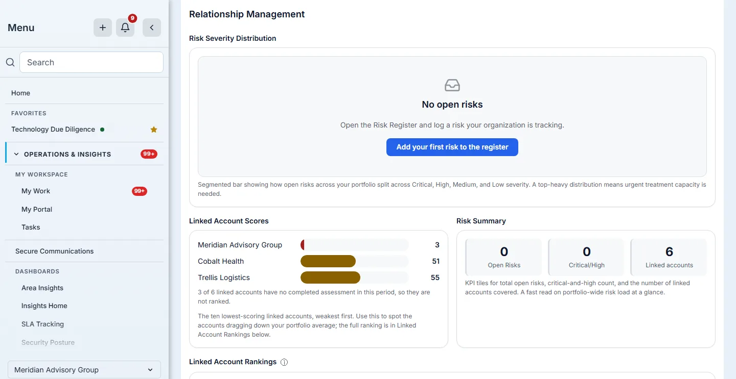
The parameter bar shows only the parameters a dashboard declares — an account, an engagement, a time range — and the choices in each picker come from your own data. Seven of the ten carry a time range; changing it re-reads the figures and puts the choice in the address. If a picker cannot load its choices, it says so in the field and offers Try loading again, so a failed load is never confused with an organisation that has nothing to choose.
Step 5 — The framework command centres: the estate, then one account
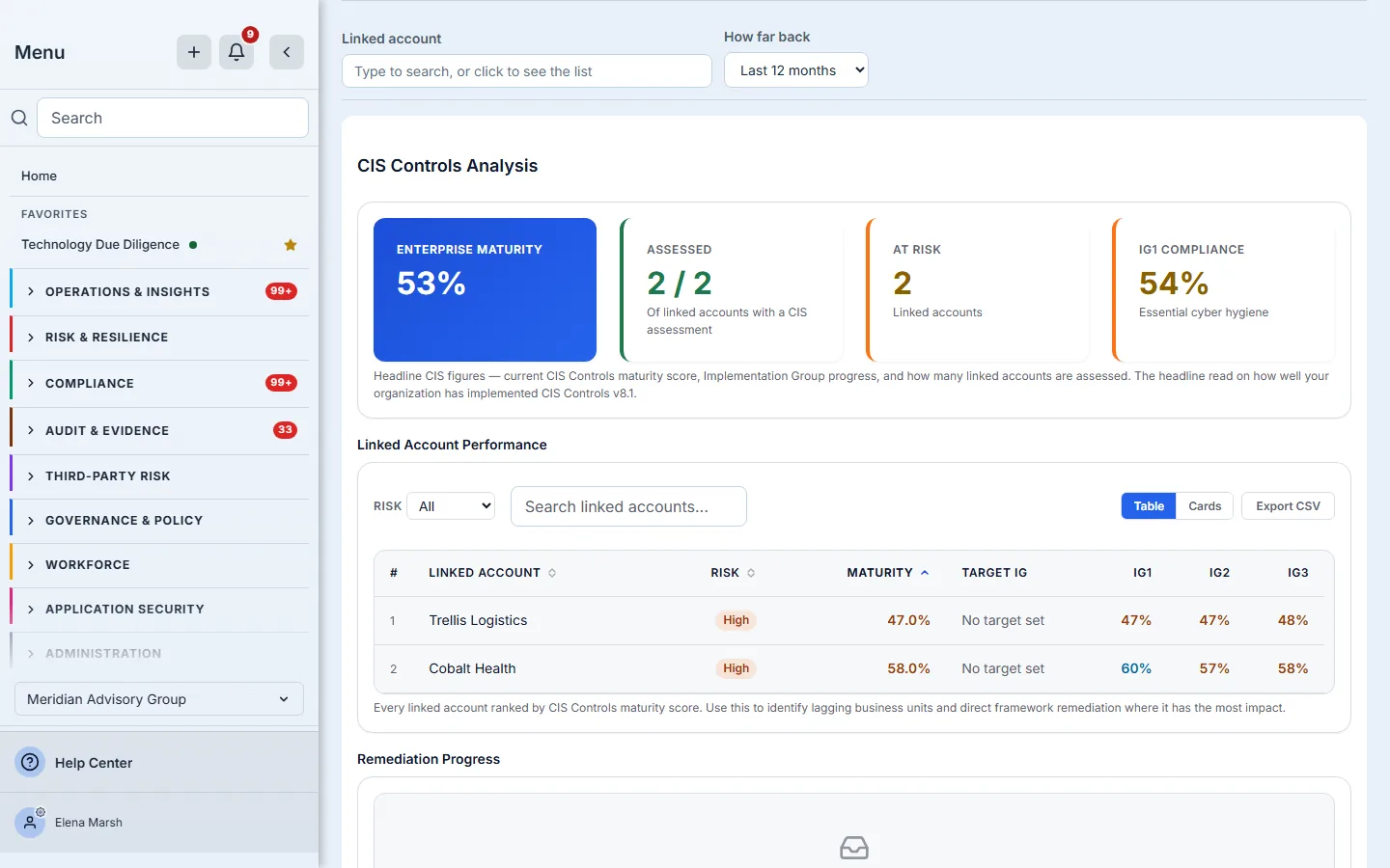
The CIS and CSF command centres open at their own routes. The enterprise centre rolls every linked account up into one view — maturity, how many accounts are assessed, how many are at risk, and each account ranked — and its own account picker, left empty, keeps it at the estate.
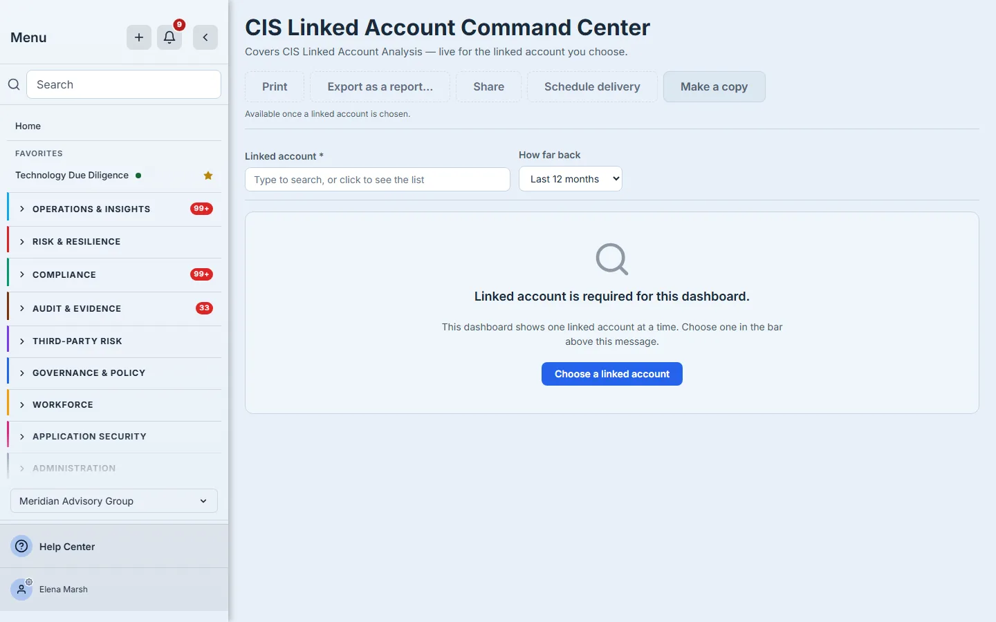
The linked-account centre needs an account and says so. It does not show an empty page: the refusal names what is missing and its button takes you to the picker above it. An organisation with no linked accounts yet is offered Add a linked account, which opens the Linked Accounts page where one is made — linked accounts are an enterprise capability.
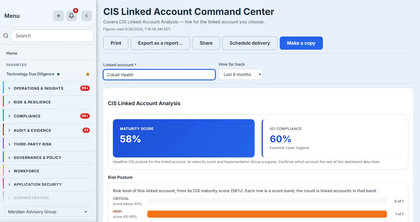
Choose the account and the document renders for it; choose a window under How far back and it re-reads for that too. Both go into the address, so the link you copy reopens this account over this window, not the enterprise.
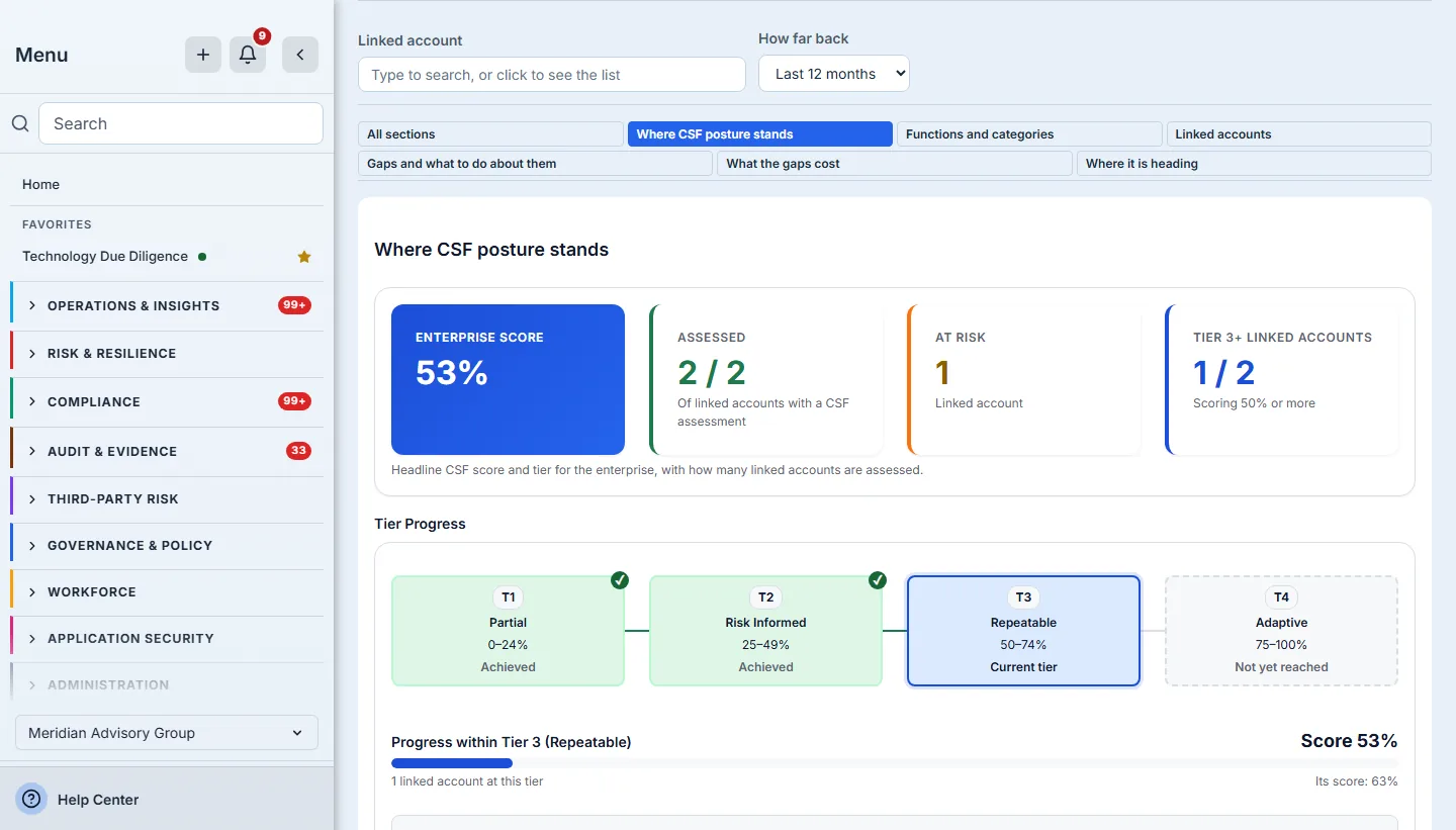
The CSF enterprise centre states a tier from the measured score — the tier progress is computed from the score shown beside it, never assumed — and its six sections have their own switcher. The assessed count says what it is out of: the linked accounts with a CSF assessment, not every account you hold.
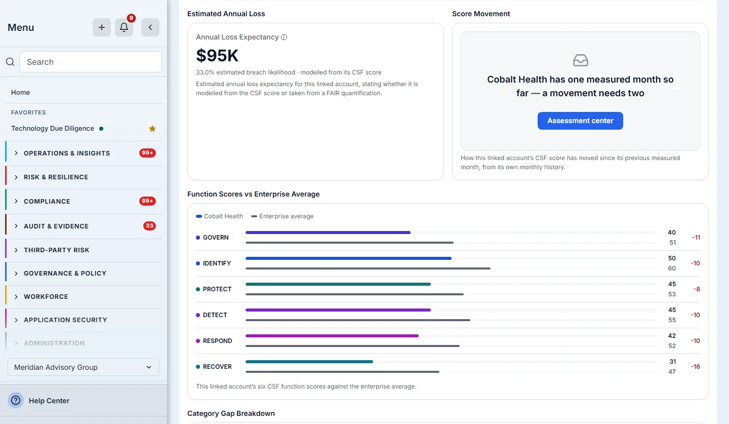
On the CSF linked-account centre, one account’s function scores are drawn beside the enterprise average. The comparison is read at enterprise scope even while the rest of the page is narrowed to the account, so the account is compared with the average across every account, itself included, rather than with its own figures.
Further down, the gap analysis and recommendation cards on both linked-account centres offer Create tasks for what they list. Each gap or recommendation becomes a finding work item on the account’s assessment run, unassigned in the work items backlog for triage, and the card names and links the items it created. Before you press, the card says which of them already have an open task — from this assessment or an earlier one — links those, and offers only the rest, so a quarterly re-assessment does not raise the same open gap twice; a gap has one task: if that task was deleted from Work Items (it moves to Cancelled, with its record and history kept for audit) or finished under an earlier assessment, raising the gap again reopens it — unassigned, in the backlog, with the reopening recorded in its activity — rather than starting a second, and the card says which it will reopen before you press. These dashboard tasks live in Work Items, at the dashboard’s grain — one per CSF category, CIS control or recommendation; the question-by-question gaps behind them are kept separately, and automatically, in the gap register at /app/gaps. The action needs edit access to work items, and says so when you have none. A task is raised against an assessment your organization ran — for an assessment another organization shares with you, the card says the task belongs in that organization instead.
Step 6 — One engagement, live
For advisory teams, Engagement insights opens one engagement as a document: each scope area’s current maturity against the level the engagement recommends, from the engagement’s own ratings, with every area below its recommendation marked and by how much.
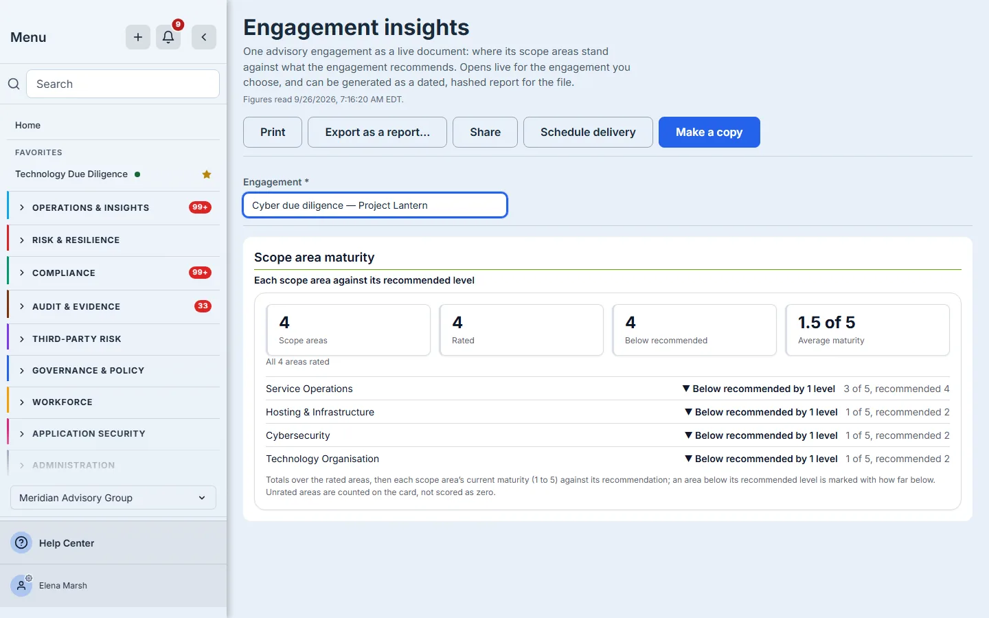
If your organisation has no engagements yet, the picker says so and offers Set up the first engagement, which opens the engagement register’s own form, rather than an empty list.
Step 7 — Act on it: share, schedule, export, print
The five header actions each hand the page to something that already exists in the product, and each one takes the account, engagement and time range you chose with it. None of them replaces the others.
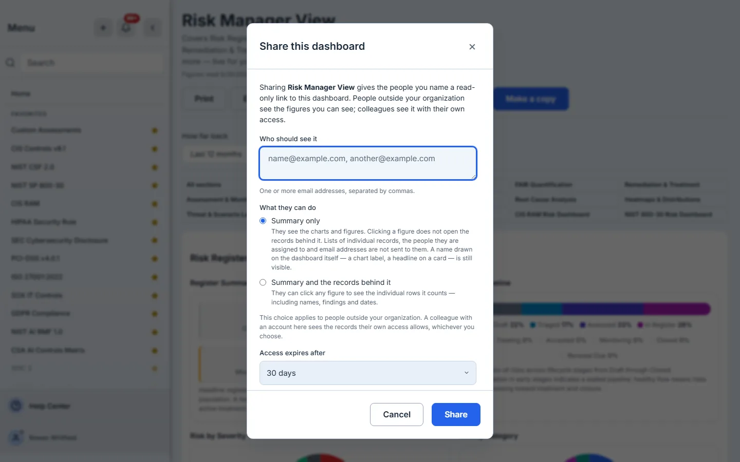
Share gives named people a read-only link to the live dashboard, opening on the account and section you were looking at. For people outside your organisation you decide whether a figure opens the records behind it or shows the summary only; colleagues see what their own access allows. The link expires after 7, 14, 30 or 90 days — the server accepts nothing longer. The same dialog lists every live link to the dashboard with whether it has been opened and a Revoke beside each, and keeps the links that have ended, with when they were withdrawn or expired. A recipient outside your organisation is given a guest account that can open that dashboard, with that account pinned, and nothing else.
A dashboard link reads with its sharer’s current access, so it stops working if the sharer leaves. The Dashboard links tab on Shared Reports lists every dashboard link in your organization — live, expired, withdrawn, and those whose sharer is no longer active — and an administrator can Transfer a link that is still needed to another member, without the recipient getting a new link.
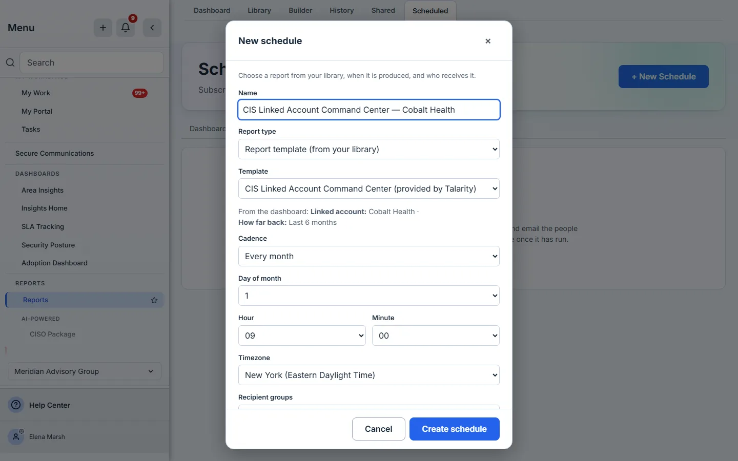
Schedule delivery opens the scheduler with this dashboard already chosen, named for its account, and the parameters on your screen carried across — here, Cobalt Health and the six-month window from the frame above — so each delivery is generated for what you were looking at.
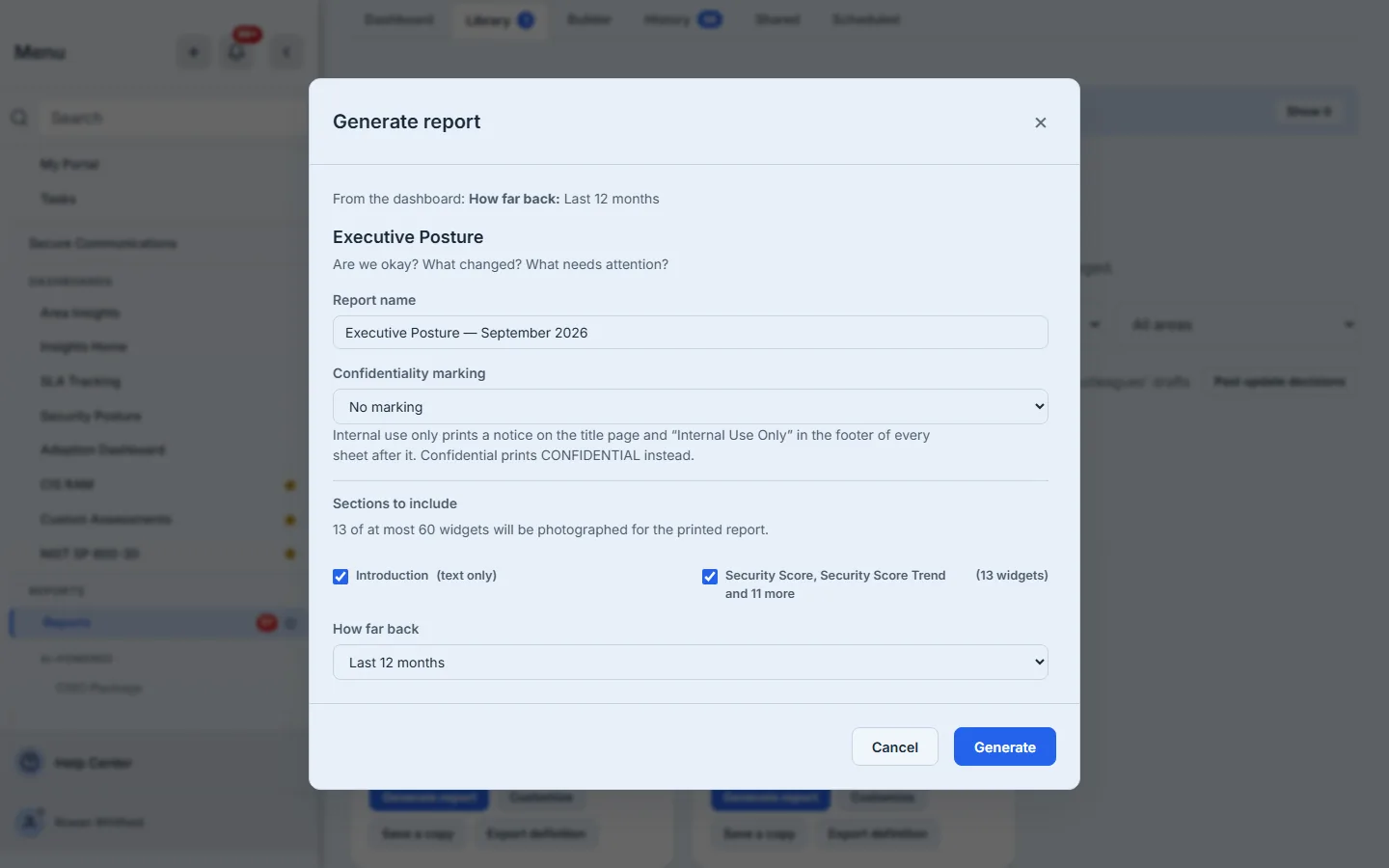
Export as a report… opens the report library’s generate dialog for this dashboard, carrying the same parameters and the section you were on. The result is a dated report run, hashed when it is produced and signable, that sits in your report history — the document a committee minutes or an auditor files. Every figure in it is photographed for the account and time range you chose. A printed report photographs at most 60 figures, so on the largest dashboards you choose which sections go in, and the dialog counts the figures against that limit before you generate. The live page has no fixed bytes, which is exactly why the signature belongs on the export and not on the page.
Print sends the page to your browser’s print dialog for a quick paper copy with no record kept.
Step 8 — Make it yours
Make a copy creates a personal copy of the dashboard and opens it. The page then says you are viewing your own copy, links back to the original, and offers Customize this copy, which opens it in the report builder. Make a copy is no longer offered, because you already have one.
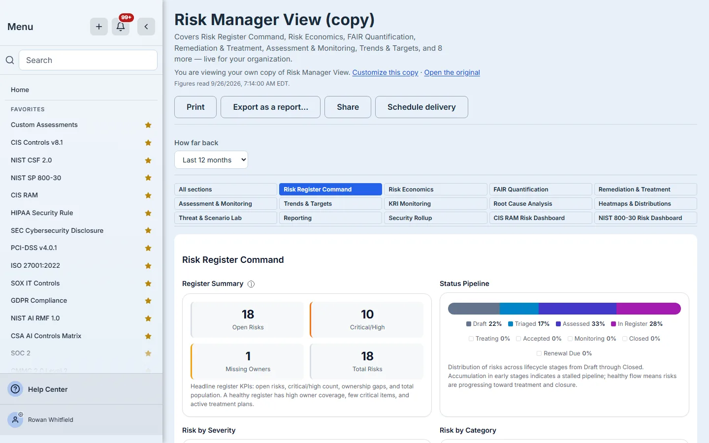
Your copy is yours to change. The delivered original is never modified, and when it improves, the library offers the improvement to your copy rather than forcing it on it.
Which one, when
| You need | Use | Why |
|---|---|---|
| ”Where are we right now?” | The live dashboard | It reads your data when it opens and says when |
| Figures fixed at a date for a committee, auditor or regulator | Export as a report… | A dated, hashed run that can be signed and filed |
| Someone outside your team to look, for a while | Share | Named, time-boxed, revocable, pinned to the account you chose |
| The same view on a cadence | Schedule delivery | Carries the parameters on screen |
| Your own wording or layout | Make a copy | A personal copy; the original keeps improving |
| The estate, or a portfolio | Enterprise centres, Group Overview | The account parameter is optional or absent |
| One account | Linked-account centres, Relationship Manager with an account | The account goes in the address |
What you walk away with
- Dashboards that read your data when you open them and say when the figures on screen were read.
- One definition per dashboard behind the live page, the export, the share and the schedule, each carrying the account and time range you chose.
- Figures that open the data behind them — on the risk dashboards, down to each risk’s own record — gaps that become work items, and figures you may not see that say so instead of looking empty.
- A dated, signable report whenever a figure has to be fixed for the record.
- Time-boxed, revocable links instead of screenshots in email, in one register an administrator can hand on when someone leaves.
Open yours now: go to /app/reports/templates, set the filter to Dashboards only, and choose Open dashboard on Executive Posture. It is live the moment it opens, and it will be live the next time too.