An auditor testing a control almost never tests all of it. They test a sample, and then they make a statement about the whole population on the strength of it. Everything that makes that statement defensible happens before anyone looks at a single item: how many, chosen how, and can somebody else get the same answer.
Most tools help with the first question and quietly abandon the other two. A sample size appears, the items are picked, and six months later — when a reviewer asks why those particular thirty invoices — the honest answer is that nobody knows. The selection was a moment, not a record.
This is how Talarity’s Statistical Sampling page treats all three as one job.
What a sample has to survive
Before any of the mechanics, it is worth being precise about what a sample is for, because it determines which details matter.
You are not trying to find every failure. You are trying to make a defensible statement about a population you did not examine — “controls over privileged access operated effectively during the period” — on the basis of a subset you did. The statement is only as good as the argument that the subset was representative, and that argument has to survive three different readers.
A reviewer, next week. They want to know the sample was big enough for the conclusion drawn. If you tested thirty items and found one failure, is that a 3% deviation rate or is it noise? The answer depends entirely on parameters you chose before you started.
An external auditor, next quarter. They want to know the items were not cherry-picked. Not that
you were dishonest — that the method could not have quietly favoured the easy ones. “We picked
thirty” is not a method. “We drew thirty by monetary-unit sampling weighted on invoice value, seed
a3f9c2” is.
Someone reconstructing the work, next year. The people are gone, the spreadsheet is in a folder nobody remembers, and a regulator has asked why those particular items. This is the reader most sampling tools abandon, and the one Talarity’s design is organised around.
Each of those readers needs something different, and only the third needs it to still exist after everyone has moved on.
Sizing the sample
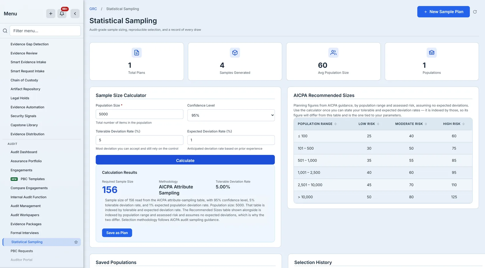
The calculator takes the four inputs attribute sampling actually needs: population size, confidence level, tolerable deviation rate, and the deviation rate you expect to find.
Two of those are worth dwelling on, because they are the ones people transpose.
Tolerable deviation rate is how much failure you can accept and still conclude the control works. Expected deviation rate is how much you think you will actually find. The gap between them is your precision, and it is the thing that drives the sample size — the closer your expectation creeps to your tolerance, the more items you need to tell them apart. Ask for 5% tolerable against 1% expected and the AICPA table wants 156 items; relax the tolerance to 10% and it wants 64.
The result card names the method that produced the number, which matters more than it sounds. A sample size read from the AICPA attribute-sampling table and a sample size computed from a Poisson reliability factor are different claims, and an auditor defending the number is entitled to know which one they are holding.
Where the table has an answer, the table is the answer — it is the authority the tool cites, and a number smaller than the guide it names is a contradiction the reader has to catch on your behalf. Outside the table’s coverage the size is computed from the reliability factors those tables are themselves built from, anchored so the two never disagree in direction: ask for more confidence and you always get a larger sample, never a smaller one.
That last property sounds too obvious to state. It is not. Mixing two sizing methods without anchoring them produces a calculator where moving from 95% to 99% confidence reduces the required sample, because one method is more conservative than the other. A tool that does that makes the control look negotiable, which is worse than either method alone.
Reading the number you get
Three figures come back, and they answer different questions.
Required sample size is how many items to test. Methodology names the family the number came from. Tolerable deviation rate is echoed back so the parameters travel with the result rather than living in a form you have already navigated away from.
Beneath them sits the sentence that reconciles the number with the AICPA reference table printed on the same screen — which of the two tables produced it, what each one is indexed by, and whether a finite-population correction reduced it. Without that sentence a reader sees a calculator answering one number beside a table saying another, and no way to tell whether the tool is wrong or the comparison is.
Choosing the four numbers
The calculator will accept anything valid. Deciding what to put in it is the actual work, and three constraints in the tool encode real statistical facts rather than arbitrary limits.
Confidence is offered at 90, 95 and 99 — not as a free field. Those are the levels the reliability factors are tabulated for, and a confidence level you invented is a confidence level nobody can check your arithmetic against. 95% is the ordinary choice for tests of controls; 99% is for the control you would be most embarrassed to be wrong about; 90% is defensible where the control is one of several covering the same risk.
Expected must be strictly less than tolerable, and the tool refuses otherwise. This is not fussiness. If you expect as many deviations as you can tolerate, there is no precision left to detect anything — you have declared in advance that the test cannot distinguish an acceptable control from an unacceptable one, and no sample size can rescue that.
Expected deviation rate is a prediction you should be able to justify. Setting it to zero is tempting because it produces the smallest sample, and it is the right answer only when you genuinely expect a perfect population — a control with no failures in prior periods and no changes since. Set it to zero on a control that failed twice last year and the first deviation you find blows the basis of the test.
The honest starting point for most control tests: 95% confidence, a tolerable rate matching what your framework or your own risk appetite says is acceptable, and an expected rate taken from last period’s actual results rather than from optimism.
Two AICPA tables, and why they disagree
The page shows a second table beside the calculator — AICPA Recommended Sizes — and the first time you look at both, they appear to contradict each other. Ask the calculator for 5% tolerable and 1% expected against a population of 5,000 and it answers 156. The reference table, for the 2,501–10,000 band, shows 45, 70 and 110.
Both are AICPA. They answer different questions, and knowing which is which is the difference between using them and being confused by them.
The calculator implements attribute sampling, indexed by the two rates you supply: how much deviation you can tolerate and how much you expect. It does not care how large the population is beyond a correction at the small end. That is why the tolerable/expected pair moves the number so violently — 5%/1% wants 156 items and 10%/1% wants 64.
The reference table is indexed by population range and assessed risk. It is the quick planning figure — the one an audit senior uses to sanity-check a plan before the parameters are pinned down, where “moderate risk, a few thousand items, call it 70” is the right granularity.
Use the calculator when you can state your tolerable and expected rates, which is what a defensible attribute test requires. Use the table when you are scoping. If they disagree, that is not an error; they are answering different questions and the calculator’s answer is the one tied to the parameters you will have to defend.
The finite-population correction
Attribute sampling assumes you are drawing from something effectively infinite. When the population is small relative to the sample, that assumption over-charges you — testing 156 items out of 200 is not far off testing all 200, and the statistics know it.
The correction reduces the sample when the population is small enough for it to matter, and the rationale says so when it applies. If it did not say so, a reviewer comparing your 61 against the table’s 156 would have to guess whether a correction was applied or a parameter was fudged.
Drawing it
Sizing is the easy half. The draw is where a sample becomes evidence or fails to.
Talarity samples from a population you import — a CSV of the actual invoices, users, changes or tickets in scope — rather than from an abstraction of one.
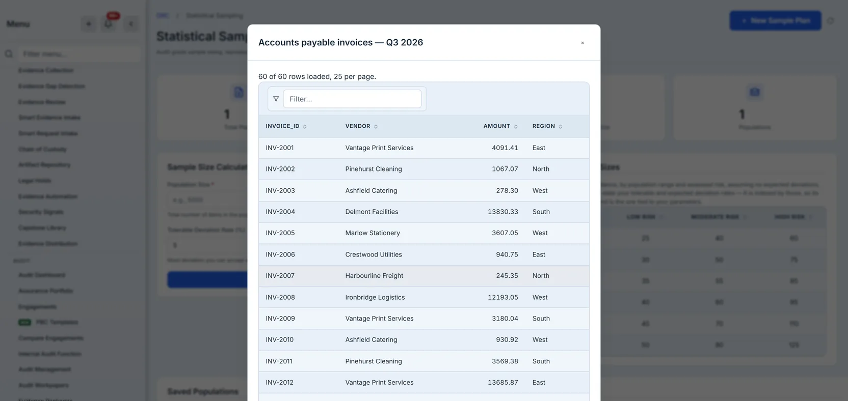
The first row is treated as the header, and those column names become the vocabulary for everything that follows — the Amount Column for monetary-unit sampling and the Stratum Column for stratified sampling are populated from your own headers, so the tool never asks you to map your data onto its idea of what a population looks like. Quoted fields, escaped quotes, embedded newlines, CRLF endings and a leading byte-order mark are all handled, because real exports from real systems contain all of them and a parser that chokes on a comma inside an address is a parser you will fight for an hour.
The import refuses rather than truncates. Above 50,000 rows it stops, names both figures — how many you brought and where the limit sits — tells you to split or filter the file, and says plainly that nothing was stored. That last clause is the one that matters: a population silently cut to a ceiling produces a sample that is statistically meaningless and looks completely normal, and a refusal that leaves you guessing whether half of it landed is barely better.
It is worth saying what the cap is not. It is not a judgement that 50,000 is enough for everyone; it is a limit on what can travel in one request and be stored as one record. If your population is larger, the honest move is to define it more tightly — this quarter rather than this year, this entity rather than the group — which is usually what an auditor wanted anyway, because a population you cannot describe in a sentence is a population whose sample nobody can defend.
What the population is is a decision, not an import
The tool samples the file you give it. That means the most consequential choice in the whole exercise happens before Talarity sees anything: what counts as the population.
If the control is “all privileged access grants are approved”, the population is every grant issued in the period — not every grant that still exists at year end, which quietly excludes the ones that were created and revoked in between, and those are exactly the ones most likely to have skipped approval. Populations defined by what survived are the most common way a defensible-looking sample tests the wrong thing.
Nothing in the software can catch that for you. What the software can do is record precisely which file you sampled, how many rows it held, and which rows came out — so that when someone asks the question in a year, the answer is a record rather than a recollection.
Then you choose how to draw.
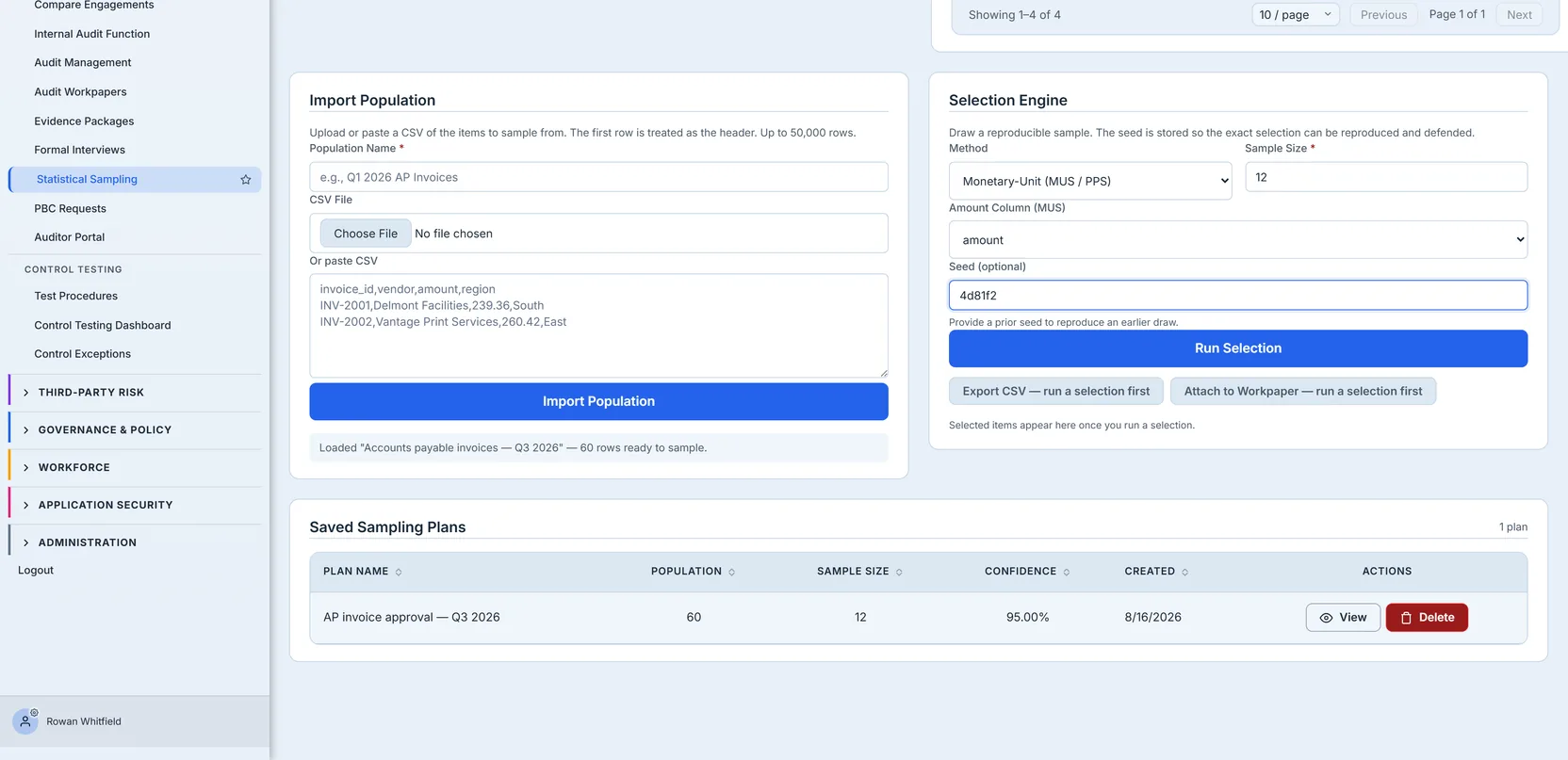
Four methods, and the choice is not cosmetic — each one is an argument about where the risk lives.
Random gives every item an equal chance. It is the right default when the population is homogeneous and you have no reason to believe failure clusters anywhere in particular. It is also the method with the least to explain: every item was equally likely, here is the seed.
Systematic takes every nth item, starting at a seeded offset inside the first interval. The interval is the population divided by the sample size, so a 1,000-row population and a 40-item sample steps every 25th row. Its advantage is coverage — the sample is spread evenly across the whole population rather than clumping by chance, which matters when the rows are in a meaningful order such as date. Its risk is periodicity: if the population has a repeating pattern that happens to align with your interval, you will systematically hit or miss it. Seeding the start offset rather than always beginning at row one is what keeps that from being reproducible in the bad sense.
Monetary-unit weights selection by value. Lay every dollar in the population end to end, step through them at a fixed interval from a seeded start, and select whichever item owns each dollar you land on. A £34k invoice is far likelier to be selected than a £2k one, because it occupies seventeen times more of the line — and a £2k one can still come up. This is the method you want when the risk is concentrated in the large items, which for most financial populations it is.
There is a failure mode worth understanding before you rely on it, because it does not look like a failure. The sampling interval is the population’s total value divided by your sample size. If a handful of items are enormous relative to everything else, that interval can exceed almost every remaining item — and then the walk lands on the same few giants repeatedly. The draw de-duplicates and tops up with the next-largest unselected items so you still receive the count you asked for, but those top-up items were chosen by size, not by probability.
The result is a sample that is perfectly reasonable as a high-value selection and is not what “monetary-unit sampling” means. Two invoices at £400k against fifty-eight under £2.5k will do it: you get the two giants and then simply the ten largest of the rest.
You do not have to spot this yourself. When a draw is part-composed that way, the results panel says so — how many items the value-weighted walk selected, how many were added as the largest remaining, and why — and the same figures are stored with the selection, so the question “was this really probability-proportional?” has an answer months later rather than depending on whether anyone noticed at the time.
The remedy is the one an auditor would reach for anyway: raise the sample size so the interval shrinks, or pull the outliers out and test them separately as a hundred per cent stratum.
Stratified splits the population by a column you nominate — region, business unit, vendor tier — and draws from each group. Allocation is proportional to each stratum’s size, and the rounding remainder is handed to the strata with the largest fractional shortfall, so the totals add up exactly to your sample size rather than landing one over or under. Use it when a small subgroup matters more than its size suggests, and a random draw could plausibly miss it entirely.
Monetary-unit sampling will refuse if the column you point it at holds no positive values. That is
deliberate, and worth dwelling on because the alternative is so tempting: the tool could quietly
fall back to a random draw and still hand you a result. It would look identical. The record would
say monetary_unit, the badge would say monetary-unit, and the sample would have been drawn with no
regard to value at all — so an auditor defending a value-weighted selection would be defending a
random one, with the product’s own record vouching for it. A refusal that names the column is
recoverable in seconds; a sample whose stated method is wrong may never be caught.
The seed is the point
Every draw records the seed that produced it.
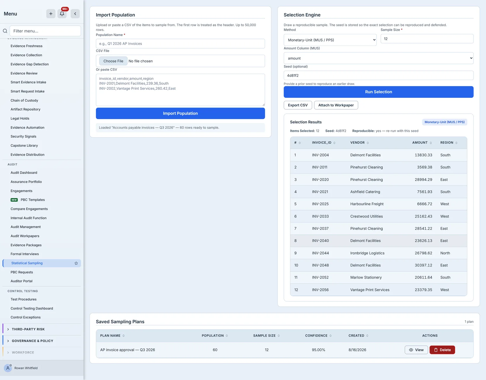
The same seed, the same population and the same parameters redraw the identical sample. That is why the generator is a seeded one rather than a cryptographically secure one — a CSPRNG is by design irreproducible, which is exactly the wrong property for evidence. Reproducibility is the claim, so reproducibility is what the implementation optimises for.
That makes the seed the smallest complete answer to “why these items”. Not a screenshot, not a spreadsheet someone kept — a value that regenerates the selection on demand.
It is worth being clear about what reproducibility does and does not prove. It does not prove the sample was appropriate: a badly chosen method reproduces just as faithfully as a good one. What it proves is that the selection was mechanical — that nobody looked at the population, chose thirty comfortable items, and wrote “random” on the workpaper. That is the specific accusation sampling documentation exists to answer, and a seed answers it completely.
The other property worth noticing is that reproducibility survives people. A seed does not depend on the analyst still working here, the browser session still existing, or anyone remembering what they did. Given the population and the seed, the draw regenerates for a stranger.
Census is a real answer
Ask for a sample at least as large as the population and you get all of it, recorded as a census rather than as a sample that happens to include everything. The distinction matters on the record: a census is not reproducible-by-seed in any meaningful sense — there is nothing to draw — and labelling it as a random draw of everything would imply a selection process that did not occur.
Finding it again
A record you cannot retrieve is not a record.
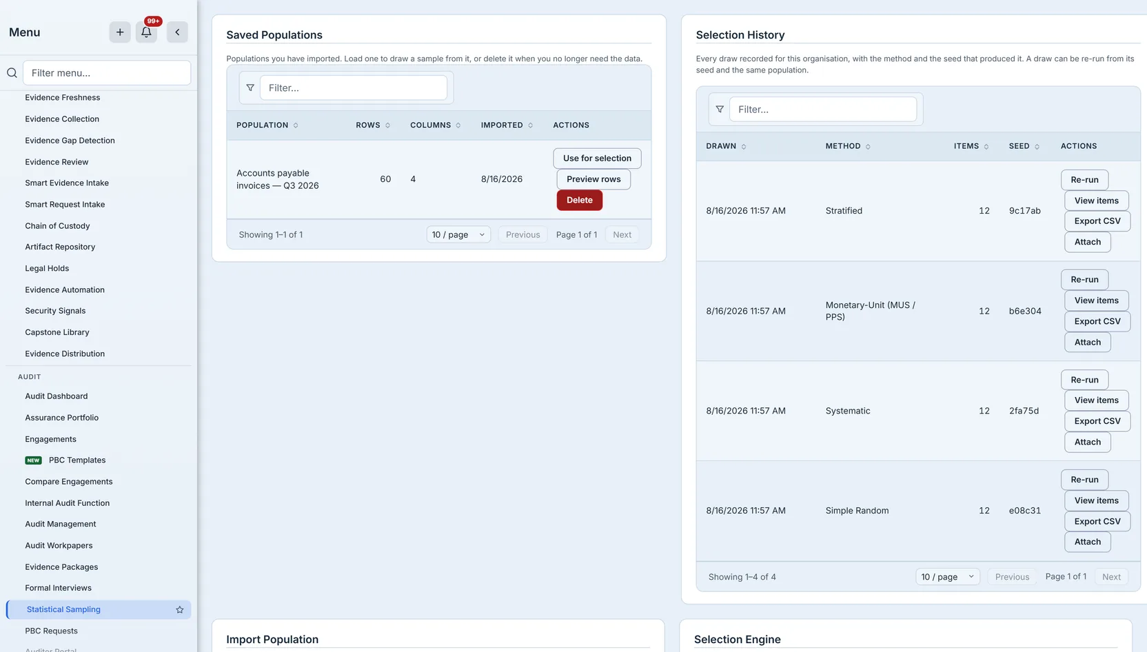
Every population you import stays listed, with its row count and columns. You can preview what is in it, draw from it again, or delete it when the data has served its purpose.
Deleting one also removes the draws taken from it, and the reason is structural rather than tidiness: a selection is stored as a list of positions into a population — row 4, row 17, row 302 — not as copies of the rows. Remove the population and those positions resolve to nothing. A draw left behind would still appear in the list, still show its method and seed, and be unable to produce a single item. That is worse than deleting it, because it looks like evidence.
So the delete asks first, tells you how many draws depend on the population, and removes both together when you confirm.
Why deletion matters more here than it looks
An imported population is a file of your customers’, employees’ or vendors’ actual records. The
import dialog’s own example is invoice_id,vendor,amount,region, and access-rights reviews are one of the things
people sample most often — so these tables routinely hold subject-identifiable data by design, not
by accident.
Data you cannot list is data you cannot govern. Data you cannot delete is data you cannot honour an erasure request against. Both of those are now ordinary operations on this page, and both are covered by retention policy rather than living outside it — selections age out on their own timestamp, and a population becomes eligible once no draw still references it, so retention cannot produce the orphans the delete path refuses to create.
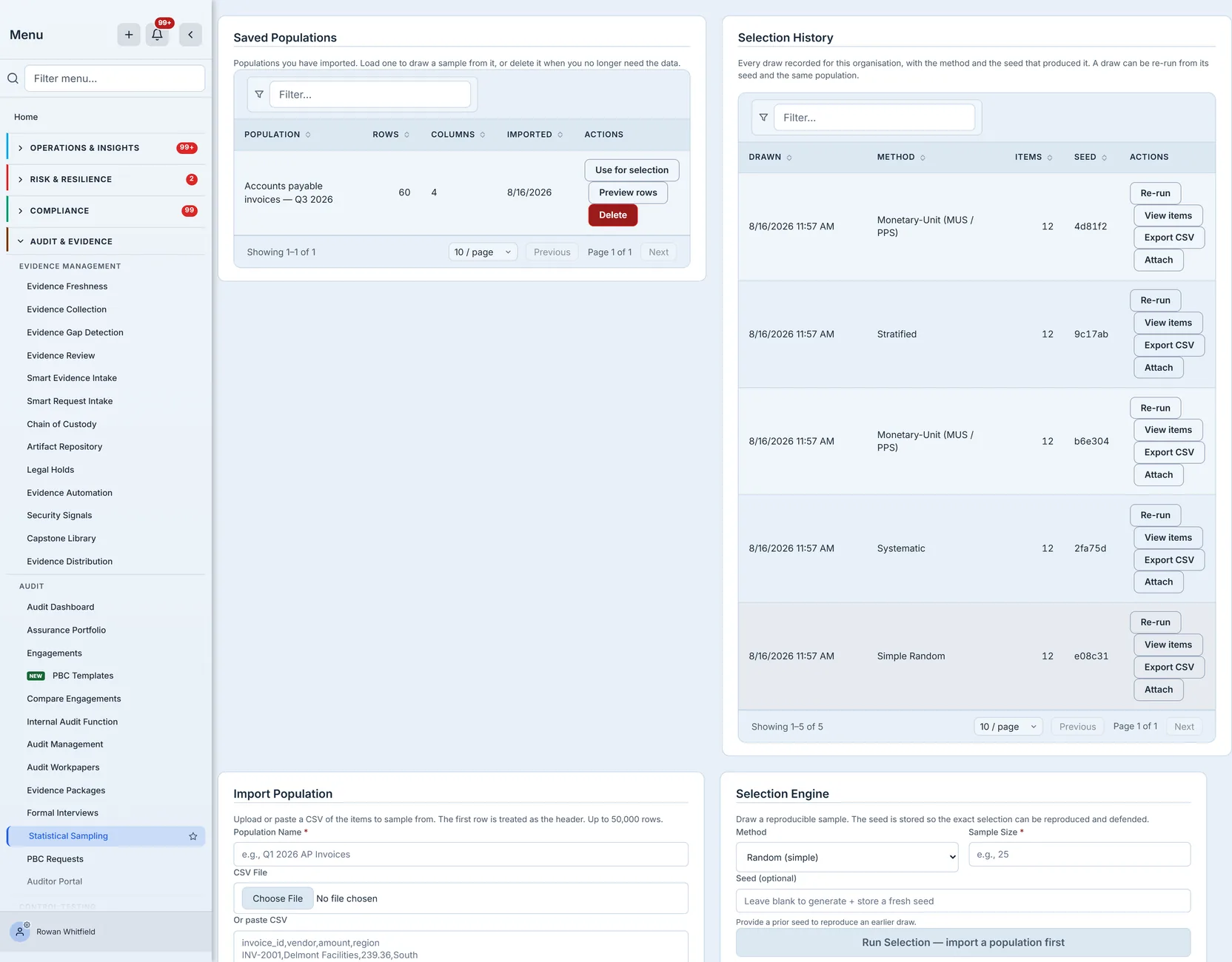
Every draw stays listed too, with its method and its seed in full on the row rather than a click away — the seed is the reproducibility claim, and a truncated seed is not a partial answer, it is no answer.
More to the point, a listed draw is usable rather than merely visible. View items opens the selection and resolves its stored positions back to the actual rows, along with the column it was weighted or grouped on; Export CSV produces the file; Attach files it against an audit workpaper; and Re-run loads the draw’s own parameters — population, method, seed, sample size — back into the engine, so the sentence at the top of the panel is a button rather than an instruction. All four work on any draw, not only the one you happen to have made in this browser session. That distinction is the difference between a history you can read and a history you can act on — and it is the one that decides whether “come back to it in nine months” is a real promise.
Because deleting a population takes its draws with it, that pairing should never come apart from anything you do on this page. It is still worth knowing what happens if it ever does: opening such a draw says so plainly instead of showing an empty table. The draw still happened; its method, seed and count are still the record of what was selected. Only the rows are gone.
Handing it over
The CSV carries a provenance block above the rows: which population, how many rows it held, the method, the seed, how many items were selected, when, and by whom. A sample that leaves the product as a bare list of records is indistinguishable from a list somebody typed. With the provenance attached it can be tied back to the draw that produced it, and re-performed by anyone who also holds the population file — the method, the seed, the column the draw was weighted or grouped on, and the population’s name and size all travel in the bytes.
That block is doing something specific. The moment a file leaves the product it loses every piece of context the screen was providing — the panel it came from, the parameters still visible in the form, the fact that it was a sample at all. Six months later the file is an attachment on a workpaper in a folder, and the only things a reader has are the bytes in front of them. Everything they need to challenge or confirm the work has to be inside those bytes.
The numbering deserves a note too. Each row carries a #, and that numbering matches what the
screen showed — the same item is item 4 in both places. That sounds trivial until a review comment
says “item 4 is missing an approval” and the two artefacts disagree about which record that is.
Deciding what the result means
Talarity draws the sample; it does not conclude for you, and the boundary is worth stating because it is where sampling tools most often overreach.
Once you have tested the items, the deviation rate you observed is compared against the tolerable rate you set at the start. If you tested 156 items expecting 1% deviations and found two, you are inside your expectation. If you found ten, you are not, and the conclusion is not “the control mostly works” — it is that the sample no longer supports the assertion you set out to make, and the next step is a larger sample or a finding.
That comparison happens in control testing, against the tolerance recorded on the test. The sampling page’s job ends at handing over a defensible draw — which is why the page reports no compliance figure at all. Nothing here knows whether the items passed, and a number invented from the draw alone would be the most dangerous thing on the screen. The tiles across the top report only what the page actually holds: plans, draws, populations, and the average population size recorded on your saved plans. Each one opens the records behind it, and where there is nothing to average yet the tile says so with a dash rather than a zero.
Attaching it to the test
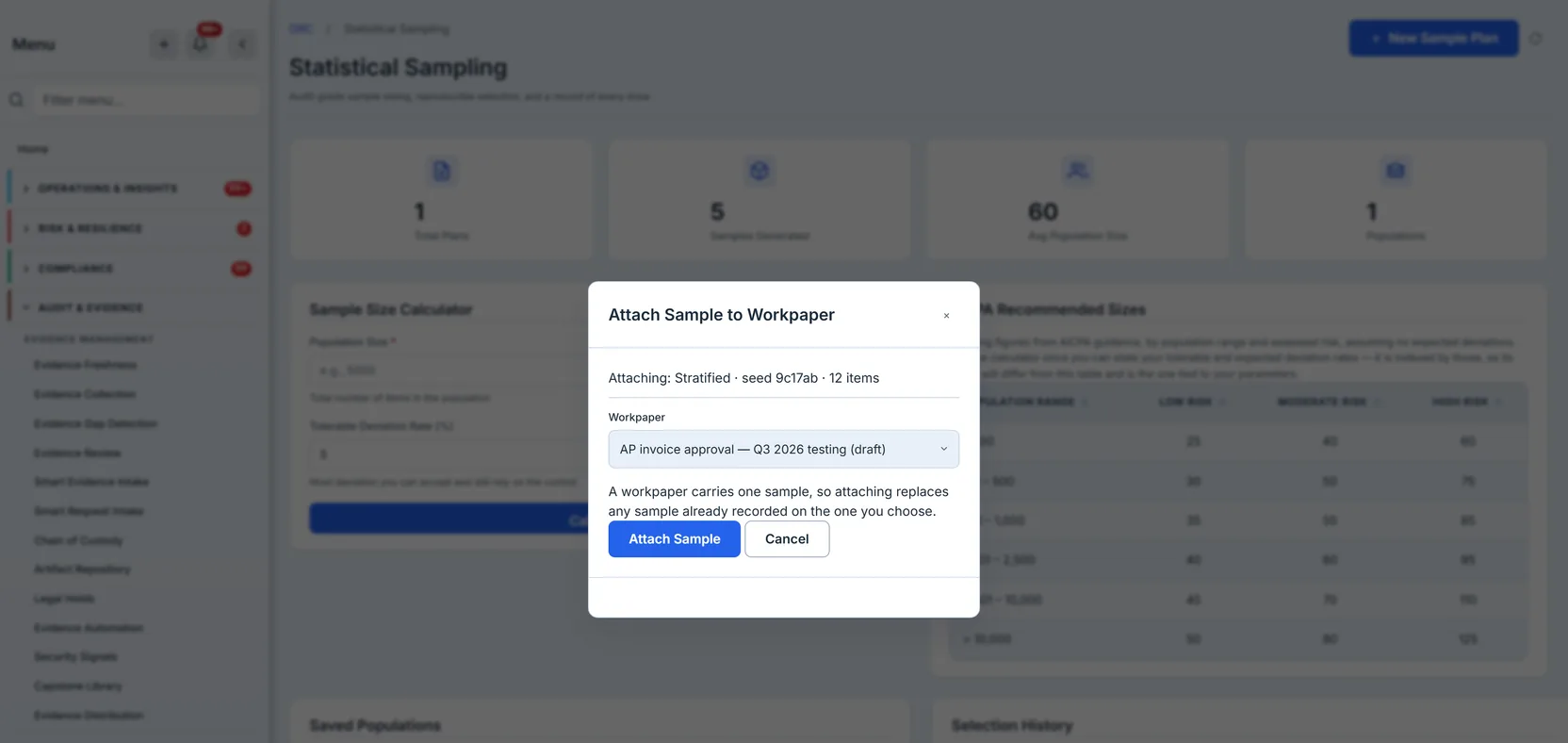
A selection can be attached to an audit workpaper, which freezes the draw against the test it supports. The attach writes the whole reproducibility record onto the workpaper — selection id, method, seed, parameters and the selected positions — plus the sample and population sizes as typed fields, so the workpaper carries its own evidence rather than a pointer to something that might change.
Any recorded draw can be attached, not only the one you just made. Attach sits on every row of Selection History beside View items and Export CSV, which matters more than it sounds: the draw you need to file against a test is frequently one from last month, made by someone else, and a sample you can only attach in the browser session that produced it is a sample you will end up re-drawing. If you have no workpaper yet, the picker says so and links to the screen that makes one — the draw is already recorded, so you attach it from its row whenever you come back.
It refuses in three cases, and each refusal is worth understanding because they are different kinds of “no”:
A finalized workpaper is closed. Attaching to it would alter a record someone has already concluded on, so the refusal tells you to supersede it with a new version instead — which is a real workflow, not a dead end.
A superseded workpaper has already been replaced. Attaching to it would put evidence on the version nobody reads.
A signed version is the strictest. Sampling coverage is part of what a signer attested to, so changing the sample size on a signed workpaper from another screen would silently alter the claim they put their name to. This one is worth calling out because the path is not obvious — it is reached from the sampling page rather than the workpaper, and a freeze enforced only on the workpaper’s own edit screen would have missed it entirely.
Attaching a second selection replaces the first. That is deliberate — a workpaper documents one sample for one test — but it is worth knowing before two people work the same engagement.
The whole thing, once through
Concretely, with the numbers from the frames above.
The control is “every accounts-payable invoice above the approval threshold carries a documented approver”. The period is Q3. You export the invoices — 60 of them — with the invoice id, the vendor, the amount and the region.
Size it. You can tolerate a 5% deviation rate and you expect around 1%, at 95% confidence. The calculator answers 156 against a population of 5,000. Your population is 60, so the finite-population correction brings it down, and in practice you are testing a large fraction of a small population — which is itself worth knowing before you start, because it means this control’s assurance is coming from coverage rather than from statistics.
Import it. Paste or upload the CSV. The header row becomes the column vocabulary: invoice_id,
vendor, amount, region.
Choose the method. The risk here is concentrated in large invoices, so monetary-unit sampling is
the honest choice — weight the draw by value. Point the Amount Column at amount.
Draw. Twelve items spanning about 3,600 to about 30,400, and their shape is the method working: the four largest invoices in the whole population are all in the sample, and mid-sized ones still appear alongside them. That is what weighting by value buys, and it is also what it costs — the smallest invoices in the population are the ones least likely to be tested, which is a deliberate trade and worth saying out loud rather than discovering later. A random draw would have spread the risk evenly and left the large items to chance.
Test them. This part is not in the tool. You pull the twelve invoices and check each for a documented approver.
Record it. Export the CSV — it carries the population, method, seed, count, date and author above the rows — and attach the selection to the workpaper for that control test, which freezes the draw against it.
Nine months later, someone asks why those twelve. The answer is in three places that agree: the selection history row with its method and seed, the CSV in the workpaper, and the ability to re-run the draw and get the identical twelve.
Where the feature ends
The population is a file you bring. Talarity samples what you import; it does not yet read your controls, users or change records directly to build a population for you.
Test results live elsewhere. The page records the draw, not the outcome of testing each item. Nothing here can say whether the sampled items passed, so the page reports no compliance figure at all rather than showing a tile with nothing behind it.
A draw cannot yet be cited on a control test from any screen. This is the gap most worth knowing, given the title. The plumbing exists on both sides — a control test will take a selection id and read its size, method and seed from the real draw — but no screen sends one, so today the connection between “here is a defensible sample” and “here is the control test it supports” is made by attaching the selection to that test’s workpaper rather than by the test citing the draw.
A sampling plan cannot be edited. View and delete are the only row actions; correcting a typo in a plan name means deleting and recreating it, which loses the created date. There is no owner beyond who created it, no due date, and no status that moves.
A draw cannot be deleted on its own. Selections go when their population goes, or when retention ages them out. There is no per-draw delete.
Per-stratum allocation is not exposed. The engine accepts an explicit allocation per stratum, capped at what each holds, but the page only sends the stratum column — so proportional allocation is what you get from the UI.
A plan and a draw are separate records. A saved sampling plan captures the parameters you intend to sample under — population size, sample size, confidence, a note about scope. A selection captures what was actually drawn. They are useful for different things: the plan is the thing you agree with a reviewer before fieldwork, the draw is the thing you defend afterwards.
Linking a specific draw to a specific plan is not yet wired, so a plan does not show its draws and a draw does not name its plan. In practice you carry the connection in the naming — a plan called “AP invoice approval — Q3 2026” beside a population called “Accounts payable invoices — Q3 2026” — which works and is not the same as the product knowing.
No place to record per-item results. Marking each drawn item pass or fail is the step that turns a drawn sample into a tested one, and it happens in control testing rather than here. Until it exists on this page, the loop from “here is the sample” to “here is what it showed” closes somewhere else.
Attaching to a workpaper needs the Audit Workpapers feature. Sampling and workpapers are two separate entitlements, so an organisation can hold one without the other. Attach checks before it opens anything: if the feature is not in your plan it says so by name and points you at the CSV export instead, rather than opening a picker that then fails to load. The draw stays recorded either way.
What you walk away with
A sample size that agrees with the standard it cites. A draw made by a named method against real rows. A seed that regenerates it. A file that explains itself once it leaves the building. And a list you can come back to in nine months when somebody asks why those twelve invoices.