Every security program has a version of the same document: the slide with this year’s initiatives on it. It gets rebuilt by hand before each leadership meeting, it disagrees with the tracker the team actually uses, and its status colors reflect whoever edited it last. Talarity’s Strategic Roadmap (/app/grc/roadmap) replaces that slide with the live portfolio itself — the same initiative records your team executes against, presented for the planning conversation.
That “same records” point matters, so here is the boundary up front: initiatives are managed in depth on the Initiative Management page — milestones, linked risks, budgets, deletion all live there. The Strategic Roadmap is the portfolio lens over those records: summary cards, a sortable list, and a timeline ordered by target date. Two pages, one truth.
Who’s involved
- The program owner maintains the portfolio: creates initiatives, keeps status honest, moves dates that slipped.
- Initiative owners — each initiative names one accountable person, because an initiative without an owner is a wish.
- Leadership reads the summary cards and the timeline quarterly, and drills into whatever looks off.
The portfolio at a glance
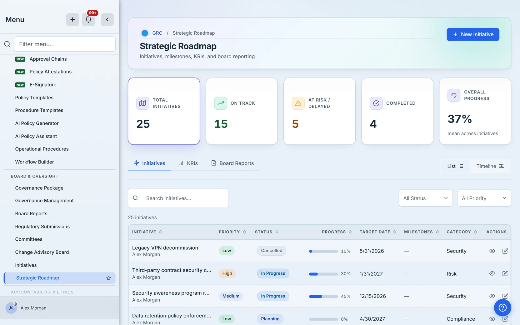
Five cards summarize the portfolio: total initiatives, on track, at risk or delayed, completed, and overall progress. In the walkthrough org that reads 25 total — 15 on track, 5 at risk or delayed, 4 completed. Sharp-eyed readers will notice those buckets sum to 24: the three status cards count only the active lifecycle, and the remaining initiative is a cancelled one, which the total honestly includes without inventing a bucket for it.
The overall-progress card averages percent-complete across the portfolio — 37% here — and shows an em dash, not a fabricated 0%, when nothing is measured yet.
Every number is a door
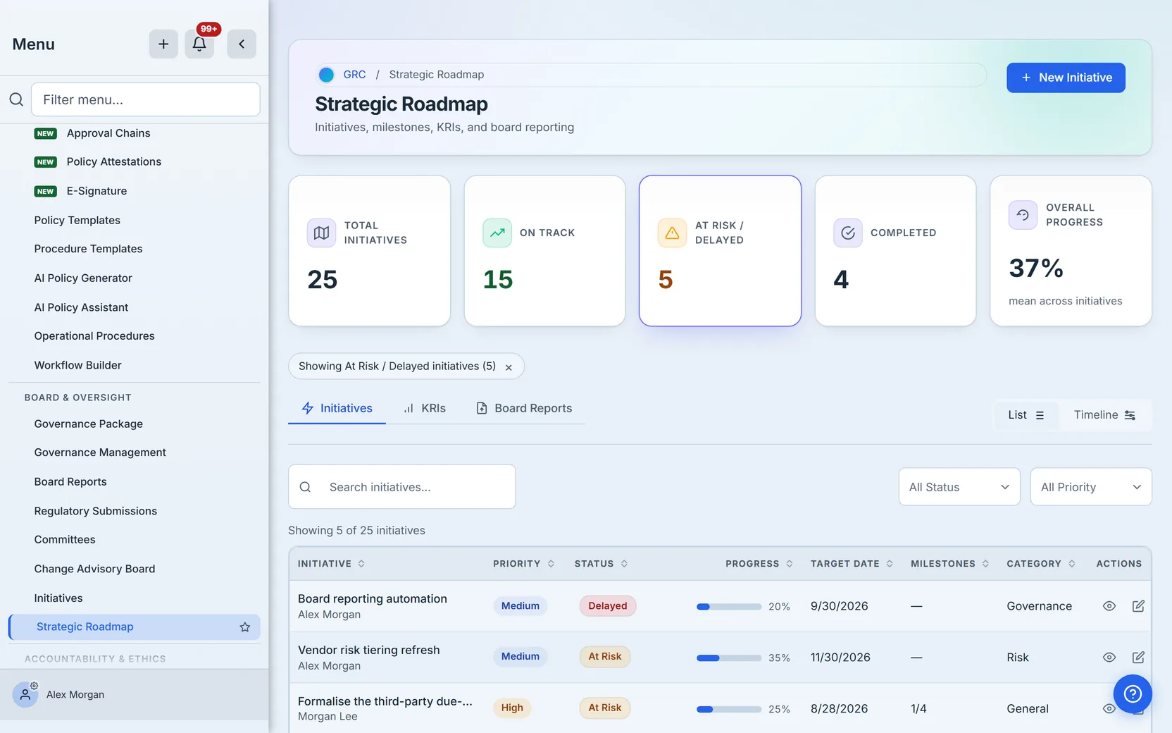
Click any of the four count cards — total, on track, at risk or delayed, completed — and both the list and the timeline narrow to exactly the rows that card counted, same status buckets, one answer regardless of view. A chip names the active filter and clears with one click. (The overall-progress card is the one number that isn’t a door: it’s a mean, so there are no rows behind it to show.)
Filters that compose
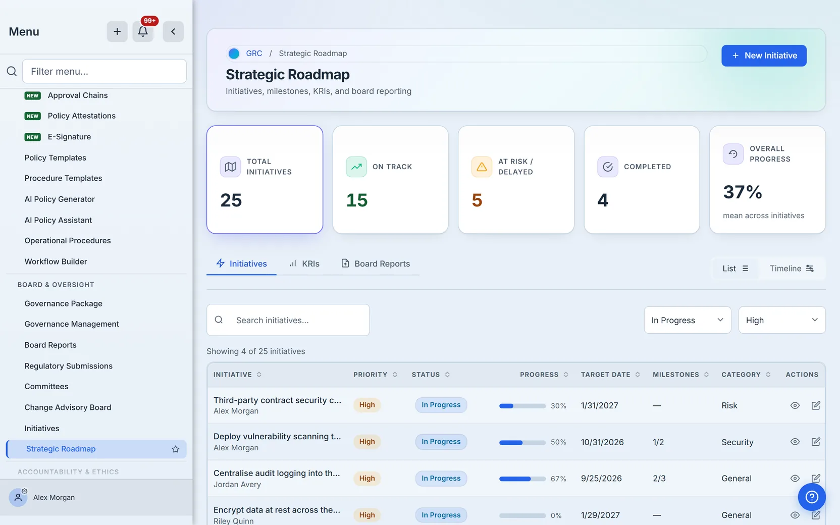
Search, the status and priority dropdowns, and the card drills all compose — each narrows the same set, in the same order, for both views. A count line above the table always says how many of the portfolio you are looking at, so a short list never masquerades as a small program.
The list is the worklist’s summary
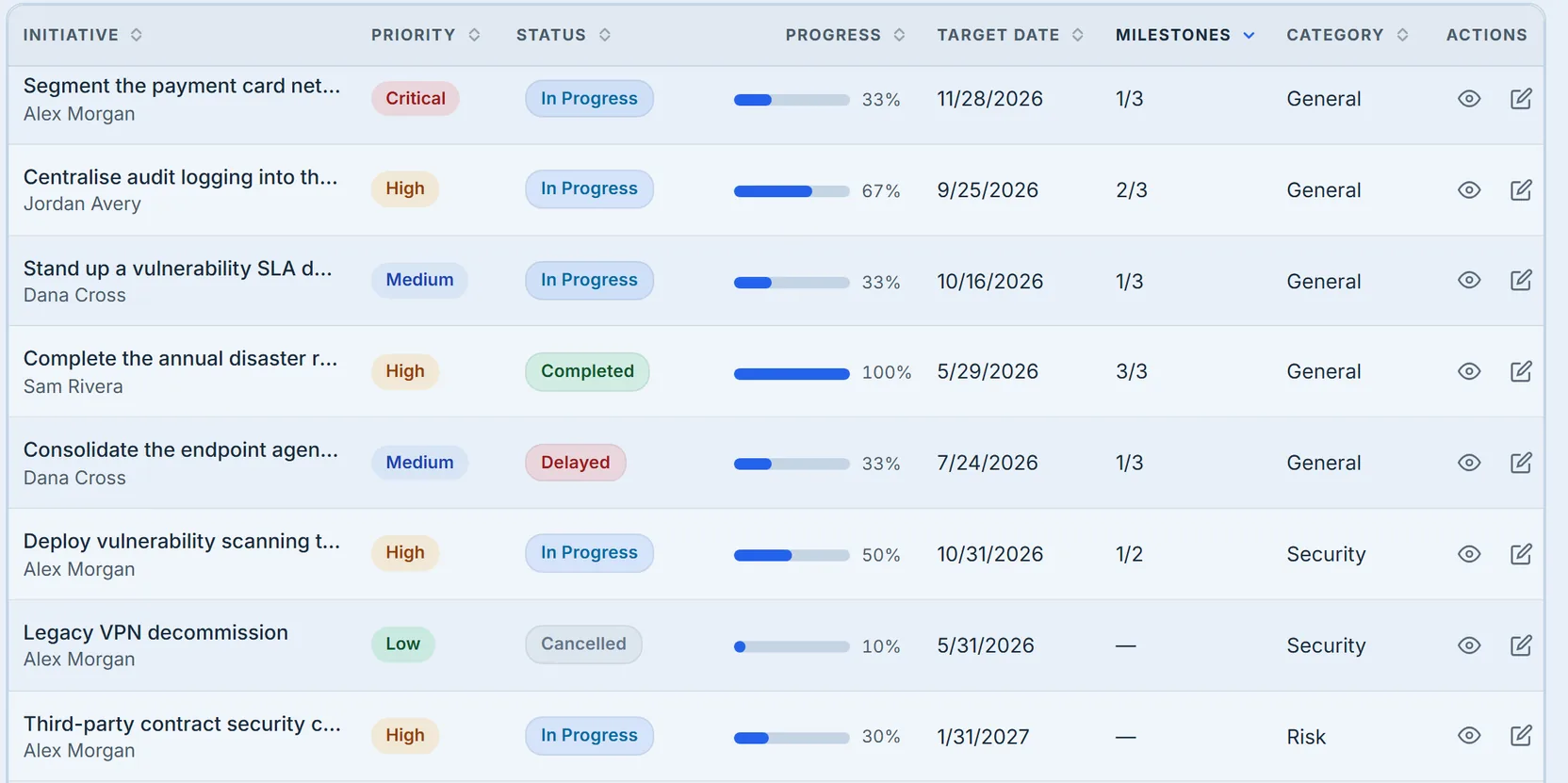
The Milestones column reads completed-of-total, rolled up automatically from Initiative Management. An em dash means no milestones are defined yet — deliberately distinct from 0/N, the same honesty rule the progress column uses.
The timeline is where scheduling conflicts become visible
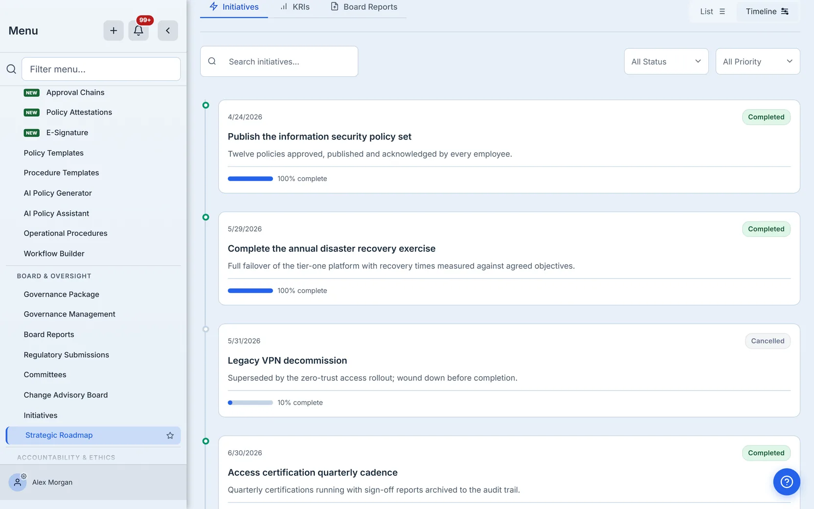
Switch to the timeline and the portfolio orders itself by target end date. Clusters of end dates in the same month are your scheduling conflicts; gaps are your slack. The card drills and filters apply here identically.
Creating an initiative
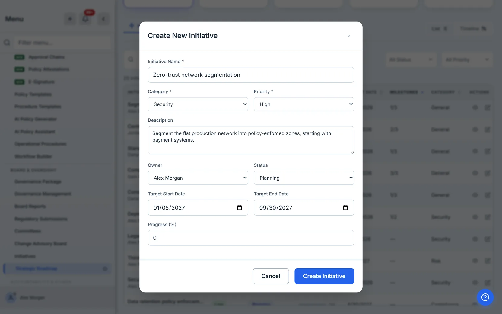
New Initiative opens a single form: name, category, priority, a description worth reading in a year, the owner (picked from your org’s members, not typed — an initiative accountable to a free-text string is accountable to nobody), status, the target window, and starting progress.
The status vocabulary is deliberately small: Planning, In Progress, At Risk, Delayed, Completed. The distinction that matters in practice is At Risk versus Delayed — At Risk means the target date still stands but you no longer believe it without intervention; Delayed means the date has already slipped. Marking something At Risk early is the whole point of the portfolio view: it is the status that starts conversations while there is still time to act on them.
The detail view — and the door to the depth
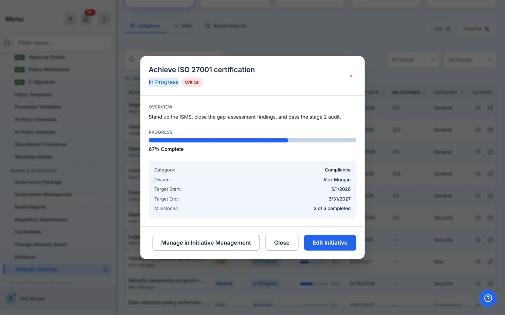
Click any row and the initiative opens in place: plain-language status and priority, the owner, the target window, the description, and the milestone rollup as “N of M completed.” At the bottom, Manage in Initiative Management is the door to the depth — milestones themselves, linked risks, budget tracking, and deletion all live on that page. The roadmap shows you the state; the management page is where you change the structure.
Editing in place
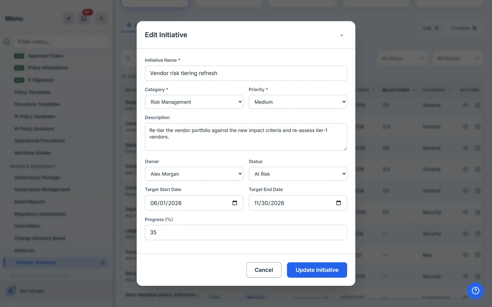
Edit opens the same form, prefilled. The common weekly motion is two fields: progress and status. If your status review takes more than a few minutes per initiative, the initiatives are too big — split them in Initiative Management until each one can be honestly assessed in a sentence.
Finding things
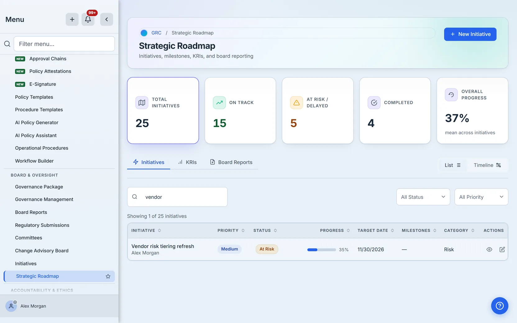
Search matches titles and descriptions as you type, and the count line reports exactly what the query kept. Because search composes with the status and priority filters, “everything about vendors that is currently at risk” is one search plus one dropdown, not an export to a spreadsheet.
Before anything exists
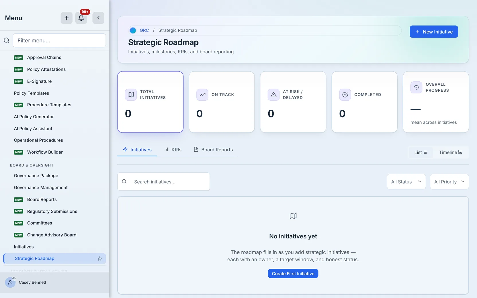
An empty roadmap says so and offers the create door — for users with the manage permission. Read-only users see the portfolio without the mutation affordances; the page resolves risk.initiative.manage before it renders a single button, so nobody discovers their permission level via an error dialog.
The doors to KRIs and board reporting


Two tabs are deliberate doors rather than embedded features: KRIs and board reporting each have a full page of their own, and the roadmap points to them instead of duplicating them. If you are building out board reporting, start with the board reporting cycle — it picks up exactly where that tab hands off.
What you walk away with
One portfolio instead of a hand-rebuilt slide. Status words with agreed meanings, marked early enough to act on. A timeline ordered by real target dates, so scheduling conflicts surface themselves. Milestone counts that roll up from where the work actually happens, and an em dash wherever nothing is measured yet — the roadmap never invents a number to look complete.
And the two-page split holds the whole thing together: the Strategic Roadmap is for the conversation, Initiative Management is for the execution. When leadership asks “how is the program going,” you open the page your team already keeps true — because it is the same page.