Ask a partner how the Calder Mutual readiness review is going and you will get a good answer. They will know which areas are weak, who is slow returning evidence, and whether the readout will hold. Ask them what their readiness practice is like and the answer gets vaguer — not because they know less, but because it is a different kind of question. The first is a fact about one engagement and lives on one page. The second is a fact about all of them and lives nowhere in particular.
That gap has a cost, and it is not the one people expect. It is not that the firm lacks data: every score is recorded, every case file is current, every engagement is documented. It is that the pattern across the engagements never gets assembled, so it never gets noticed. A scope area that is weak on one client is that client’s problem and gets fixed on that client’s page. The same area weak on most of your clients is a different observation entirely — about the sector you sell into, about the maturity of the market, and possibly about the advice you have been giving — and nobody meets it, because meeting it requires reading fourteen case files in one sitting and holding them in your head.
Compare Engagements (/app/engagements/compare) assembles it. It ranks your own engagements against
each other on one instrument, names the areas that fall short across the most engagements, and
separates out the shortfalls already close enough to their target that a quarter of work would
close them.
It is your book of work and nobody else’s. No other firm’s clients appear here, and nothing is anonymised, because there is nobody to anonymise it from. That is worth stating plainly because the platform does run an anonymised cross-firm comparison, with a k-anonymity floor and suppressed cohorts, and it is a different feature reached from a different page. This one is just your book, sorted.
Where the numbers come from
Nothing on this page is entered here. The scores it ranks are the scope-area maturities recorded on each engagement’s case file, either by a consultant recording a judgement or written back by a completed assessment run. If you have not read Running a client engagement, that is where the scoring happens and where the vocabulary — assessed, scored, complete — is defined.
This page adds no new judgement. It aggregates the ones already made, which is exactly why its correctness rests on refusing to aggregate things that are not comparable.
The instrument is the premise, not a filter
The first control on the page is a dropdown holding the six engagement types — the page calls this the instrument, because it is the thing an engagement was measured with. It is the premise of everything below it. The page arrives pre-set to one; what it will not do is blend two.
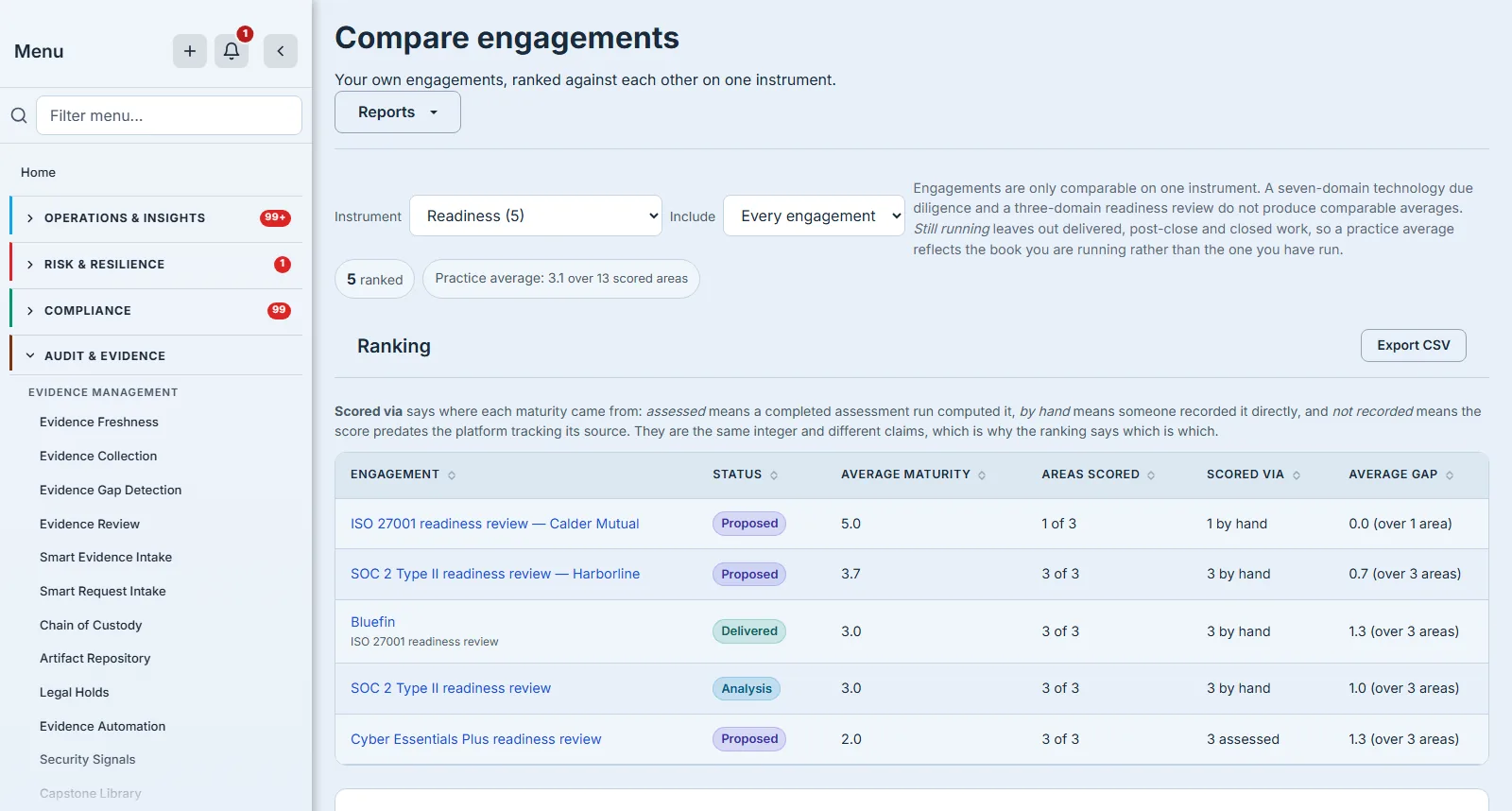
Engagements are only comparable when they were scored against the same scope areas. A technology due diligence runs across seven or eight domains; a readiness review runs across three. Averaging those together does not produce a blended view of your practice — it rewards the narrow engagement for having been narrow, because a three-area average is computed over the three areas somebody chose to look at.
So the page will not guess. The backend refuses a request that does not name an instrument, rather than defaulting to one and producing a number that looks like a comparison and is not one.
The counts come back with every response, including an empty one, so the picker tells you how many engagements each instrument holds.

That count is doing more work than it looks. Without it, a firm that runs no technology due diligence opens the page on an empty state every single visit, with its real book one dropdown away and nothing saying which entry to choose. The only honest instruction in that situation is the list itself.
The instrument you choose goes into the address bar, so the comparison you are looking at is a link you can send. A partner asking “have you seen where our readiness work is sitting?” should be able to paste a URL rather than describe a dropdown position.
When you have one engagement, or none
The page is honest about being early. One engagement on an instrument produces a ranking of one, and every figure on the page is then a fact about that single engagement rather than about a practice — which the page states rather than disguises, down to a shortfall list that says “short on 1 engagement”.
A comparison starts being worth reading at three or four engagements on the same instrument. Below that you are looking at a list, and the case files are better.
When an instrument holds nothing at all, the empty state names the instruments that do hold work and links to them, rather than telling you to keep looking.
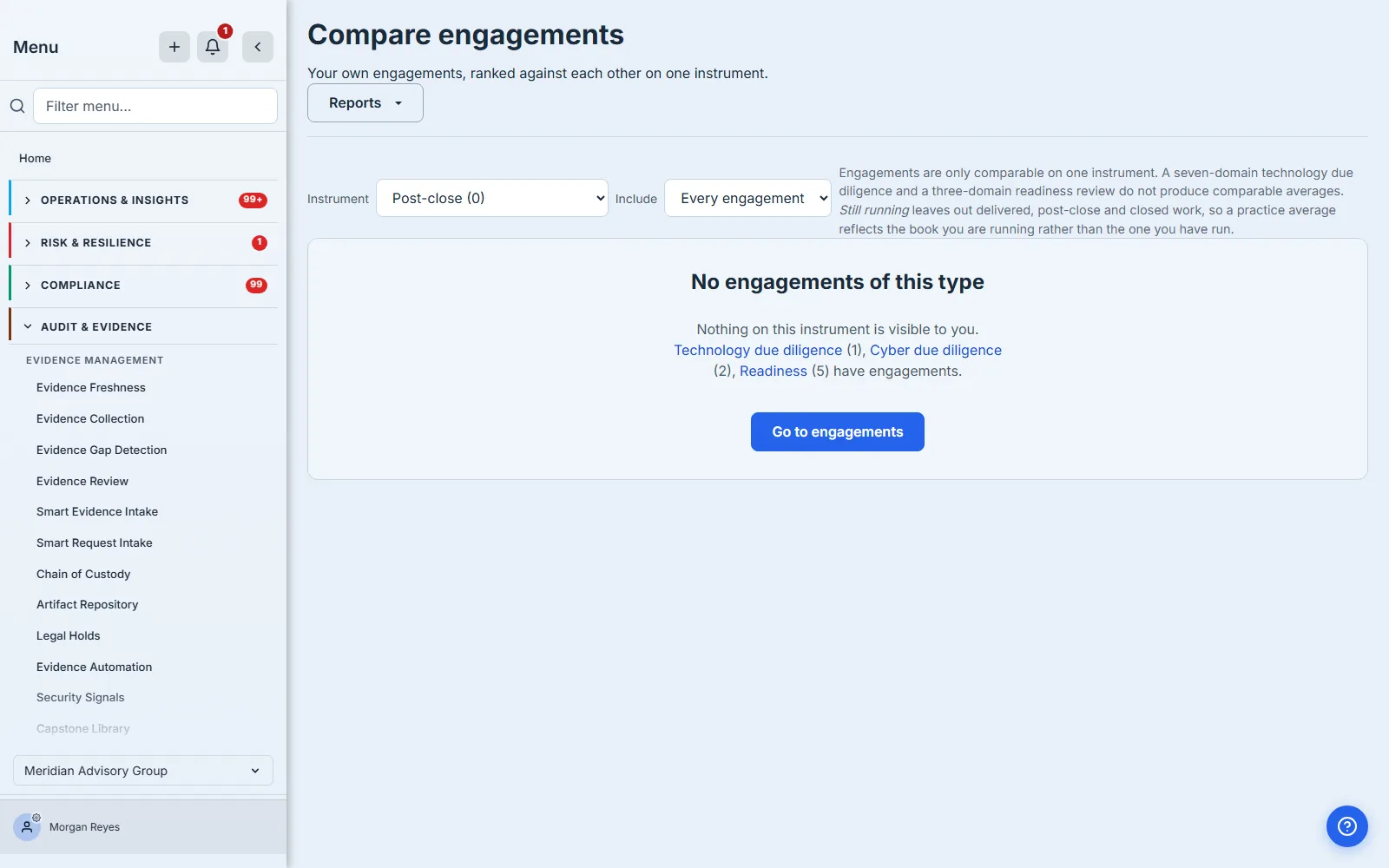
Those are links, not a list to read and act on manually — the difference between a dead end and a route. And the wording is careful about something the page cannot know. “Nothing on this instrument is visible to you” is not the same claim as “your firm has none”: a partner scoped to two clients sees only their work, and the page has no way to tell those two situations apart. So it declines to claim either, and says which one it is describing. A partner told their firm runs no readiness work, when in fact they are scoped to two clients, has been misinformed about their own organisation.
What the ranking says, and what it refuses to say
Six columns. Two carry the numbers, two exist to stop you misreading them, and the other two name the engagement and say where it is in its lifecycle.
Average maturity is the mean of the scored areas on that engagement. Areas scored is how many areas that mean covers, out of how many exist. Areas scored is not decoration: 3.8 over two areas is not better than 3.2 over seven, and nothing else on the row tells you which you are looking at. An engagement scored on two of eight areas will sit high in the ranking early and drift as the rest are scored — the coverage column is what makes that predictable instead of surprising.
Average gap is the distance to target, and it carries its own denominator separately, because it is not the same denominator. A gap can only be computed where an area has both a current score and a target. An engagement can be fully scored and still have targets on only some of its areas, so “areas scored 7 of 7” beside a gap computed over two is a real state, and the column says so.
A gap measured against a missing target would read as no gap at all — the most reassuring possible
way to be wrong — so where nothing carries a target the cell reads — rather than zero.
Scored via is the column that makes the ranking defensible.
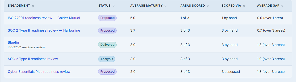
A maturity a person typed and a maturity a completed assessment computed are the same integer and different claims. This page’s whole premise is that only like-for-like scores may be ranked — it refuses to rank across instruments for exactly that reason — so ranking a computed 4 against a typed 4 without saying which is which would be the same error one level down.
There are three states, not two — though only two of them can be photographed. Scores written before the platform recorded provenance at all carry no source, and that is reported as not recorded rather than being guessed into one of the other two. That third state is legacy by definition: it belongs to rows that predate the column, so a firm starting today will never create one. An unrecorded source is not evidence of either origin, and a record that quietly picks the more flattering interpretation is worse than one that admits the gap.
Neither source is the “right” one. A partner’s judgement after three weeks on site is frequently better evidence than a questionnaire, and a questionnaire is frequently better evidence than a partner’s recollection six weeks later. What matters is that a ranking mixing them says so, because the person defending the ranking will be asked.
The practice average, and why it is not the average of the averages
The chip above the table reads Practice average, and it is the most easily misread number on the page — which is why it carries its coverage in the chip itself.
The obvious way to compute it is to take each engagement’s average and average those. That is wrong, and it is wrong in the direction that lets the narrowest engagement move the firm’s number as far as the broadest does. An engagement scored on one area would move the firm’s headline figure exactly as far as one scored on seven, so a single early-stage engagement with one optimistic score can lift the practice average of a whole quarter.
So it is weighted: the mean across every scored area in the ranked engagements, not the mean of the per-engagement means. An engagement that has been assessed broadly counts for more than one that has barely started, which is the only reading that survives a challenge.
The chip states how many scored areas the figure covers, for the same reason every other average on the page does. A practice average over forty scored areas and one over three are different kinds of claim, and the number alone cannot tell you which you have.
When nothing is ranked, the chip reads —. Not zero. A firm whose engagements are all still being
scored has no practice average, and a zero there would read as a very bad quarter rather than an
early one.
Reading a row properly
The ranking in the first screenshot is led by an engagement with an average maturity of 5.0 — the highest score the scale carries. Read the next column and the picture changes: 1 of 3 areas scored.
That is not a strong engagement. It is an engagement where one area has been assessed, that area happened to be strong, and the other two have not been looked at yet. Its average is real, correctly computed, and almost certainly going to fall. A partner who quotes it as their strongest engagement is quoting a sample size of one.
The row beneath it reads 3.7 over 3 of 3, with an average gap of 0.7 across all three areas. That is a fully scored engagement, close to its targets — and by any reading that matters it is in better shape than the 5.0 above it.
The ranking sorts on the average, because the average is what a ranking is. It does not hide the rest: coverage sits in the very next column precisely so the top of the list can be interrogated rather than trusted. Where two engagements do tie on the average, the more broadly assessed one wins, so a narrow engagement never outranks a thorough one on equal numbers.
This is also why the practice-average chip reads lower than the figure you would get by averaging the column yourself. Weighted across every scored area it comes to 3.1; averaging the five per-engagement figures instead gives 3.3. The difference is that the row contributing a single area is counted as one area rather than as one engagement — and 3.3 is the number a reader would reach with a calculator and the column in front of them, which is exactly why the chip publishes what it was computed over.
An unscored area is not a zero, and an unscored engagement is not last
This is the rule the whole page is built on, and it is worth being explicit about because the alternative is so tempting.
If an unscored area counted as zero, an engagement that started last week would sink to the bottom of the ranking and read as your worst client. It is not your worst client. It is your newest one. Absence is never scored as zero here — the same rule the enterprise gap analysis applies to linked accounts that have never been assessed.
The consequence is that some engagements cannot be ranked at all, and those are listed rather than dropped — up to the ceiling described further down.
Every readiness engagement in this firm’s book happens to be scored, so its “Not in the ranking” list is empty. The frame below is therefore the technology due diligence instrument, where a recently opened engagement has not been scored yet — the same page, the same list, one option across in the picker. Note what an instrument with nothing ranked shows: a dash for the practice average rather than a zero, and the export still offered, because that is the case where the file carries more than the screen does.
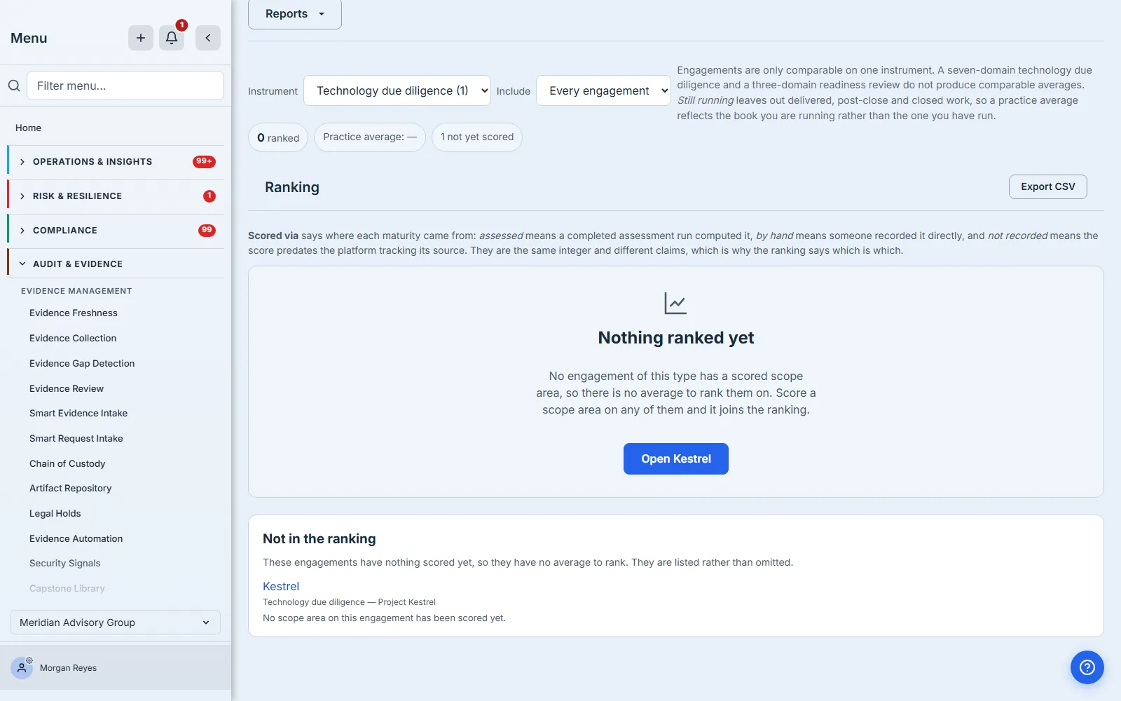
Each carries its reason, and the page distinguishes two: no scope areas have been defined yet is a different situation from scope areas exist and none has been scored. The first is a scoping conversation, the second is a diary problem. The engagement above is the second kind.
A ranking that quietly omits work is one you cannot check. “We ranked eleven of your fourteen” and “you have eleven engagements” are different statements, and a partner scanning a leaderboard has no way to tell which one they are reading unless the page says.
Note what this list is not. It is not a coverage gap — every engagement here is live work with a client and a team. Unscored is not uncovered. The blind spots in your client base are a different question, answered on a different page.
The two lists below the ranking answer different questions
They look similar. The difference between them is the point of having both.
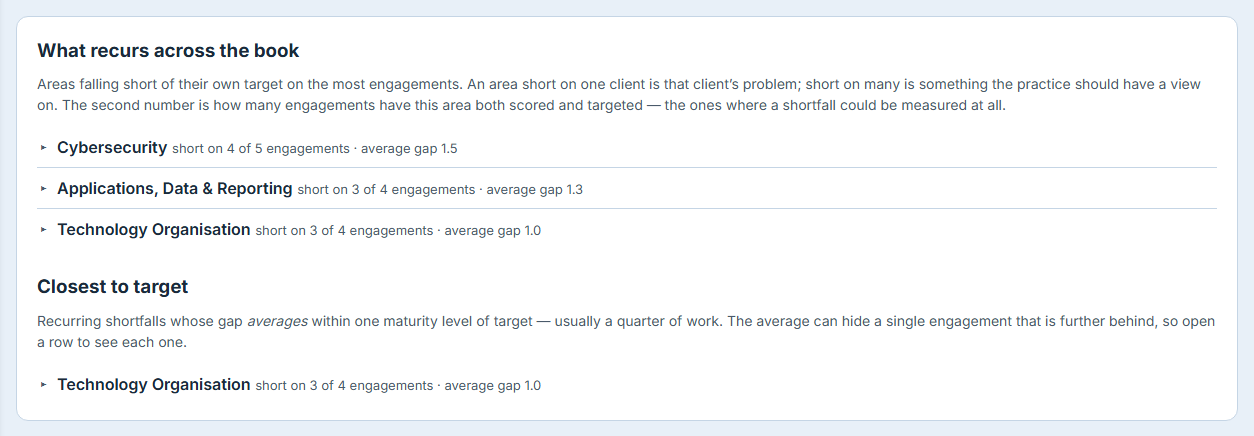
What recurs across the book is about how many. An area short on one client is that client’s problem. An area short across most of the book is something your practice should have a view on — about the market you serve, about the maturity of the sector, and possibly about the advice you are giving.
Closest to target is about how far. These are shortfalls already within one maturity level of their target, ordered so the ones affecting the most engagements come first — the work a quarter could realistically close. The band is one full maturity level, and it is fixed: a narrower one would surface only shortfalls already effectively closed, and a wider one would stop meaning “close”. It is not a per-firm setting, which is worth knowing before you plan a quarter around it. Note that it applies no minimum: an area short on a single engagement can appear here, and the count beside it is what tells you so.
An area can be prominent in the first list and absent from the second — short everywhere and short badly. That is the combination worth a practice conversation, and it is legible only because the two questions are asked separately rather than sorted into one list twice.
Both counts carry their denominator, for the same reason every average on this page carries its coverage: “short on four engagements” is not a practice-level finding until you know whether four is out of five or out of forty. The second number is the engagements where that area is both scored and targeted — the ones where a shortfall could be measured at all — and the page says so rather than leaving you to assume it means your whole book.
And every row opens. Click one and the engagements behind it are named, worst gap first, each linking to its case file. A recurring shortfall you cannot attribute is a shortfall nobody owns, and the whole point of naming a pattern is being able to act on the particular pieces of work that make it up.
When either list is cut at its cap, it says how many it is showing out of how many exist. A bounded list that does not say it is bounded has a specific failure mode that is worse than being long: it looks complete. Ten rows and no note reads as ten recurring shortfalls, not as ten of twenty-seven.
Turning a shortfall into work
Reading that cybersecurity is short across four of your five readiness engagements is the point of the page, but it is not the end of the job. Opening a row lists the engagements it is short on, and the same disclosure offers Draft a recommendation on the ones it has listed — the button names how many, so on a long list you are acting on the twenty-five shown rather than on a number you cannot see.
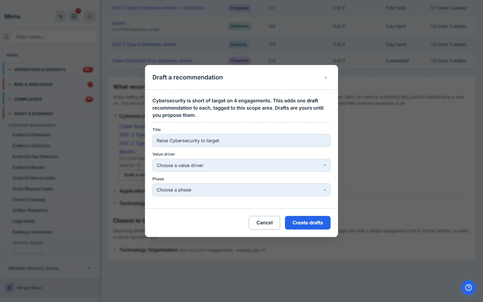
It writes one draft recommendation onto each of those engagements, tagged to the scope area it came from, so the recommendation is traceable to the comparison that produced it rather than appearing on a deck from nowhere. Drafts stay yours: nothing reaches a sponsor until you propose it from the engagement itself, which is the same rule the single-recommendation path follows and the reason a bulk action here does not skip it.
Two details worth knowing before you use it. It asks for the value driver and the phase rather than choosing them for you — every investment summary sums over that pair, so a guessed value would land a dozen rows in a bucket nobody picked while the totals still added up. And running it twice does nothing the second time: an engagement that already carries a recommendation for that scope area is skipped, and the confirmation tells you how many were created and how many already had one.
Which list should drive the quarter
They pull in different directions and the honest answer is that neither wins outright.
Working the recurring list first maximises how much of your book improves, because you are fixing the thing that is wrong in the most places. It is also the harder sell internally: an area short across most of the book by two full levels is a capability problem, not a task, and closing it looks like training, hiring, or changing what you recommend.
Working the near-target list first maximises how much closes, which matters when the practice needs visible movement rather than a strategy. The risk is that you spend a quarter clearing things that were nearly done and end it with the same capability gap you started with.
The pair is most useful where they disagree. An area high on the recurring list and absent from near-target is short everywhere and short badly — that is the one worth a partner conversation rather than a work item.
When the book gets big
The page is built for a firm with a real book, not a demo one, and that shows up in four places.
The first is the question a three-year-old practice actually asks. A single average over everything you have ever run blends live fieldwork with engagements you closed two years ago, and answers a question nobody posed. The Include control narrows the comparison to work that is still running — leaving out delivered, post-close and closed engagements — so the practice average can describe the book you are running rather than the one you have run. Every engagement is the default, because the alternative is a page that quietly reports less than it did yesterday, and the instrument counts move with the choice so the picker and the ranking never disagree about how many engagements there are.
The ranking table gains a filter box once it exceeds ten rows and paginates past twenty-five, and the filter searches the engagement’s name as well as its codename — a partner typing either should find the row, and a codename-only search would return nothing while the name sat visible on screen.
The comparison itself is bounded at two hundred engagements on one instrument. Past that, the page says so and reports the real total, and the bound is ordered so that scored engagements survive the cut — an unscored engagement contributes nothing to a ranking, nothing to the recurring list and nothing to the practice average, so it is the row a cap should drop first.
That ordering has a consequence worth stating plainly, because it is easy to read the wrong way round. The cap applies to the whole set before it is split, so the unranked list is the half it eats: a firm past the ceiling gets a complete ranking and a partial list of what is missing from it. Only if the scored engagements alone exceed the ceiling does the ranking start being cut too. The unranked list has no cap of its own — below the ceiling it shows everything — but it is not immune to the ceiling on the comparison as a whole.
When the page will not open
Comparison needs the advisory permission, access to this page, and the Auditor & Advisory module. If one of those is missing, the page names the three things it needs, says one of them is missing, and points you at an administrator — rather than offering a Try again button that cannot succeed. It does not say which of the three, because the refusal that reaches the browser does not carry that, and guessing would be worse than admitting it.
The distinction matters more than it sounds. A refusal you can retry and a refusal you cannot are different situations, and a page that offers the same button for both teaches people to press it twice and then file a ticket. An expired session gets its retry, because the next call fixes it. A missing entitlement does not, because no amount of pressing changes a licence.
What this page deliberately does not do
It answers now. There is no trend on any figure, no comparison against last quarter, and no stored snapshot of a previous ranking. That is a real boundary rather than an oversight: the platform’s snapshot and period-comparison machinery lives in reporting and is bound to datasets, and the honest consequence is that “did our practice average move?” is not a question this page can answer today. The practice average is computed live each time you open the page, and no history of it is kept — so if you want the figure quarter over quarter, the export is what to keep.
It also does not tell you which clients you are not serving. Coverage gaps across your client base are the Assurance Portfolio’s question — see the module note below, which is where the two pages are told apart.
Taking it off the screen
A ranking you cannot show anyone is a ranking you will re-derive in a slide.
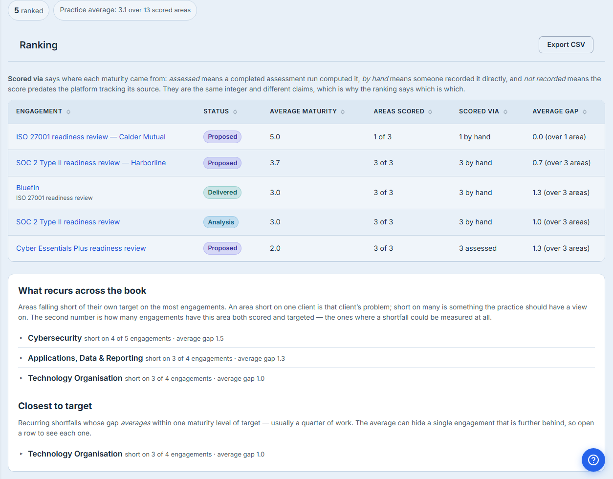
The export carries the whole comparison, not the page of the table you happen to be looking at — including the engagements that are not ranked, with the reason each one is missing. Unmeasured cells read as a dash and never as zero, because a spreadsheet reader has no way to tell a measured zero from an unmeasured one unless the file says which it is.
If the instrument holds more engagements than the comparison covers, the file says so in its own right. A truncated export that stays quiet about it is a document that misrepresents the book while carrying the authority of a report.
What is actually in the file
One row per engagement, ranked and unranked alike, with the columns from the screen plus the ones the screen summarises: the engagement name and its codename separately, the status, whether it was ranked, the average and its coverage, the gap and its coverage, and the three provenance counts broken out rather than collapsed into a phrase.
The unranked engagements carry their reason in the same column layout, so a spreadsheet sorted on “ranked” gives you the two populations without losing either.
Both practice-level lists come with it, below the engagement rows: each area with how many engagements it falls short on, out of how many it could be measured on, its average gap, and the engagements themselves named with their individual gaps. That is the half of this page most likely to be quoted in a partners’ meeting, and until it was in the file the only way to take it anywhere was to retype it.
The header row is the same vocabulary as the page. That matters more than it sounds for a document that will be read in a meeting where the page is not open: a column called “Areas with a target” is self-explaining in a way that “gap denominator” is not.
Getting back to the engagement
The other way off this page is inward. Every row in the ranking links through to its case file, so a name that surprises you is one click from the engagement it belongs to rather than a lookup in another tab. Where an engagement carries a codename that becomes the label, because codenames exist precisely so a target company’s staff cannot learn a deal is in progress, and the engagement’s own name follows on a sub-line — “Project Seadog” alone gives a reader no way to tell a codename from a client’s actual name. Most engagements carry no codename, and those simply show their name.
The “Not in the ranking” list links the same way, and by the same reasoning: an engagement with nothing scored is the one nobody has looked at recently, so those are arguably the names a partner most needs to open.
Contributing to the peer comparison — and choosing not to
Everything above compares your engagements against each other. There is a second comparison available, against a pool of engagements from other firms, and it is off by default.
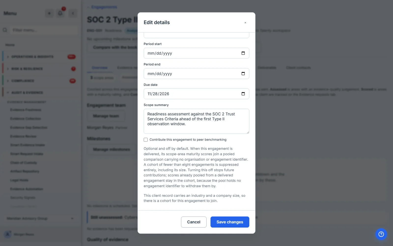
When an engagement is delivered with this ticked, its scope-area scores join a pooled comparison that carries no organisation identifier and no engagement identifier — provided the client record carries an industry and a company size. A comparison is against similar organisations, so without both there is no cohort to join and nothing is contributed; the form says so beneath the checkbox rather than letting a firm consent to something that will not happen. Cohorts below the anonymity floor are suppressed entirely — including their size, because a suppressed cohort that reports “3 peers” has already told you something about a small population.
Leaving it unticked costs you nothing on this page. Your own book is your own book, and the comparison you are reading here never leaves your organisation.
The consent is per engagement rather than per firm, and that is deliberate. A firm may be perfectly willing to contribute a readiness review it ran for a mid-market manufacturer and unwilling to contribute a cyber due diligence on a live transaction, and a single organisation-wide switch would force the cautious answer for everything. Unticking stops future contributions; scores already pooled from a delivered engagement stay in the cohort, because the pool holds no engagement identifier to withdraw them by.
The contribution happens on delivery, not on ticking. An engagement still in fieldwork has scores that will move, and pooling a half-finished assessment would degrade the comparison for everyone reading it — including you.
Reading the peer comparison
The pooled view lives on the engagement’s own case file rather than here, which is the right split: this page answers “how does this engagement compare to my others”, and the peer panel answers “how does it compare to everyone’s”. They are different questions with different privacy properties, and a single screen mixing them would make it hard to remember which numbers had left the building.
If your cohort is below the anonymity floor, the peer band is withheld on every scope area that falls under it, with the reason stated in place of a number. The rest of the panel reads normally — this client’s maturity, its provenance, its target, and your own book’s comparison are all still there. That is not a loading failure and it is not a gap in your data; it is the floor doing its job, and the honest report of it is silence rather than a figure computed from too few peers.
Where it sits in the module
Three pages in the Auditor & Advisory module answer three questions that are easy to blur, and knowing which one you want saves a lot of clicking.
The case file answers how is this engagement going. It is where scores are recorded, evidence is chased and the deliverable is assembled — the fullest of the three, and the only one where you change what an engagement is.
Compare Engagements answers what is my practice like on this instrument. It is a reading of work already done, and the one thing it writes is the recommendation you raise from a shortfall — it never edits an engagement’s scores. Its unit is the engagement.
The Assurance Portfolio answers which of my client relationships is not being served. Its unit is the client relationship, not the engagement, and its most important output is a list of clients with no live work at all — a population that produces no rows anywhere else, and which this page by construction cannot show you, because a client with no engagements has nothing to rank.
The trap is that Compare Engagements and the Portfolio both hand you a list of names you were not expecting, so it is easy to remember one and reach for the other. The distinction that resolves it: this page is about work you are doing and how it is going; the Portfolio is about work you are not doing.
The finding does not stay on the page
A comparison you have to remember to run is a comparison you will run twice and then stop running.
So the headline of it — the practice figure, and the scope area falling short across the most
engagements — also appears as a Practice Quality panel on the Assurance Portfolio
(/app/audit/portfolio), the page a partner already opens to see the book. You meet the finding on
the way past rather than behind a page you have to think to open, and the panel names the area and
the count, so it is a finding rather than a number. It links straight back here with the instrument
already chosen.
The panel reads the same comparison this page reads — not a second calculation of “practice average” that could drift from it — and it carries the coverage with the number, for the reason the whole page insists on: an average over two scored areas is not better than one over seven. Where nothing has been scored yet the panel does not appear at all, rather than showing a nought or a dash: a firm mid-first-engagement has not scored 0.0, and a figure with nothing behind it on a page of populated ones reads as a fault rather than as an absence. This page is where that state is explained.
What you walk away with
- The pattern across your engagements is a finding in its own right. A scope area short on most of your clients is not a run of bad luck at those clients; it is a fact about the market you sell into, and possibly about the advice you have been giving. It exists only in aggregate, which is why nobody meets it one case file at a time.
- Recurring and near-target are two questions. The area short across most of the book and the area a quarter could close are rarely the same area, and the pair is most useful where they disagree.
- One instrument at a time, always. A comparison across instruments is a number that looks like a comparison. The page refuses rather than defaults.
- Every average carries its coverage — including the practice average, which is weighted by how much of each engagement has actually been scored, so a barely-started engagement does not move your headline figure as far as a finished one.
- Absence is never scored as zero. Unscored engagements are named with their reason, not ranked last and not dropped.
- Provenance travels with the score, so a ranking can be defended rather than merely quoted.
- Every bound is disclosed, and the export carries the whole comparison rather than the visible page.
- The finding has somewhere to go. Opening a shortfall row names the engagements behind it and offers a draft recommendation on each, tagged to the scope area it came from; the practice figure and the area falling short also surface on the Assurance Portfolio, so the pattern reaches you without your having to remember to look for it.
The morning the recurring list shows one scope area short across most of your book, the question in front of the partnership is no longer which client to fix. That is the whole reason for assembling it.