Every vulnerability program answers to the same three questions, and they rarely come one at a time. Leadership asks whether the backlog is shrinking. An auditor asks whether the critical findings are being fixed inside their SLA. And after the next headline exploit, someone asks the question with a clock on it: are any of the things attackers are using in the wild sitting open in our environment right now?
The Threat & Vulnerability Dashboard (/app/threat-vuln/dashboard) answers all three on one page, continuously, from records you already keep. It owns no register of its own — it reads your vulnerability findings and joins them to the platform’s threat-intelligence catalog. Creating, triaging, and closing findings happens in Vulnerability Management; subscribing to feeds happens on the Threat Intelligence page (/app/threat-intel). This page is the one-screen executive read across both. This article walks it section by section: what each number measures, which record feeds it, and — twice — where the dashboard deliberately refuses to guess.
Who’s involved
- Security manager / vulnerability owner — reads exposure and works the overdue queue; the SLA numbers are their scorecard.
- Remediation owners — the named assignees on each overdue finding.
- Security leadership / auditors — read KEV exposure and SLA compliance as the two numbers that matter most.
The KPI hero

Four cards, each naming its own window and denominator. Open Vulnerabilities counts findings in the four open states — new, triaged, in progress, mitigated — and carries a critical sub-count. SLA Breaches counts findings whose remediation deadline has passed, with a live “open past due now” sub-stat. KEV Exposure is the one to read first: it counts open findings whose CVE appears on CISA’s Known Exploited Vulnerabilities list, with “4 past CISA due date” — the ones with a federal remediation deadline already behind them.
The fourth card earns a closer look precisely because of what it doesn’t say. Scanner Freshness shows --, not a reassuring number, because no scanner integration is connected here. Freshness is defined as hours since the last successful sync, and when there has been no successful sync there is no honest number to show — so the card shows a dash and a “No scanner connected” prompt rather than a fabricated zero. That distinction — unknown versus zero — is the design principle behind this entire page, and it shows up again, more sharply, in the KEV section.
Severity, lifecycle, and age
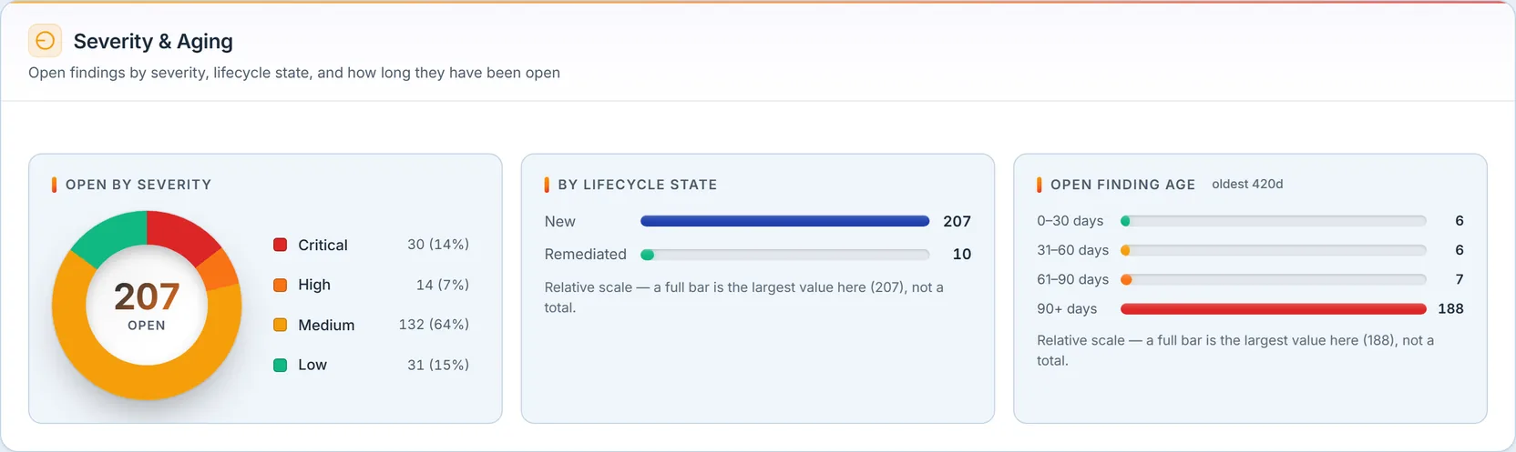
Three panels under one header answer how bad, how far along, and how old. The Open by Severity donut breaks the 207 open findings into critical, high, medium, and low, with the total in the center. By Lifecycle State shows where those findings sit in the workflow — new, triaged, in progress, mitigated — rendering only the states that actually carry findings, so an empty bucket never pads the chart. And Open Finding Age buckets everything still open by how long it has been open, measured from the discovery timestamp: 0–30, 31–60, 61–90, and 90-plus days, with the age of the oldest finding called out in the header — here, 420 days. A backlog that piles up in the 90-plus bar is telling you something the severity donut can’t: findings aren’t being closed, only accumulated.
Remediation SLA
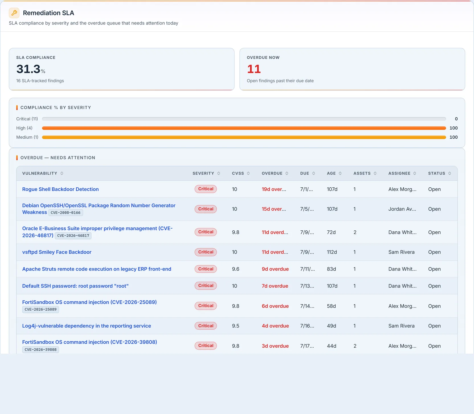
This is the auditor’s section. SLA Compliance is the share of SLA-tracked findings still inside their window — here 31.3% across 16 tracked findings. A finding becomes tracked the moment it gets a remediation due date; until then it’s honestly excluded from the rate rather than counted as a silent pass. Compliance % by Severity breaks the rate out per severity, and the per-severity rate is null — shown as nothing, never a fake 0 or 100 — when a severity has no tracked findings at all. Here critical compliance sits at 0% because every one of the eleven tracked criticals is past due, while high and medium read 100%.
The Overdue — Needs Attention table is where that number becomes a work list. Each row carries the finding, its CVE, CVSS, exactly how many days it’s overdue, its due date, its age, how many assets it touches, and — importantly — a named assignee, not a user id, so the row tells you who to ask. It’s ranked most-overdue first and capped at fifteen, with an honest “showing X of N” note when there are more, so the worst offenders surface without hiding a longer tail. Every row links into the finding in Vulnerability Management, because this table exists to be worked.
KEV & exploitability — the section to read first

Most vulnerability tools rank findings by CVSS — how bad the flaw could be in theory. This section adds the question that actually drives triage: is it being exploited right now? It answers by joining your open findings, live, to the platform’s copy of the CISA Known Exploited Vulnerabilities catalog and the EPSS exploit-probability scores. The four cards frame it: CVE-Tagged Open (47 findings carry a CVE; 28 of them matched the enrichment catalog), KEV Open (6 are on the known-exploited list), Past KEV Due Date (4 are past the federal remediation deadline), and High EPSS (findings scoring ≥50% likely to be exploited that aren’t yet on KEV).
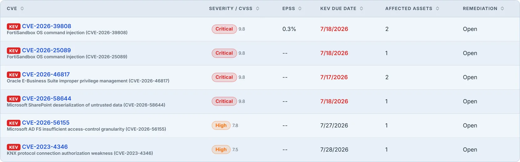
The exposure table lists them, most-exploitable first (EPSS descending): a KEV badge, the CVE, the product, severity and CVSS, the EPSS percentage, the CISA due date — flagged when it’s passed — the affected-asset count, and remediation status. These are real products under their real names — Fortinet FortiSandbox, Oracle E-Business Suite, Microsoft SharePoint, Microsoft AD FS — because that’s the point: this is the short list you patch before anything else on the page.
Now the honesty story that makes this section trustworthy. The join is a LEFT JOIN, which means a finding with an unrecognized CVE would naturally produce a match of nothing. A naive dashboard would render that as a comforting green “KEV: 0” — no known-exploited findings! — when the truth is that it simply couldn’t look them up. This dashboard refuses. When findings carry CVEs but none of them could be matched to the catalog, it shows the KEV cards as -- and posts an alert reading, in effect, “exploitability status is currently unknown, not zero.” A zero here is only ever shown when the lookup genuinely succeeded and found nothing. That single design choice is the difference between a dashboard that reassures you and one you can actually trust in an audit.
Scanner coverage & pipeline
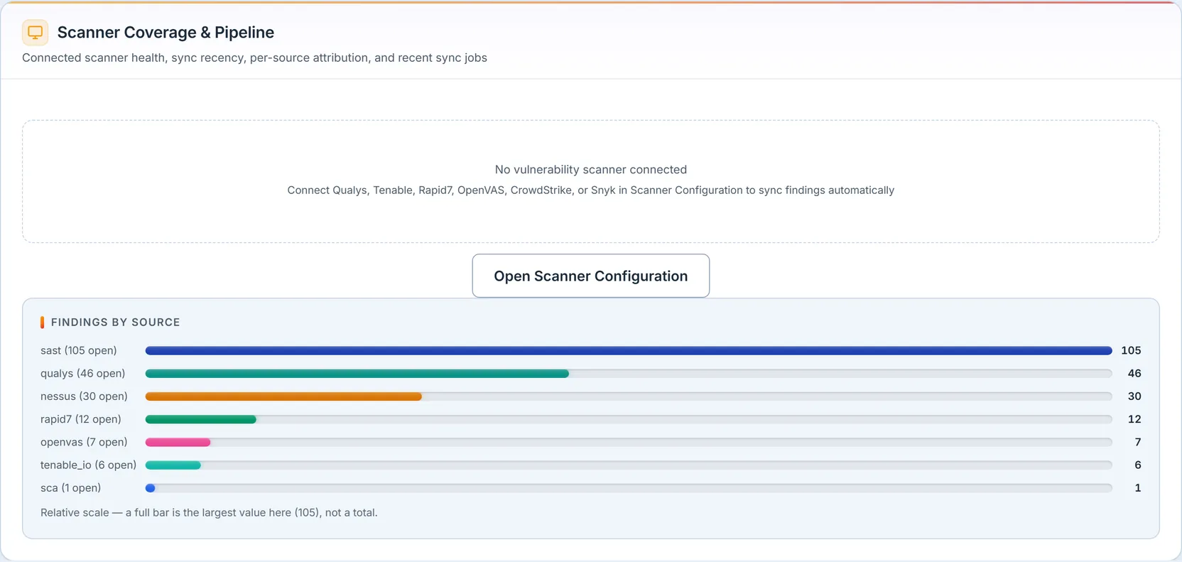
This section answers “where is this data coming from, and is it alive?” When a scanner integration is connected, each scanner gets a card showing its health — healthy, last sync failed, never synced, or disabled — its last sync time, and its findings-per-run. Here no live integration is wired, so the panel says so plainly and points to Scanner Configuration rather than inventing a status.
What it can still show honestly is Findings by Source — a per-source attribution built from the findings themselves, so it counts every scanner that has ever fed data, including CSV and historical imports, not just currently-configured integrations. That’s the honest coverage picture: your findings came from these seven sources, in these volumes, whether or not a live pipe is connected today.
Threat feed health
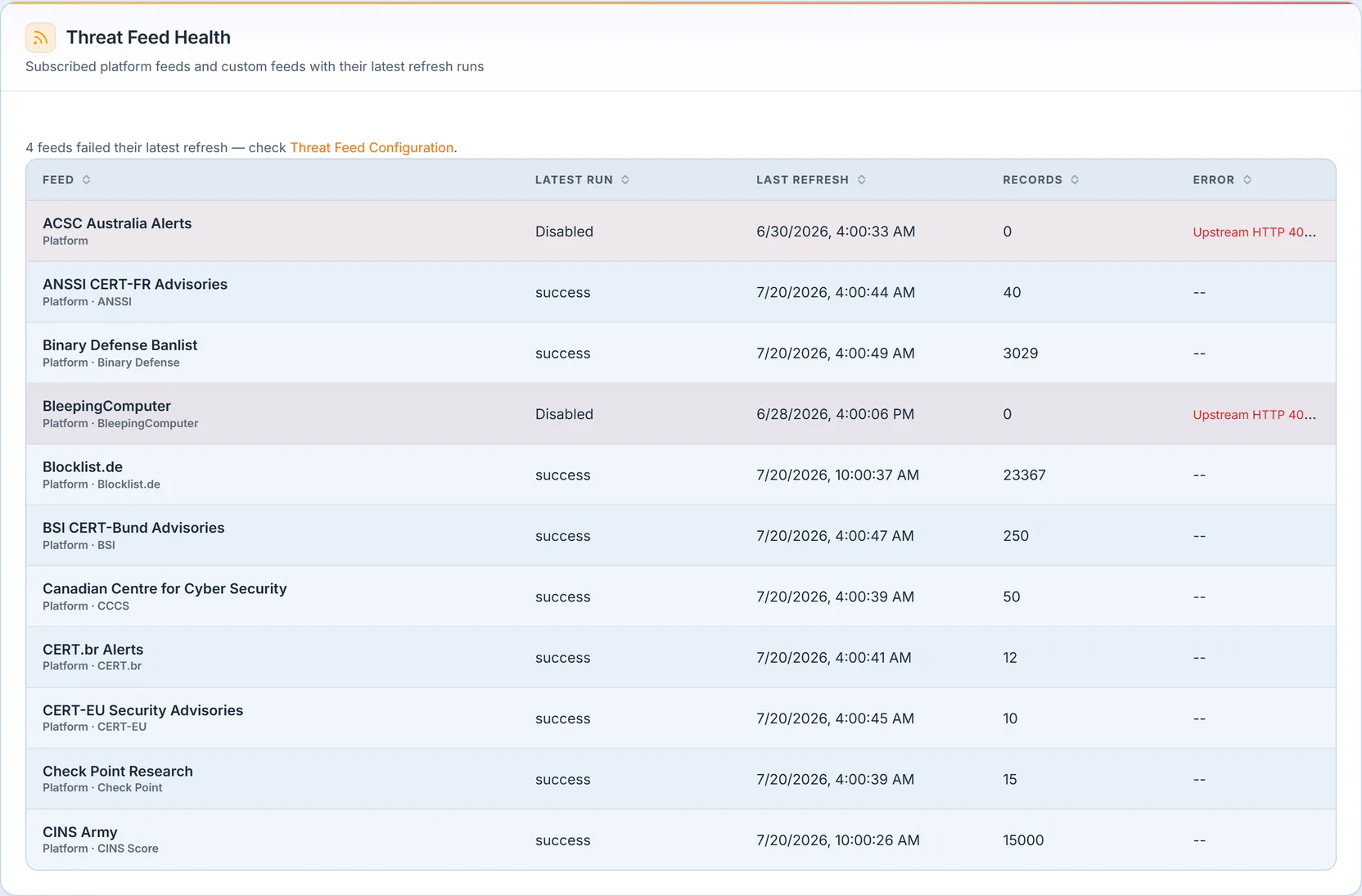
Threat intelligence is only as good as the pipes feeding it, and stale feeds fail quietly — which is exactly why this section makes failure loud. A banner counts feeds that failed their most recent refresh (“4 feeds failed their latest refresh”), and the table below shows every subscribed feed — platform or custom — with its latest-run status, last refresh time, records ingested, and any error message, with the failed rows visually flagged. A feed showing Disabled with an “HTTP 403 Forbidden” error isn’t hidden; it’s surfaced so someone fixes it. (This section, and the next, appear only for organizations with threat-intelligence enabled — the dashboard hides them cleanly rather than showing empty shells to teams who don’t use them.)
Threat activity
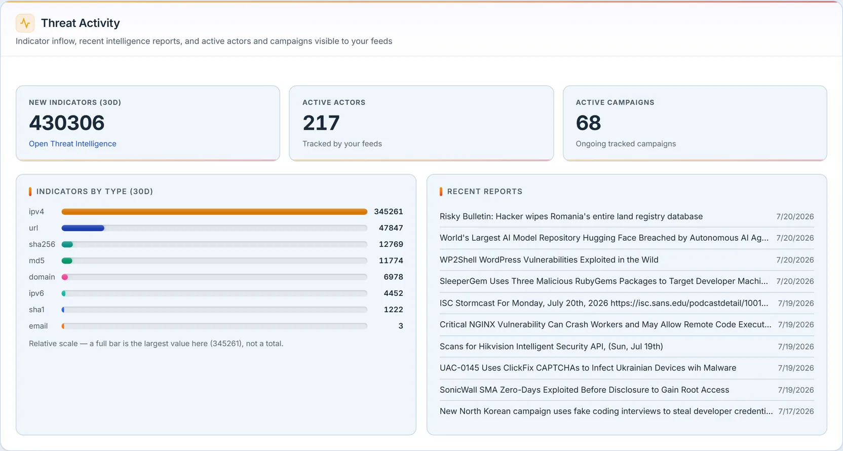
Where the feed-health section proves the pipes work, this one shows what came through them. New indicators over the last 30 days, active actors, and active campaigns are counted across the feeds this org subscribes to — scoped precisely to your subscriptions plus your own custom intelligence, never the platform’s entire firehose. Indicators by Type breaks the inflow down, and Recent Reports lists the latest published intelligence with severity and TLP handling tags. Each card links into the full Threat Intelligence surface, where this data is browsed and managed.
Discovery versus resolution

The last section is the “are we keeping up” chart: findings discovered per week against findings resolved per week, over twelve weeks, each with its total — and, for organizations with threat intelligence enabled, a third indicator inflow sparkline from the subscribed feeds. Every line is drawn from real row timestamps — the discovery date, the resolution date, the indicator creation date — over a fixed twelve-week spine, so a week with no activity shows an honest zero rather than a gap the chart quietly closes. Each panel notes its own vertical-axis range, so a tall spike can’t be misread against a different scale. When the discovered line runs above the resolved line week after week, the backlog is growing no matter how good the medians look; when resolution finally picks up — as it does in that sharp rise at the right edge — you see it here first.
Where the numbers come from
Every drill-down on this page lands on the register it reads, because this dashboard is a lens, not a workbench.
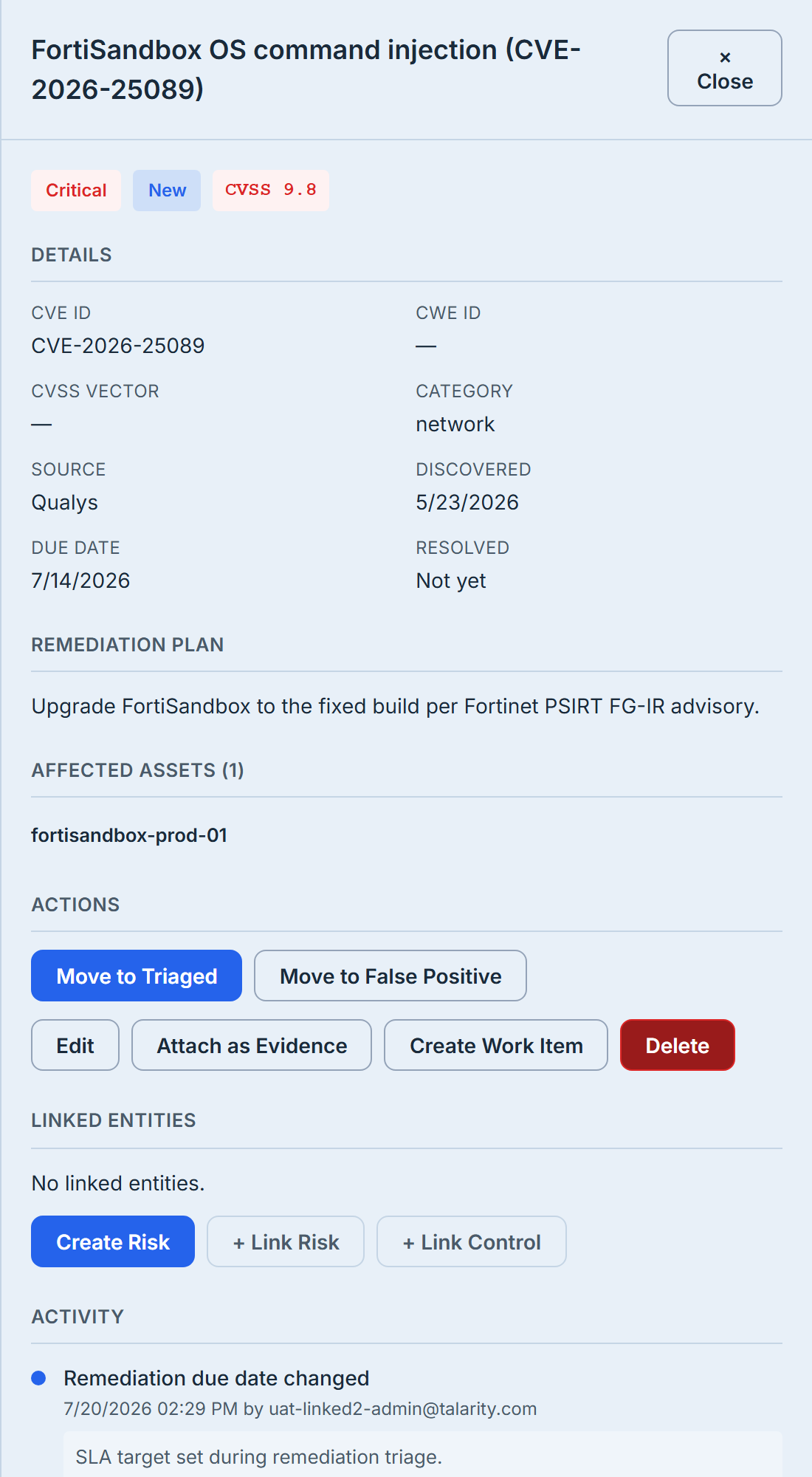
Click any finding — from the overdue queue, the KEV table, or a hero card — and you land in Vulnerability Management, where the finding is triaged, assigned, given a due date, and closed. Those actions are what move every number you just read: assign an owner and set a due date, and the finding joins the SLA panel; close it, and it leaves the open counts and appears in the resolved trend. The dashboard reports the state; the register changes it.
What you walk away with
- Exposure ranked by what’s actually exploited, not just what scores high — the KEV/EPSS overlay is the short list you patch first.
- An SLA scorecard with names attached — compliance by severity, and an overdue queue that says who owns each breach.
- An aging view that shows a growing backlog the severity donut would hide.
- Feed and pipeline health that fails loudly, so stale intelligence gets fixed instead of silently trusted.
- Two refusals to guess — a KEV zero is only ever shown when the lookup succeeded, and a freshness number only when a sync actually happened. Everything else reads
--.
To create, triage, and close the findings this page rolls up, see Vulnerability Management. For the enterprise risk register these findings ultimately feed, see Reading the Risk Overview dashboard.