Every framework asks the same three questions about your people, in different words. SOC 2 CC6.1 wants to know who has access and whether it is still warranted. ISO 27001 A.6 wants evidence that joiners were provisioned deliberately and leavers were revoked promptly. Your CFO wants to know why the SaaS bill went up. They are all asking one thing: who works here, what do they hold, and what is overdue?
The Workforce Dashboard (/app/workforce/dashboard) answers that continuously, from the same records your team already maintains — the roster, asset assignments, license seats, training programs and access-review campaigns. This article walks the page section by section: what each number measures, where the data lives, and which workflow moves it.
Who’s involved
- HR / People ops — owns the roster and the joiner, mover and leaver events.
- IT / Asset owner — owns the provisioning queue, the asset catalog and the license seats.
- Security & compliance — owns access certification, required training, and the attestation record.
- Auditor — follows the drill-downs from each number back to the record that produced it.
How this page thinks
- Every number names its denominator. Headcount says which roster view scoped it. Each bar states what its length is a share of. A ratio with nothing to divide by renders as a dash, never a flattering 100%.
- Unknown is never zero. A license with no per-seat cost on file does not contribute
$0to idle spend — it contributes nothing, and the card says so out loud. The difference between “there is no waste here” and “we cannot price this” is the difference between a report and a guess. - The reassuring numbers get the most scrutiny. A zero is the number nobody questions, so every zero on this page has to explain itself: no renewals due says whether that is because none are due or because nobody recorded the dates. An omission that flatters you is worse than an error, because you will never go looking for it.
- Sections degrade independently. Each section loads on its own; one failing handler shows an error with a retry inside its own panel rather than blanking the page.
- There is no Refresh button, on purpose. Nothing here is a snapshot: the page reads your live workforce records every time it loads, and reads them again when you come back to the tab. A refresh control would only be worth its space if the data could be stale, and a badge asserting “data is current” would only be worth believing if it could ever say otherwise.
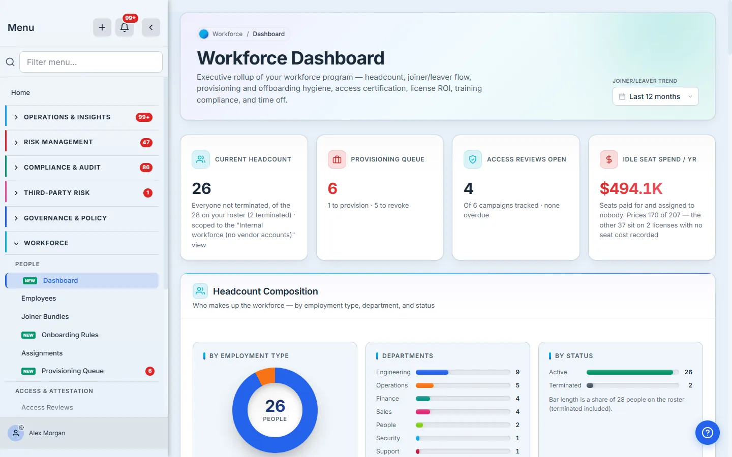
The KPI strip
Four numbers, each a claim about a different system.
Current headcount counts everyone not terminated — and it tells you what it left out: “Everyone not terminated, of the 28 on your roster (2 terminated) · scoped to the Internal workforce (no vendor accounts) view.” If an org-default roster filter is applied, the card names the filter. A headcount that quietly excludes contractors and never mentions it is how two people in the same meeting end up with two different numbers.
The word current is doing real work there. “Everyone not terminated” includes people on leave and people pending start, so this card is deliberately a wider population than the bar labelled Active in the By Status panel below — that one counts the active status alone. Two numbers, one screen, and the subtitle is what stops you having to guess which is which.
Provisioning queue is open asset and access work: 1 to provision · 5 to revoke. Both halves are named, because they are opposite problems — one is a joiner still waiting, the other is a leaver who still has your data.
Access reviews open counts certification campaigns still collecting decisions, with overdue called out separately.
Idle license spend is the money sitting on paid seats nobody is using. It is the number most likely to be wrong in a GRC tool, so the next section is about how it is computed — and what it deliberately does not include.
Headcount composition
Three views of the same 26 people: by employment type, by department, by status.
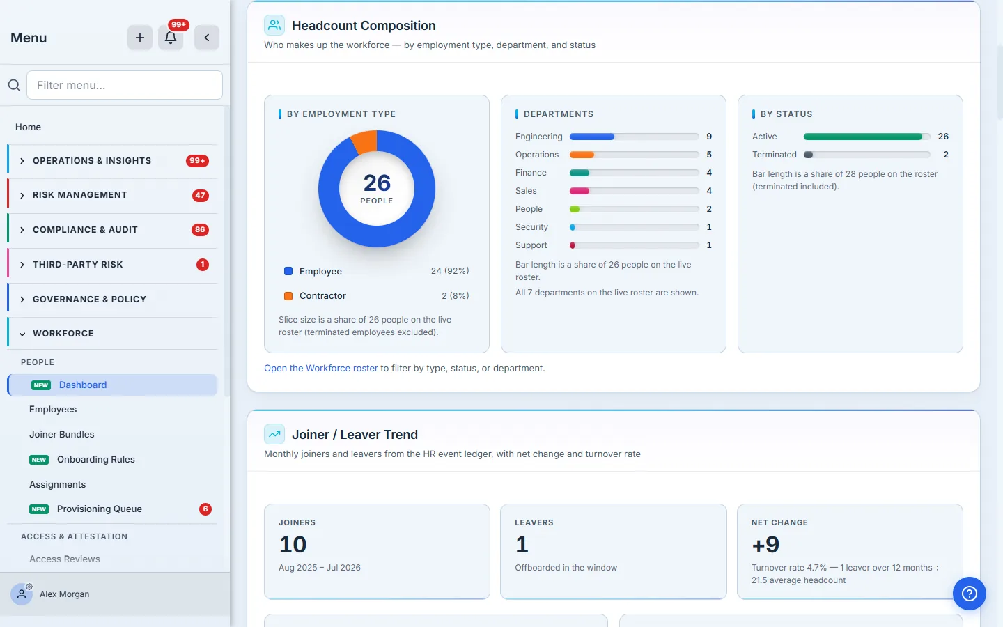
The important detail is that these three panels do not all divide by the same number — and each one says which number it used. Type and department are a share of the 26 people on the live roster. Status is a share of all 28 including terminated — because a status chart that hid terminated employees would be unable to show you any.
That is the whole discipline in one screen: two denominators, three panels, and no guessing which is which.
Departments state their own completeness too: “All 7 departments on the live roster are shown.” When there are more than fit, that becomes “Showing the 8 largest of 14” with a link to the rest. A chart headed “Top departments” that never tells you what the top is out of invites you to read the visible bars as the whole population — which is why the heading is simply Departments, and the caption does the honest work.
If this panel says “No department set”, read it as a data question
The one bar you should never ignore is No department set — drawn last, in grey, and counted separately from the departments above it. It is not a department. It is the number of people your sources never told us about, and it is the single most useful diagnostic on this page.
A panel that is entirely “No department set” is not a distribution — it is a broken input. It does not mean nobody has a department; it means nothing has ever written one. Departments reach the roster three ways: your directory sync (Entra ID / Intune pull
departmentstraight off the user object), the Department column on a CSV import, or the Department field on an employee. Until one of those fills in, this panel has nothing to group by, and the panel says exactly that rather than drawing you a chart of one.
This matters beyond the picture. Department is not decorative — it is an audience. A policy sent to “everyone in Engineering” resolves against this same field on the roster, so a blank department column silently shrinks that audience to nobody. If the bar is grey here, the acknowledgement drive you schedule later will quietly reach no one, and the two symptoms have one cause.
Joiner / leaver trend
Twelve months of joiners and leavers, drawn from the hr_events ledger — the append-only record of hires and departures, not a snapshot of current status.
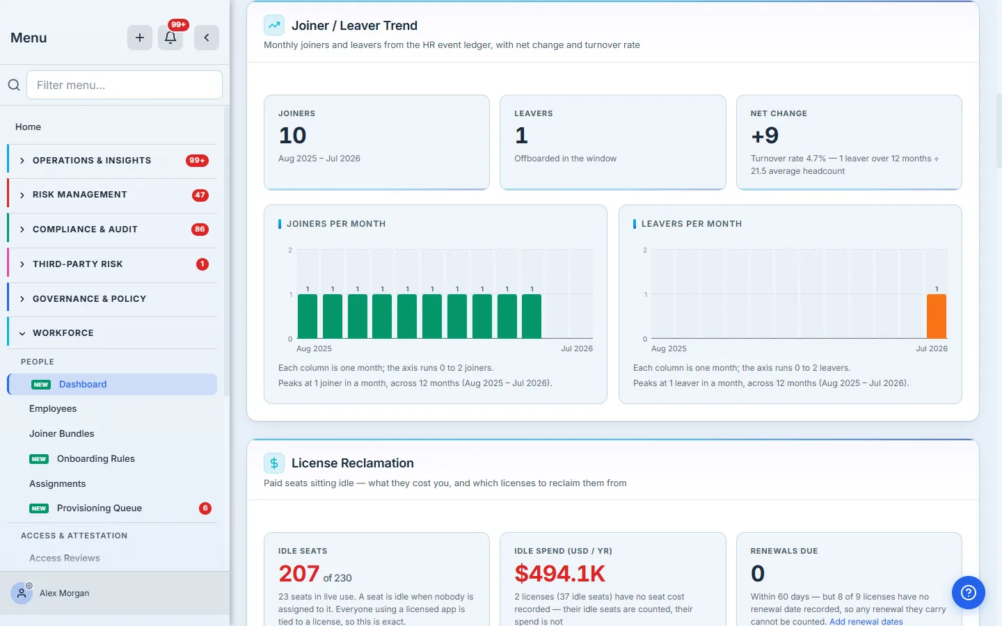
Look at the leavers chart. There is exactly one leaver in the window, and it renders as a single half-height column against an axis that runs 0 to 2. That is deliberate, and it is worth dwelling on, because the obvious way to draw this chart is wrong: if you scale the plot to the series’ own maximum, a single leaver fills the panel floor-to-ceiling and the chart looks like an exodus. The shape of a chart is a claim. Both panels here share one zero-based axis, so equal height means equal people, and one departure looks like one departure.
License reclamation — and what “idle” actually means
This is the money section, and it is the one to read carefully.
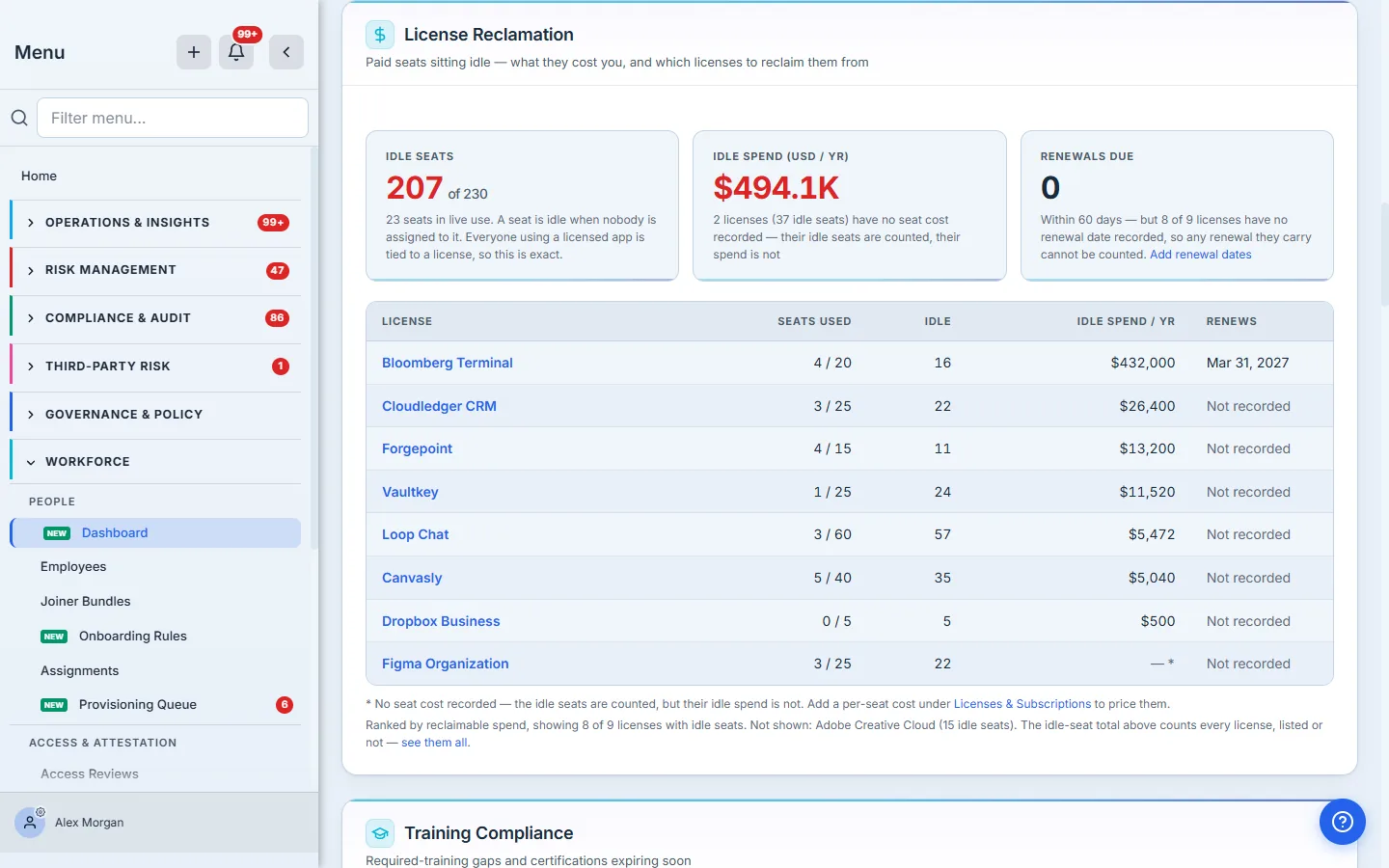
A seat is idle when nobody is assigned to it — you are paying for it and no one is holding it. That definition is printed on the card, because everything downstream depends on it, and because “idle” is the kind of word a reader will otherwise fill in for themselves: it does not mean “someone has it and never logs in”. Seat usage is counted from asset_assignments rows that name the license the seat is drawn from — so if a real person is really using an app but their assignment was never tied back to a license, their seat looks free. The card therefore tells you which case you are in: “Everyone using a licensed app is tied to a license, so this is exact.” If any assignment were unattributed, it would say so instead, and warn that the idle figure is an upper bound. An idle-spend number that quietly errs toward “you are wasting more than you are” is worse than no number at all.
The arithmetic reconciles in the open. The eight listed licenses carry 192 idle seats; the footnote names the ninth (“Not shown: Adobe Creative Cloud (15 idle seats)”); 192 + 15 = 207, the headline. The listed spend sums to exactly $494,132.
And the spend figure states what it does not cover: “2 licenses (37 idle seats) have no seat cost recorded — their idle seats are counted, their spend is not.” Those rows show an em dash, not $0. A subscription you have not priced is not a free subscription, and collapsing the two would understate the waste while presenting the result as a total.
One detail worth knowing: a subscription’s cost can be recorded either per-seat or as a whole-contract amount. A $540,000 annual Bloomberg Terminal contract across 20 seats has a knowable seat cost — $27,000 — and the dashboard derives it, which is why Bloomberg is the single biggest reclaimable line on the page.
The same discipline applies to the quietest number on the card. Renewals due reads zero — and a zero is exactly the kind of number nobody double-checks, which is why it says why it is zero: most of these licenses have no renewal date on file, so any renewal they carry cannot be counted. A reassuring number with a missing denominator is the most dangerous thing a dashboard can show you, because it is the one you will not question.
Where seat usage comes from
Seats are counted because somebody attributed them. That happens here, when you grant an app to a person.
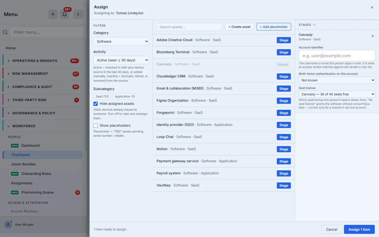
The Seat license selector is the link between “this person uses Canvasly” and “one Canvasly seat is in use”. When the app has exactly one license, it defaults to it — the common case should not require a decision. When it has several, you pick. And when the grant genuinely should not consume a seat, No seat license is the honest answer: the helper text says it is “correct only for a shared or service account.”
Notice that the selector states the count as it stands: “Canvasly — 36 of 40 seats free”. Commit the assignment, reopen the same picker, and it reads 35 of 40. That is the whole mechanism in one control — the seat did not become “used” because somebody updated a spreadsheet, it became used because a named person was granted the app against a named license, and the reclamation figures upstream moved with it: 208 idle seats across the org became 207.
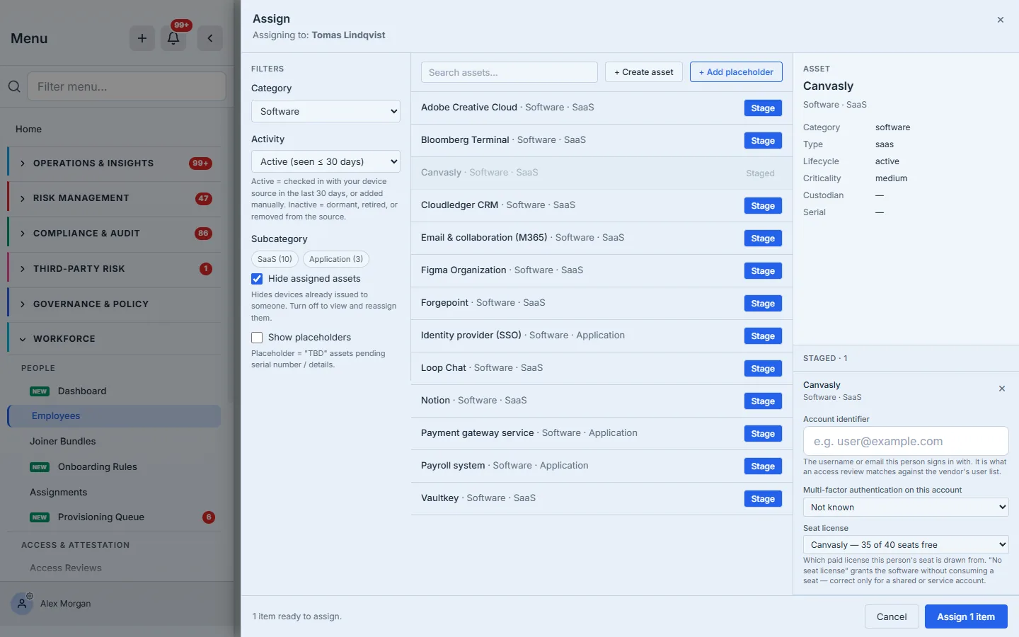
The Account identifier matters more than it looks: it is what an access review matches against the vendor’s own user list. A seat you cannot tie to a login is a seat you cannot certify.
Training compliance
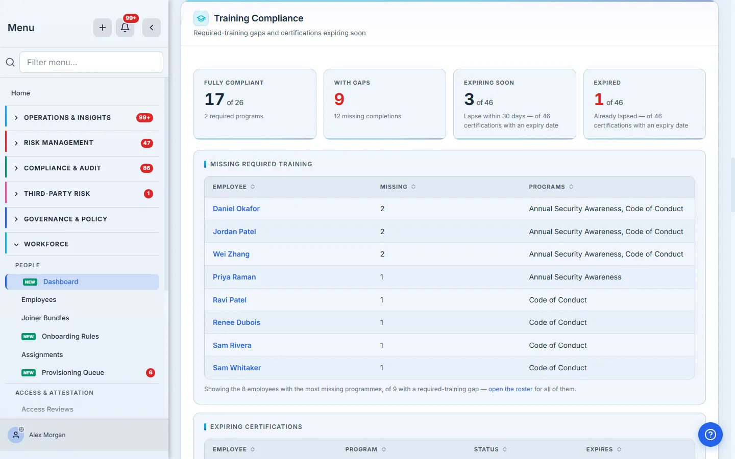
Fully compliant means the person holds a valid, unexpired completion (or a recorded waiver) for every required program. The gap table names the people and the specific programs they are missing — not a percentage, a list you can act on.
Note that expiry is a gap. Priya Raman appears in the gaps table missing Annual Security Awareness, and again in the expiring table with that certification marked Expired. Those are the same fact seen twice: an annual certification that lapsed on 6/10/2026 stopped satisfying the requirement the day it expired. Compliance is a state with an end date, not an achievement.
The training registry
Required-versus-optional is not a label on a person; it is a property of the program.
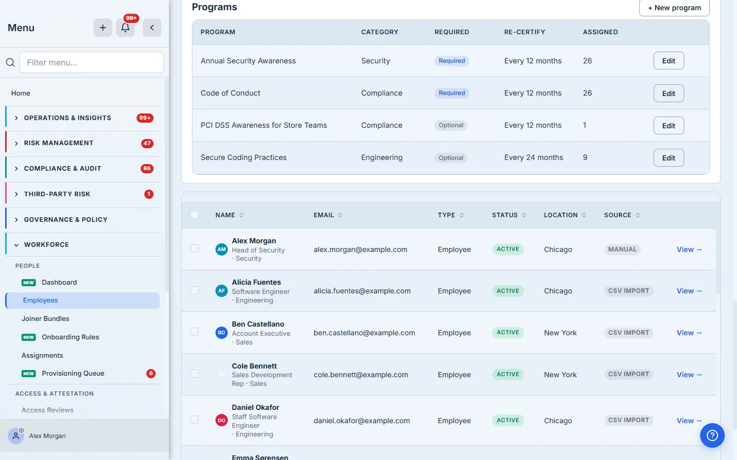
A program marked required counts toward the compliance number on the dashboard; optional ones are tracked but never chased. Re-certify is the cadence — Every 12 months means completing it sets an expiry twelve months out, and the requirement re-opens on its own when that date passes. Assigned is how many people currently carry the program.
The Assigned column is worth reading next to Required. Annual Security Awareness and Code of Conduct are required and sit at 26 — everyone. Secure Coding Practices is optional and sits at 9, and PCI DSS Awareness for Store Teams at 1. That is the difference the registry exists to hold: a program is not “for everyone” because it is important, it is for everyone because someone assigned it to everyone, and the number here says which is true.
Waiving a requirement
Sometimes a person genuinely does not need the training, and pretending otherwise corrupts the number.
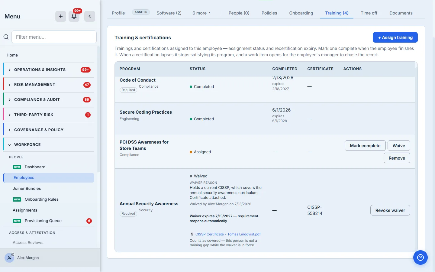
A waiver marks a requirement satisfied without the training being taken — the employee holds an equivalent external certification, or a contractor is covered by their own employer’s program.
It is an audited decision, and an auditor asks four questions about it: why, who approved it, when — and when does it lapse. The record answers all four.
The reason is mandatory and is shown in full on the row. Beside it sits the attribution — who granted the waiver and when — recorded by the system at the moment of the decision, not typed into a text box. That distinction is the whole point: a reason on its own is a sentence somebody wrote, and a sentence claiming “reviewed by the Head of Security” is not the same thing as a record showing that the Head of Security is who clicked the button.
The fourth question is the one that is easiest to leave unanswered, and the most expensive to get wrong. A waiver on a recurring requirement expires. If the training comes round every year, so does the exemption from it: the review date is mandatory, it cannot be set beyond one recertification cycle, and when it passes the requirement is re-issued automatically and a work item goes to the employee’s manager. The compliance percentage stops counting the waiver the moment it lapses — not the next morning when a sweep gets around to it.
Without that, a waiver is a permanent exemption from a permanent obligation: excuse somebody from annual security awareness once, and they are excused from it forever, counted as covered forever, with nothing anywhere that would ever bring it back for review. The number would be quietly wrong, and wrong in the direction that flatters you.
And because a justification is only prose, the waiver can carry the thing it rests on: a certificate number and the document itself, attached from the evidence library. “They hold a current CISSP” is a claim. The certificate is the record.
Waiving is offered only where a requirement is actually outstanding. There is nothing to excuse on a training somebody has already completed and whose certification is still current, so the option does not appear there.
Access review health
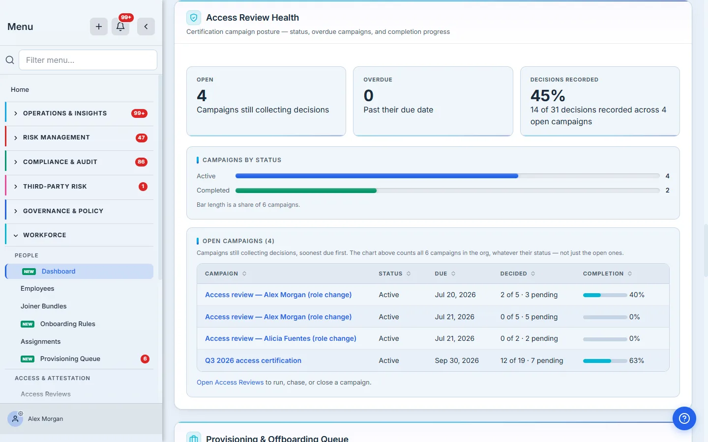
Each campaign shows what has been decided against what is still pending — 2 of 5 · 3 pending — and a completion bar that agrees with it. Certification is a decision per grant, not a checkbox per person: certify, revoke, or flag, each with a reason.
The headline is the one to read carefully: decisions recorded, not average progress. Those are different numbers, and the difference matters at scale. Averaging the four campaigns’ percentages would let a two-decision campaign count for as much as a five-hundred-decision one; the figure here is the actual ratio — every decision recorded (14), over every decision the open campaigns require (31).
Note the two denominators doing different jobs, which is this page’s habit again: the headline divides by the open campaigns’ decisions, while the status chart underneath says “Bar length is a share of 6 campaigns” and states outright that it “counts all 6 campaigns in the org, whatever their status — not just the open ones.” Four open plus two completed. A status chart that silently dropped the completed ones would make a finished programme look like a smaller one.
Three of those four are named after a person and a role change — those are movers. Talarity opens a scoped review when someone’s job or department changes, because the access that was right for their old role is exactly the access nobody re-examines after they move. That is also why the department field on the roster is not cosmetic: changing it is what asks the question.
Provisioning and offboarding
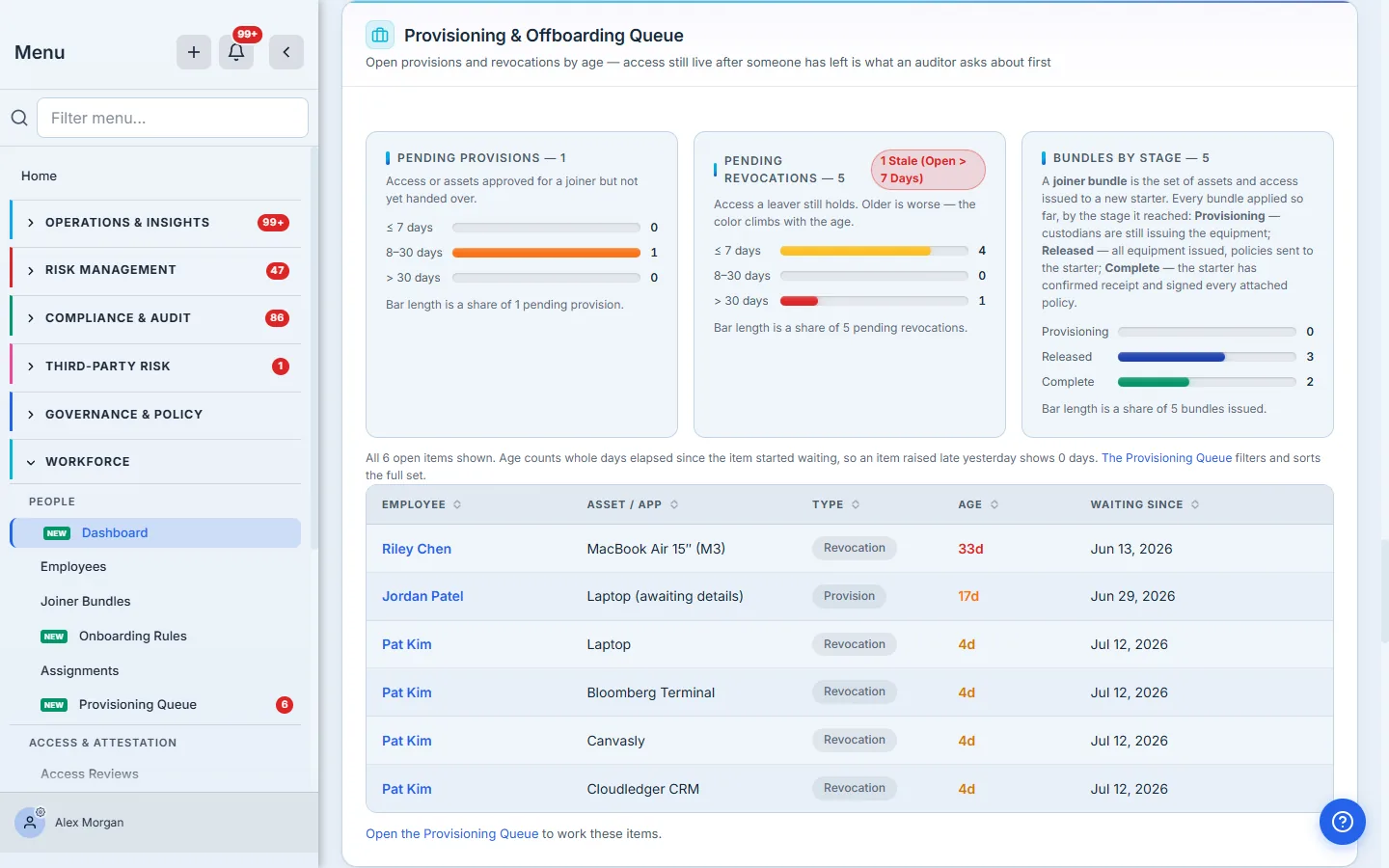
This is the section an auditor will linger on. Pending revocations are things a leaver still holds, aged into buckets, and the color climbs with the age — a revocation open longer than seven days is flagged Stale, which is the SOC 2 red flag: Riley Chen left on 6/13 and still holds a MacBook 29 days later.
The bundle funnel tracks joiner bundles through their stages: Provisioning (custodians are still issuing the equipment), Released (everything issued, policies sent), Complete (the starter confirmed receipt and signed every attached policy). A bundle stuck in Released is usually an unsigned policy, not a missing laptop.
Attestation coverage
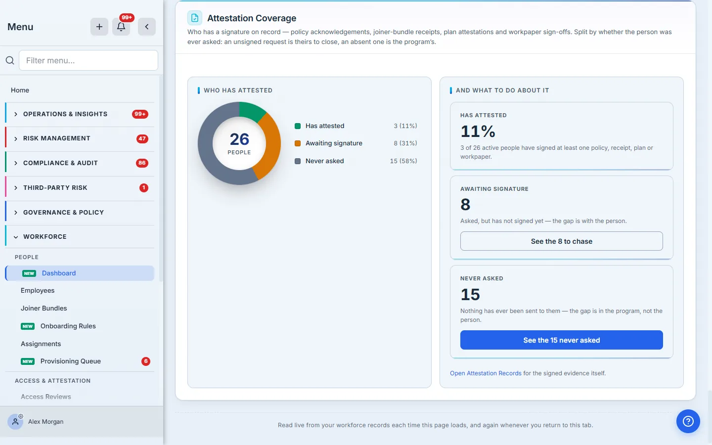
This counts people with a signature on record — a policy acknowledgement, a joiner-bundle receipt, a recovery-plan attestation, an evidence-package signature or a workpaper sign-off. It is deliberately not a count of generated PDFs; a document somebody viewed is not a document somebody signed.
The part worth pausing on is the split. “Not yet attested” is two completely different problems wearing one number, and they belong to different people:
- Awaiting signature (8). They were sent something and have not signed it. That gap is theirs, and the action is to chase it.
- Never asked (15). Nothing has ever been sent to them. That gap is the program’s, not the person’s — and no amount of chasing will close it, because there is nothing to chase.
A single merged total cannot tell you which you are looking at, so it cannot tell you what to do next. Split, it names the owner and the action for each half — and the three segments sum to the current headcount (3 + 8 + 15 = 26), so you can check it against the roster in one glance.
And each half hands you the list, not just the number. The buttons read “See the 8 to chase” and “See the 15 never asked”, and they open the roster filtered to exactly those people. That distinction matters far more at scale than it does here: at three thousand employees, a card reading “1,847 never asked” beside a link to an unfiltered directory is a dead end, because the one thing you need — which 1,847 — is precisely what the link throws away. The count on the button and the rows on the page are computed from a single shared definition, so they cannot drift apart and quietly start lying to you.
Most of your workforce does not have a login — they are on the roster, not on a seat — so an acknowledgement request reaches them as an emailed link rather than an in-app task. Target a department and everyone in it gets asked, whether they can log in or not.
That works because the audience resolves against the roster, not the seat list — it reads the same department field the Departments panel groups by, and picks up the people with no login on the way past. Which is the other reason a grey No department set bar is worth chasing: the audience picker offers only departments it can actually find on the roster, so a blank column there means the department you want to send to is not on the list to choose.
The register behind it all
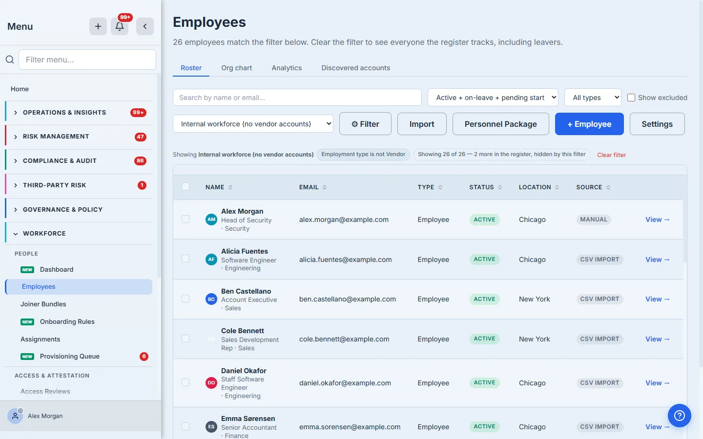
Every number on the dashboard resolves back to here. The Source column is the quiet one that matters: it names which of the five ingestion paths wrote each row — Manual, Intune, Entra ID, Org login, or CSV import — which is the first thing anyone asks when a number looks wrong. (Where your employee list comes from walks all five.) Each row also carries its job title and department under the name, so the bars in the Departments panel resolve to actual people here rather than to a number you have to take on trust.
Every bar is a filter you can run
The Departments panel is a picture; the roster is the list behind it. Filter builds a rule out of the same fields the dashboard groups by — pick Department, is, and type the one you want.
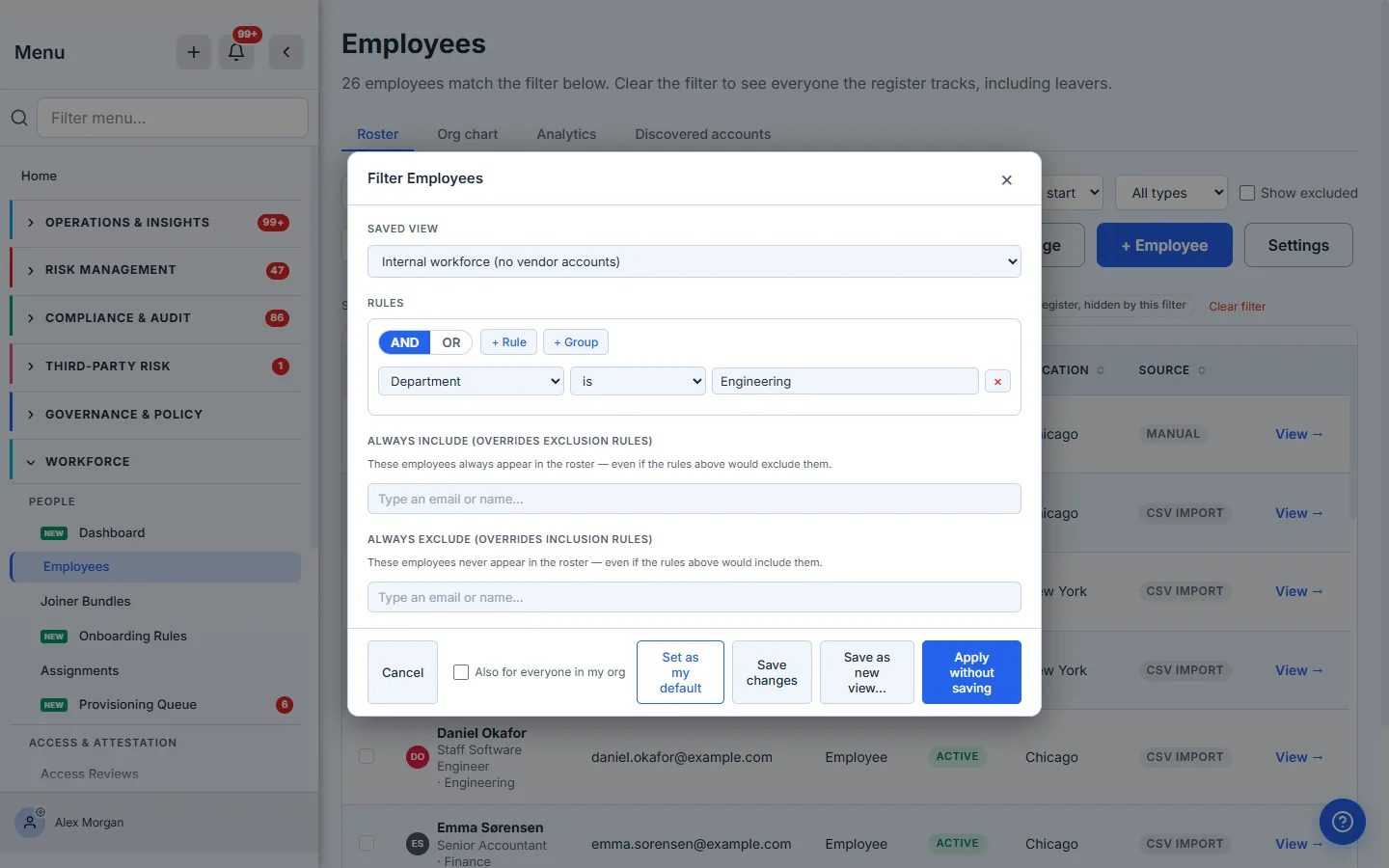
Note the fields read as a sentence — Department is Engineering, not department equals. The rule is a saved view in waiting: Apply without saving for a one-off question, Save as new view for one you will ask monthly, Set as my default for the population you consider your workforce.
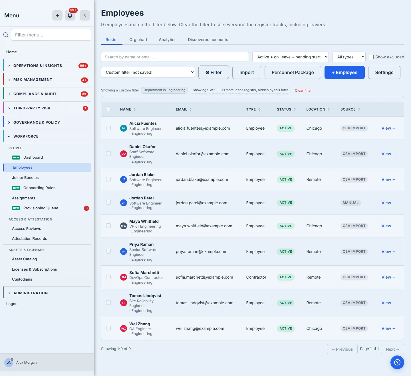
Nine rows — the same nine the Engineering bar counted on the dashboard. That is the check worth doing on any dashboard you are asked to trust: take a bar, run it as a filter, and see whether the list agrees with the picture. And the result keeps the page’s habit of naming what it left out — “Showing 9 of 9 — 19 more in the register, hidden by this filter” — so a filtered view can never quietly pass itself off as the whole roster.
Open one person and you get their whole file — assets and SaaS they hold, policies, their lifecycle history, and their training record.
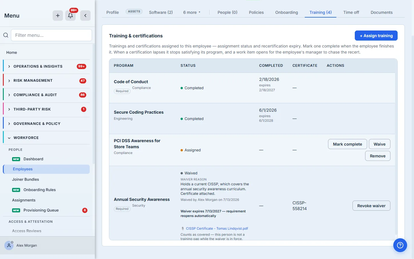
The row’s actions follow its state, so nothing offers you something that cannot be done: an outstanding programme can be completed or waived, a waived one can be revoked or given a review date, and a completed, still-current certification offers neither — there is nothing left to excuse.
Where the seats actually live
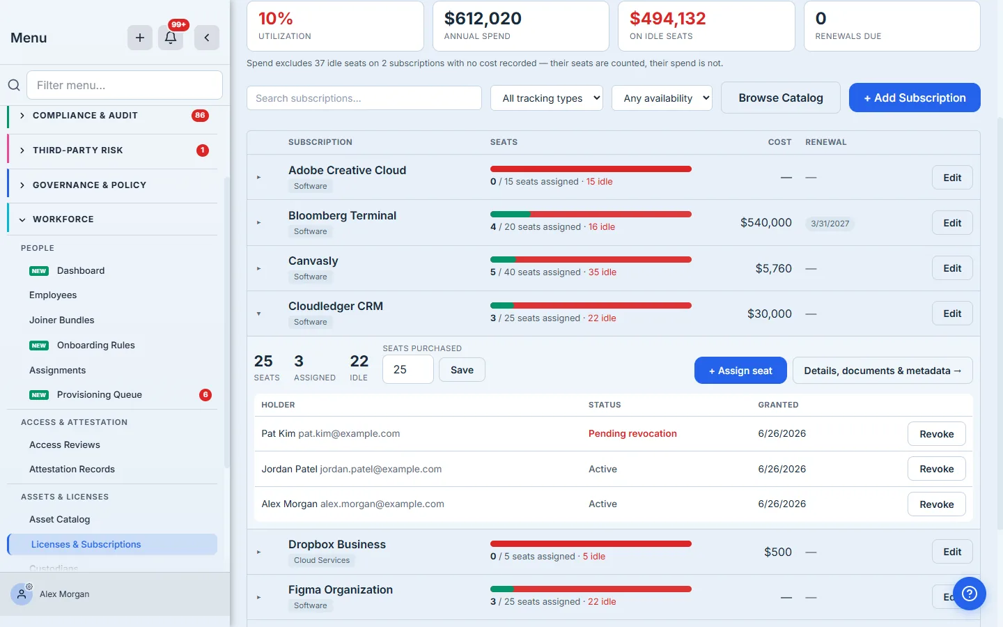
The reclamation card tells you how many seats are idle; this page tells you who holds the ones that are not. Expand any subscription and you get the named holders, their status — including Pending revocation for a leaver whose seat has not been taken back yet — and the date the seat was granted. Revoke is right there on the row.
The same disclosure follows the money here too: “Spend excludes 37 idle seats on 2 subscriptions with no cost recorded.” The two pages read the same records and, by design, give the same answer.
What you walk away with
- Headcount that names its own denominator, so two people reading the same card get the same number.
- An idle-spend figure that defines “idle”, reconciles to its own table, and tells you what it does not cover — including whether it is exact or an upper bound.
- Training compliance that treats expiry as a gap, and a waiver path that records why somebody was excused, who excused them, and when — rather than quietly dropping them from the count.
- A revocation queue aged in public, because the leaver who still has access is the finding you do not want to hear about first from an auditor.
- An attestation number honest enough to blame the program rather than the people, and to hand you the action that closes it.