Third-party risk is one of the few programs where every framework asks the same blunt question: do you actually know the state of your vendors, right now? SOC 2 puts it in CC9.2 (vendor and business-partner risk management), ISO 27001:2022 spreads it across A.5.19–A.5.23 (supplier relationships, supply-chain security, monitoring), and the FFIEC’s third-party guidance expects ongoing monitoring — not an annual binder.
Most teams answer with a spreadsheet the CISO rebuilds the week before each board meeting. The Vendor Dashboard (/app/vendor-dashboard) is that answer maintained continuously: an executive rollup where every number is computed live from the vendor records, requests, contracts, and snapshots your team already maintains. This article walks the page section by section — what each number measures, where the data lives, and which workflow moves it.
Who’s involved
- TPRM lead — lives on this page; works the overdue and expiring queues, watches concentration.
- Vendor owner — the person a drill-down lands on; maintains the vendor’s profile, docs, and contract records.
- CISO / risk executive — reads the standing grades, concentration score, and trend line quarterly.
- Auditor — follows drill-downs to the vendor case files, contracts, and attestation artifacts that back each number.
How this page thinks
Three things to understand before reading any section:
- Point-in-time vs windowed. The date-range selector (Last 30 days / 90 days / 6 months / 12 months) re-queries only the sections where a window makes sense: Expiring Items (look-ahead), Contracts & Obligations (renewal window), Response Metrics and Trend Analysis (analysis period), and the staleness threshold in Compliance Gap Analysis. The KPI strip, distributions, standing, concentration, and overdue queue are deliberate point-in-time snapshots — “how many vendors are critical” doesn’t have a 30-day version.
- Freshness. Every read is served through a 30-second cache; the freshness bar under the header shows when the data was computed, and Refresh re-runs everything. Vendor and request mutations invalidate the dashboard’s caches automatically, so the page catches up within seconds of a change.
- Sections fail independently. Each section loads, errors, and retries on its own — a hiccup in one query never blanks the page.
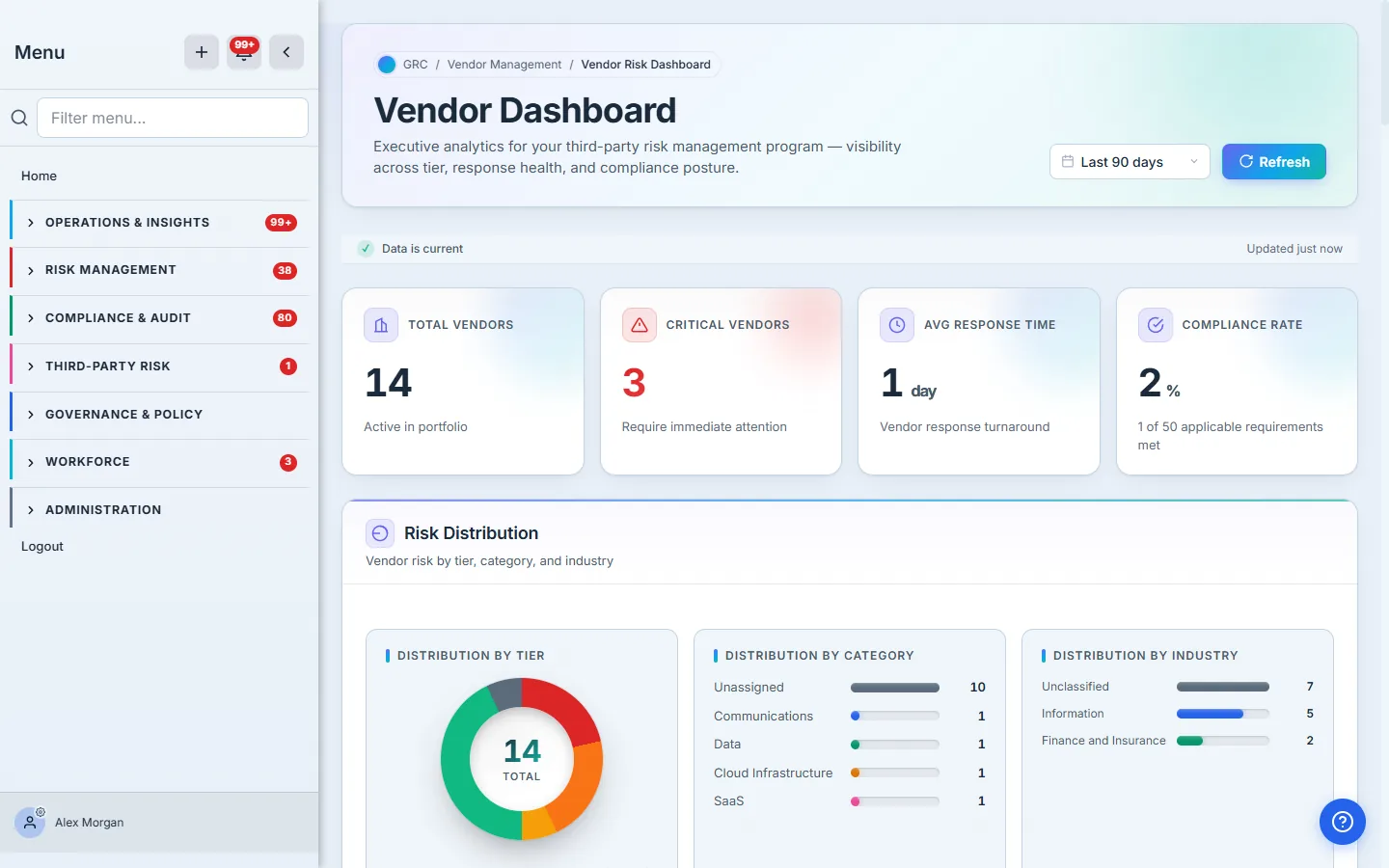
The KPI strip
Four numbers, four sources:
- Total Vendors — the active portfolio (vendors in the active, onboarding, under-review, or restricted lifecycle stages). It always equals the tier donut’s total below — one number, one definition. Populate it: Onboarding a vendor.
- Critical Vendors — active vendors whose inherent risk tier is critical. The tier comes from the classification engine, not a hand-picked label. Populate it: Vendor risk tiering.
- Avg Response Time — average days between a request being sent to a vendor and the vendor completing it, over the last 90 days. Fed by the vendor-request pipeline covered below.
- Compliance Rate — the percentage of applicable vendor requirements (SOC 2 report, NDA, DPA, current assessment, active contract, annual review) currently met across the portfolio, with the raw fraction spelled out in the subtitle (“1 of 50 applicable requirements met”) so a hard 2% is never mistaken for missing data. It is the same evaluation the Compliance Gap Analysis section details row by row.
Risk Distribution
Three charts over the active portfolio: the tier donut (critical / high / medium / low, plus a gray Unassigned segment for vendors not yet classified — so the donut always accounts for every vendor in the KPI), category bars, and industry bars from each vendor’s NAICS classification.
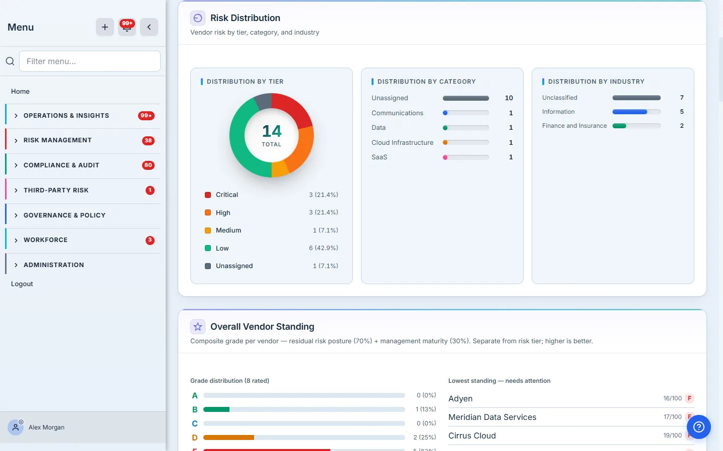
Every one of these is profile data: tier from classification, category and industry from the vendor’s profile (the industry picker takes a plain-language search — “payments”, “cloud” — and maps it to a NAICS code). A tall Unassigned segment or an empty industry chart is the dashboard telling you the intake step is being skipped. Populate it: Onboarding a vendor, Vendor risk tiering.
Overall Vendor Standing
Standing is the other axis from tier: tier asks “how much could this vendor hurt us,” standing asks “how well is this vendor being managed.” Each rated vendor gets a composite score out of 100 — residual risk posture (70%) + management maturity (30%) — banded into A–F grades (A ≥ 80, B ≥ 65, C ≥ 50, D ≥ 35, otherwise F). The needs-attention column lists only vendors graded D or F (with a “showing N of M rated” count), each linking to its case file; when nobody is below C it says so instead. Vendors that can’t be scored yet are counted as unrated, never faked into a grade. Standing needs no assessment to exist — it moves with classification and governance signals, which is why a newly-classified vendor can carry an F before its first assessment ever runs.
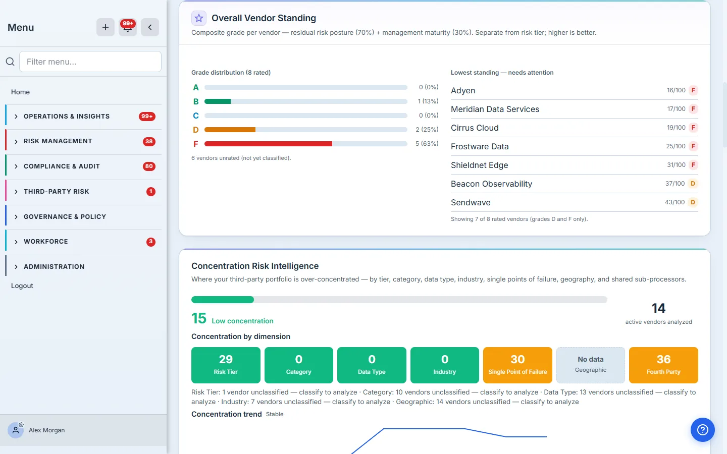
Standing moves when residual risk moves — linking compensating controls on the vendor’s case file is the main lever. Populate it: Residual risk, done right.
Concentration Risk Intelligence
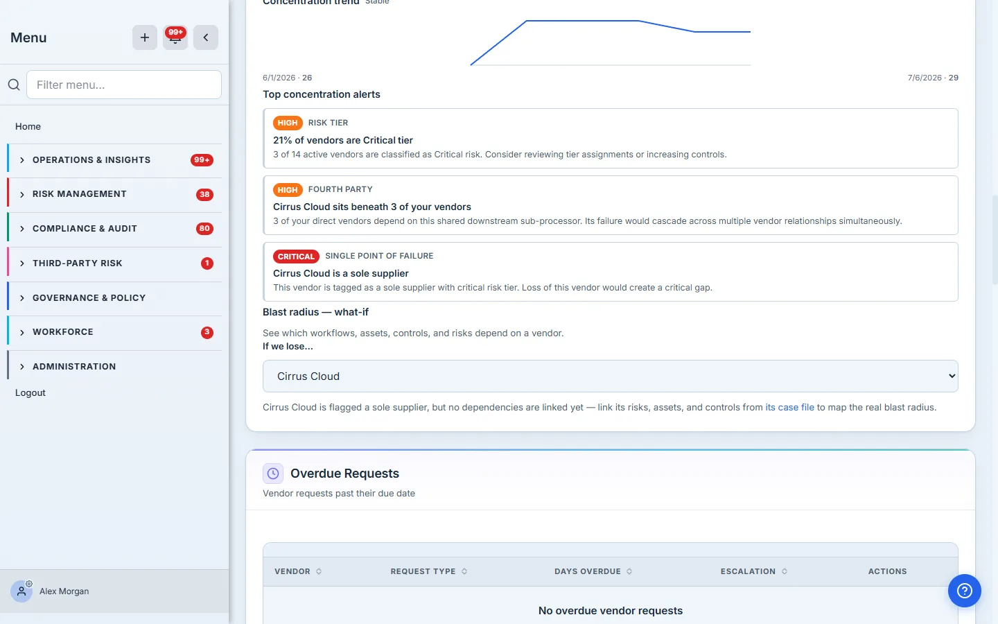
The portfolio-shape section: a 0–100 concentration score blended from seven dimensions (risk tier, category, data type, industry, single points of failure, geography, shared sub-processors), a heat-map cell per dimension, a weekly trend sparkline, and severity-badged alerts like “X is a sole supplier.”
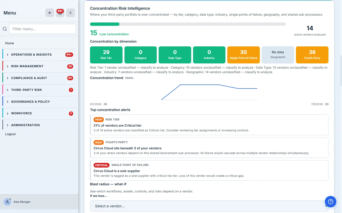
Each dimension has its own feeder: SPOF needs the Sole Supplier / Critical Workflow tags on vendor profiles, geography needs the data-processing-location field, and the fourth-party dimension reads the sub-processor edges you draw on /app/supply-chain. The section is honest about what it can’t see: a dimension with nothing classifiable shows a neutral No data tile — never a green zero — and each tile footnotes how many vendors are unclassified, because classifying them is what makes the score real. The trend shows its start and end scores next to the dates, and appears after the weekly snapshot job has run at least twice — it accrues on its own. Populate it: Vendor concentration risk.
Blast radius — what-if
Pick a vendor from the what-if selector and the panel traverses your entity links — workflows, work items, assets, controls, risks — to answer “what breaks if we lose them.” The result is only as good as your linking discipline: it reads the same Linked Items panels you fill on vendor, risk, and control case files. When a flagged sole supplier has no links yet, the panel says exactly that — and links you straight to the vendor’s case file to start mapping.
Overdue Requests
Every request you’ve sent a vendor (document chase, information request, remediation ask) carries a due date. This queue lists vendors with requests past due — days overdue, severity-tinted, with an Escalated badge when the reminder cascade has run out of patience. The best state for this table is the one in the screenshot: empty.
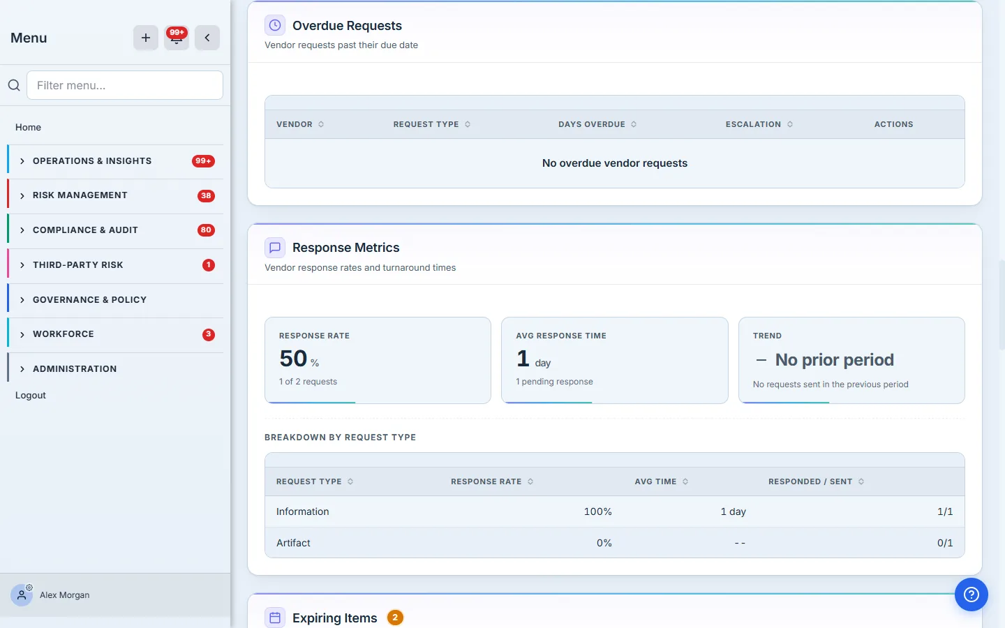
Response Metrics
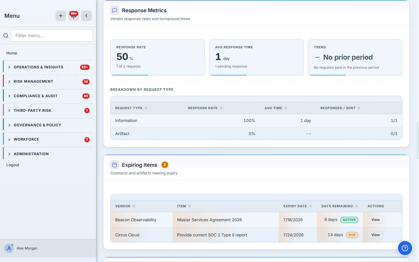
The vendor-responsiveness section: response rate (completed ÷ sent in the window), average response time, pending count, and a trend state comparing this window to the previous one — when no requests went out last period, it says “No prior period” instead of inventing a delta. The breakdown table lists every request type with a Responded / Sent count, so a type that’s still awaiting an answer shows 0/1 rather than vanishing.
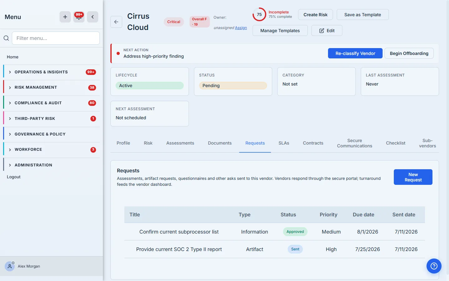
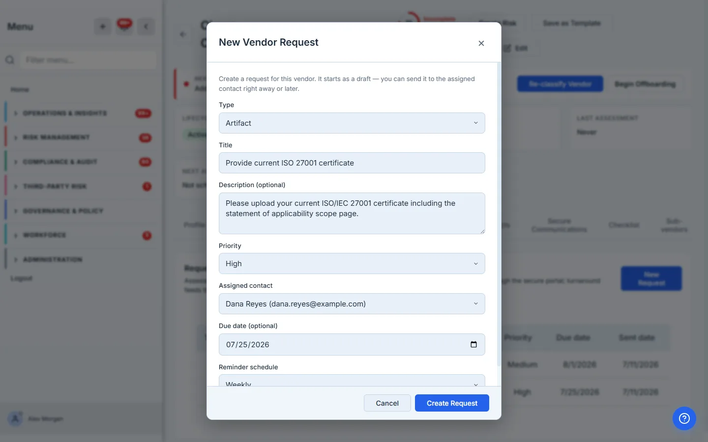
Both this section and the overdue queue are fed by the Requests tab on each vendor’s case file: create a request (type, priority, due date, assigned vendor contact, reminder schedule), send it, and the vendor answers through their portal — no login juggling, and every timestamp (sent, viewed, submitted) becomes the data you’re reading here. A dedicated walkthrough of the request pipeline is queued; until it ships, the Requests tab itself is self-explanatory, and Vendor monitoring covers the ongoing-diligence cadence these requests implement.
Expiring Items
One look-ahead queue over four different record types: contracts approaching their end date, vendor documents with expiry dates (certificates, insurance), required artifacts coming due, and open requests near their deadline. Row tinting escalates at 60, 30, and 7 days out; the count badge counts items within 30 days.
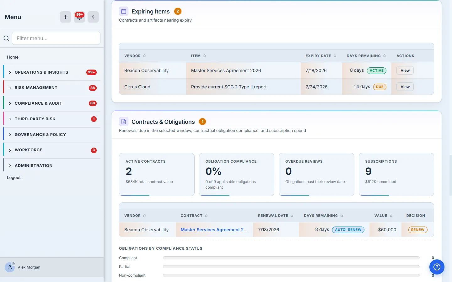
Populate it: Vendor contracts, obligations & renewals for the contract rows, Vendor risk attestation and the vendor Docs tab for document and artifact expiry.
Contracts & Obligations
The commercial layer: active contract count and total value, obligation compliance rate (compliant ÷ applicable assessed obligations), overdue obligation reviews, and subscription spend — plus the renewal queue for the selected window, with auto-renew badges and recorded renewal decisions.
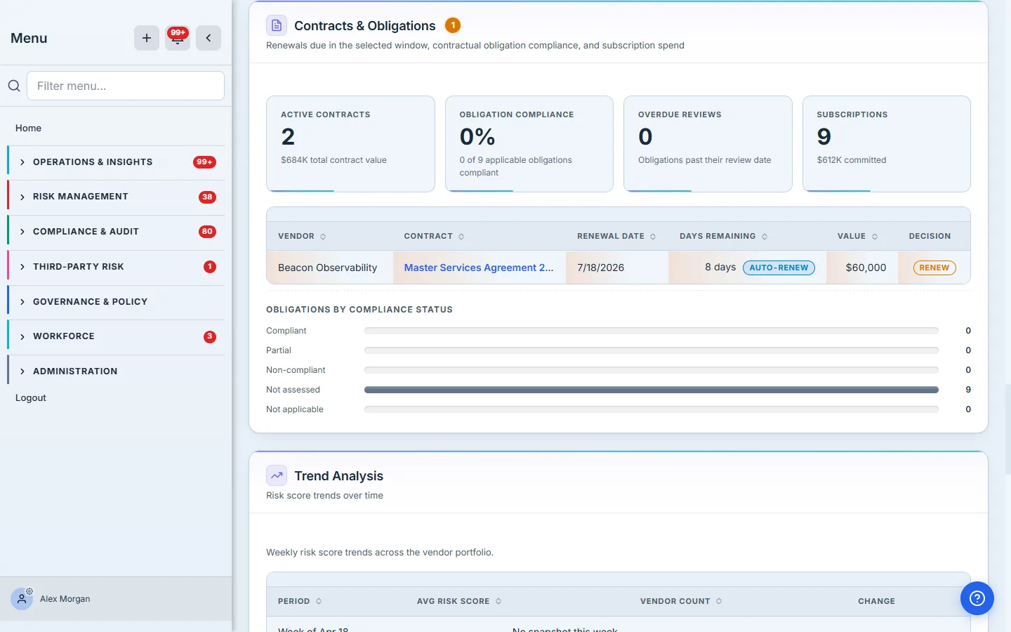
The auto-renew badge is the quiet control gap. A contract that renews itself doesn’t ask for a decision — which is exactly why the renewal queue shows it. Recording a decision on
/app/vendor-renewalsbefore the date is the control.
Subscription spend is computed per currency and never cross-summed — a EUR pool and a USD pool stay separate lines. Populate it: Vendor contracts, obligations & renewals, Every SaaS subscription is a vendor.
Trend Analysis
Average portfolio risk score over time, from snapshots captured automatically — a real history table, not a recomputation. The grain follows your window (weekly at 90 days, monthly at a year), periods without a snapshot say “No snapshot this week” rather than interpolating a line through nothing, and the Change column inverts the usual color logic: falling scores are green, because lower risk is better.
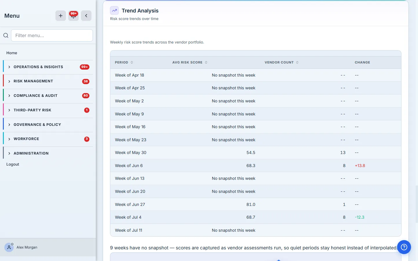
There’s nothing to populate here directly — trends accrue as vendors carry scores. Reassessments are what move it: Vendor monitoring.
Compliance Gap Analysis
The row-by-row version of the Compliance Rate KPI: every evaluated requirement (SOC 2 report, ISO 27001 cert, current risk assessment, active contract, NDA, DPA, annual review) with how many vendors are missing it and the coverage percentage — including the rows you’ve fully covered and the ones that don’t apply to anyone, so the table is the whole picture rather than just the bad news. Requirements are tier-conditional — a SOC 2 report is only required of critical and high-tier vendors, so a low-tier vendor without one doesn’t count against you.
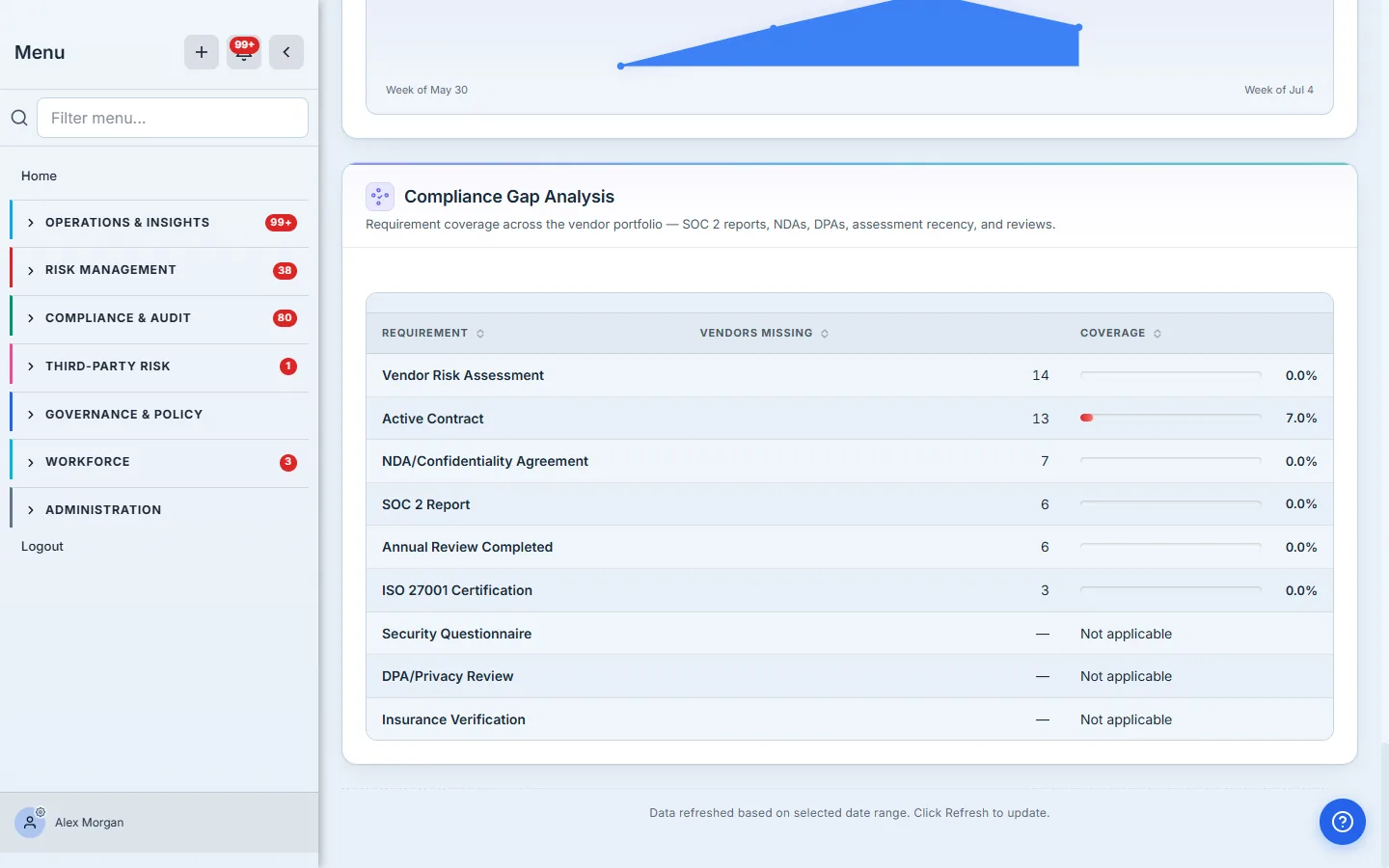
The evidence lives where you’d expect: the Active Contract requirement reads the same contract records the Contracts card counts, and the rest comes from the vendor profile — certifications, NDA and DPA flags, assessment recency, review dates. Populate it: Vendor questionnaires for assessment recency, Onboarding a vendor for the agreement flags.
What’s deliberately NOT on this page
- Vendor questionnaires are a separate pipeline (send a SIG/CAIQ, score responses) and do not feed the request metrics here — see Vendor questionnaires.
- CSV export of the dashboard lives in the vendor reporting flow, not on this page; the browser print stylesheet covers the “PDF for the meeting” case.
- Per-vendor deep detail — every drill-down lands on the vendor case file, which is its own surface with its own guides.
What you walk away with
- One screen that answers “how is third-party risk, right now” — every number computed live from the records your team maintains anyway.
- Two work queues (overdue requests, expiring items) that convert the rollup into this week’s task list.
- A concentration score that catches the portfolio-shape risk no per-vendor review can see.
- A defensible trail — every metric drills down to the vendor case files, contracts, and artifacts an auditor will ask for.
- A populate path per section — when a chart looks thin, the fix is a linked workflow, not a data-entry hunt.
Open /app/vendor-dashboard, set the window to Last 90 days, and work the two queues first — overdue requests, then expiring items. Ten minutes a week keeps every section of this page honest, and the trend line does the annual-review narrative for you.